Eric and I have been very eager to upgrade to UMAP (as opposed to tSNE) as our go to dimensionality reduction tool for single-cell data. UMAP is only about a year old, but it has become increasingly popular in the field. UMAP is very similar to tSNE, however it allows the analysis of many more events in a shorter amount of time (for a detailed comparison of UMAP and tSNE, check out this publication: biorxiv/Nature Biotechnology). However, finding a platform to use UMAP has been a challenge. Traditionally UMAP has been run through Python. Since most of the analysis algorithms we use are based in R, Java, or MATLAB, I’ve never tried Python and it would require some dedication to become comfortable with. tSNE and PhenoGraph have been sufficient for our analysis needs, so we’ve been waiting for a version of UMAP that would be more accessible to us and other bench scientists.
Recently, Cytofkit announced they were including UMAP in the new version of the pipeline (Cytofkit2), since we are avid users we explored this avenue first. However, as mentioned in a previous post, the new program has a bug in the data transformation step which makes it impossible to use currently. I, and other users, have reached out to the developers and to the community in an attempt to rectify this issue, but have had limited success. While the developers work to resolve this we thought we’d try out the new UMAP FlowJo plugin.
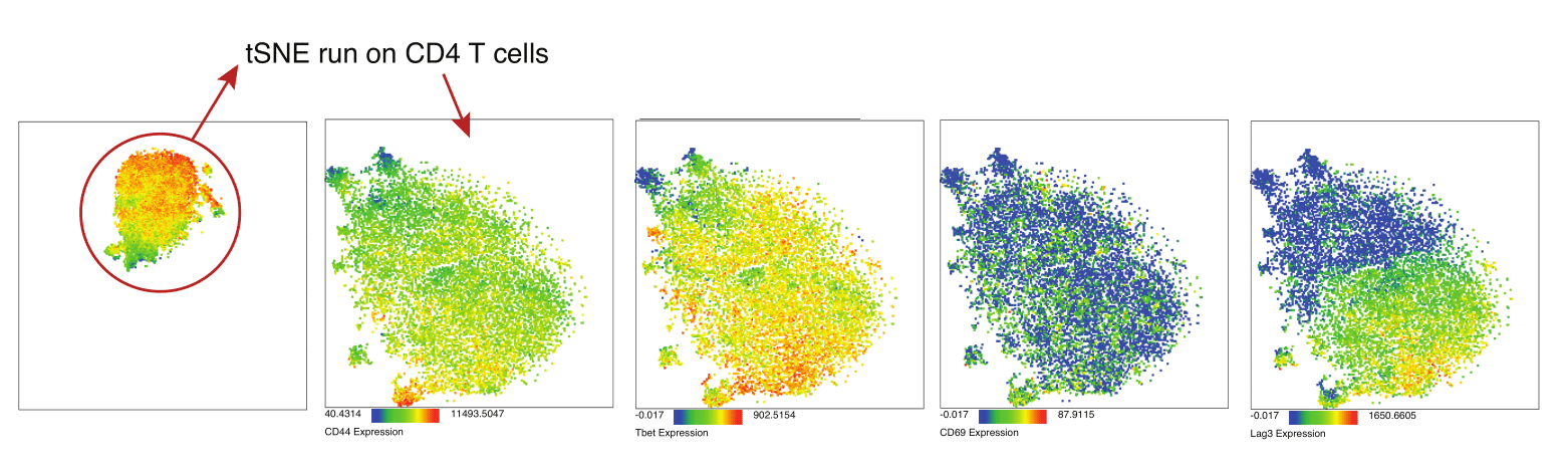
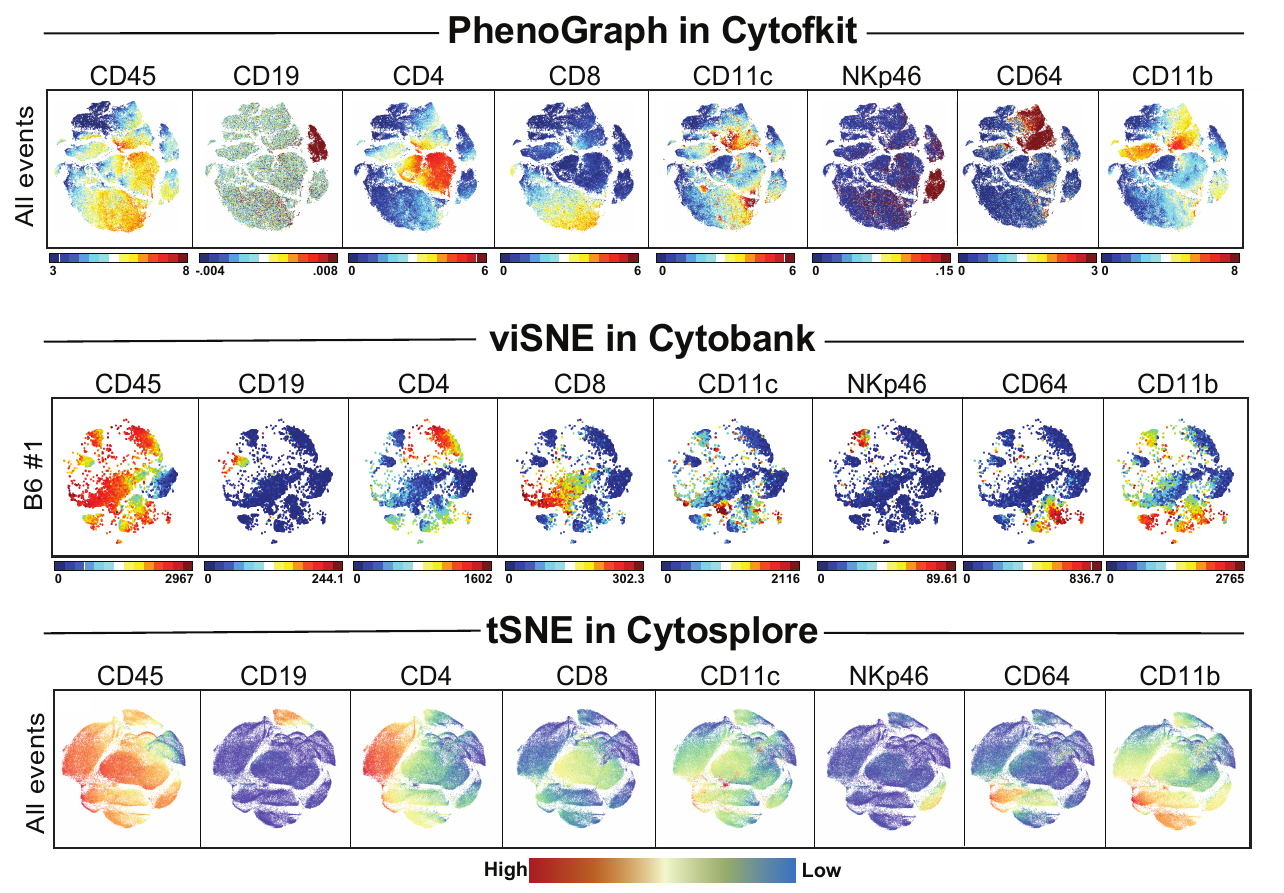
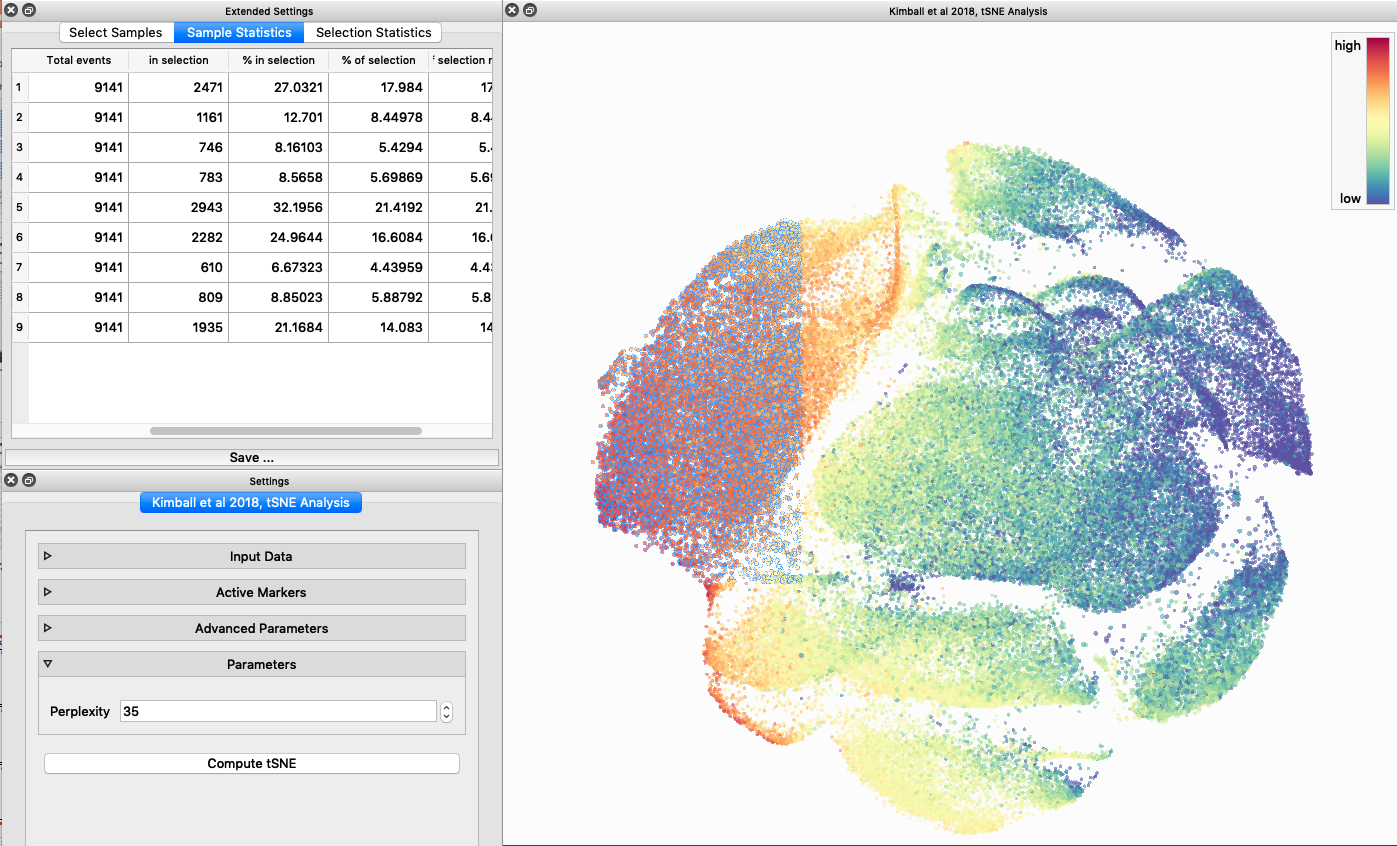
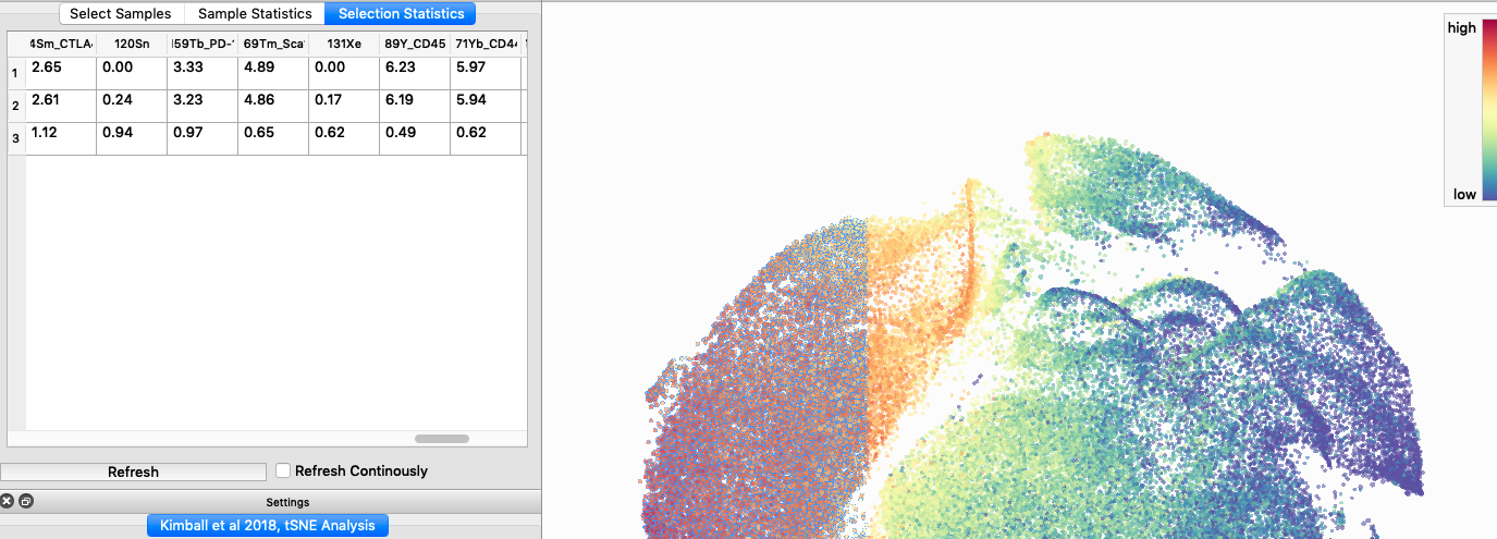
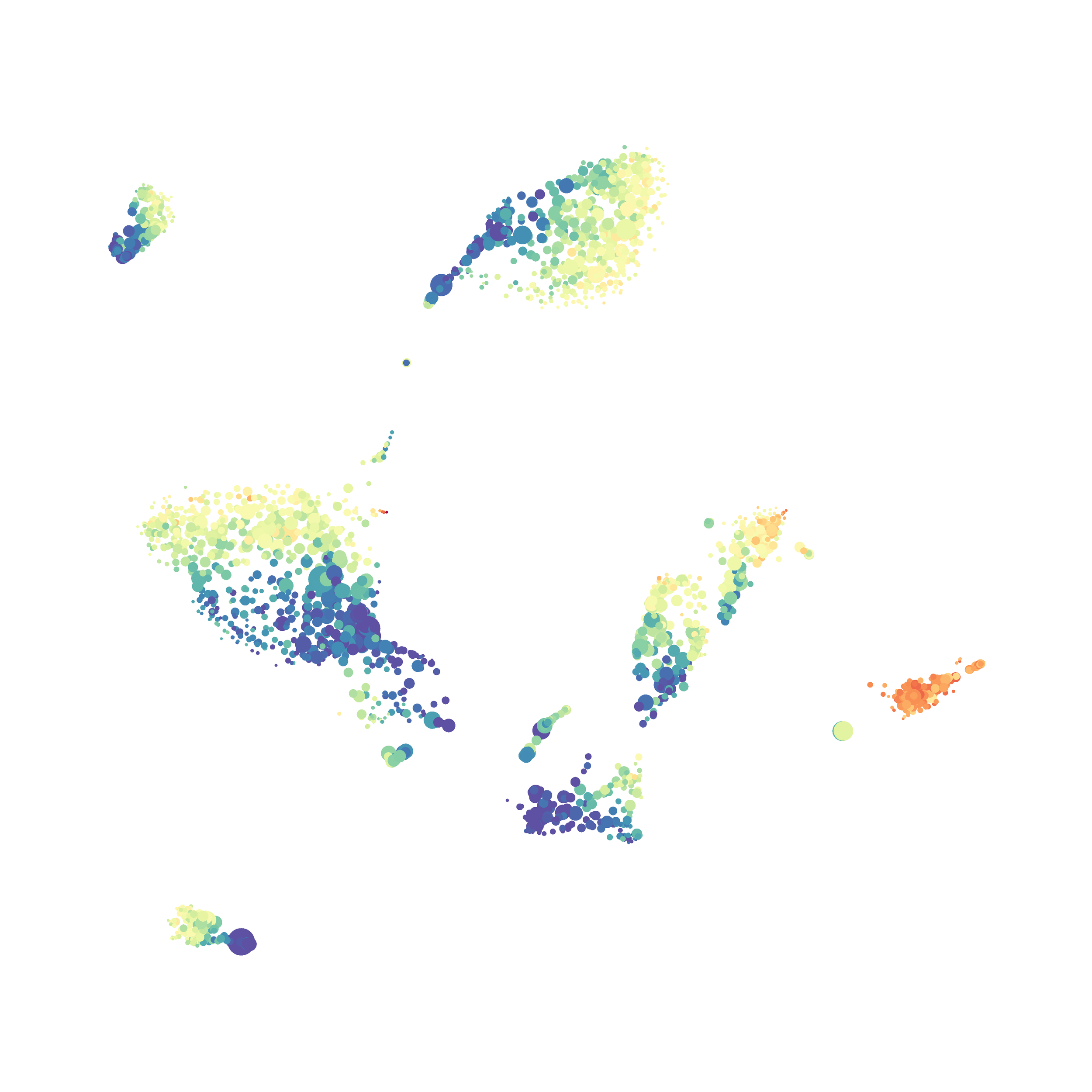
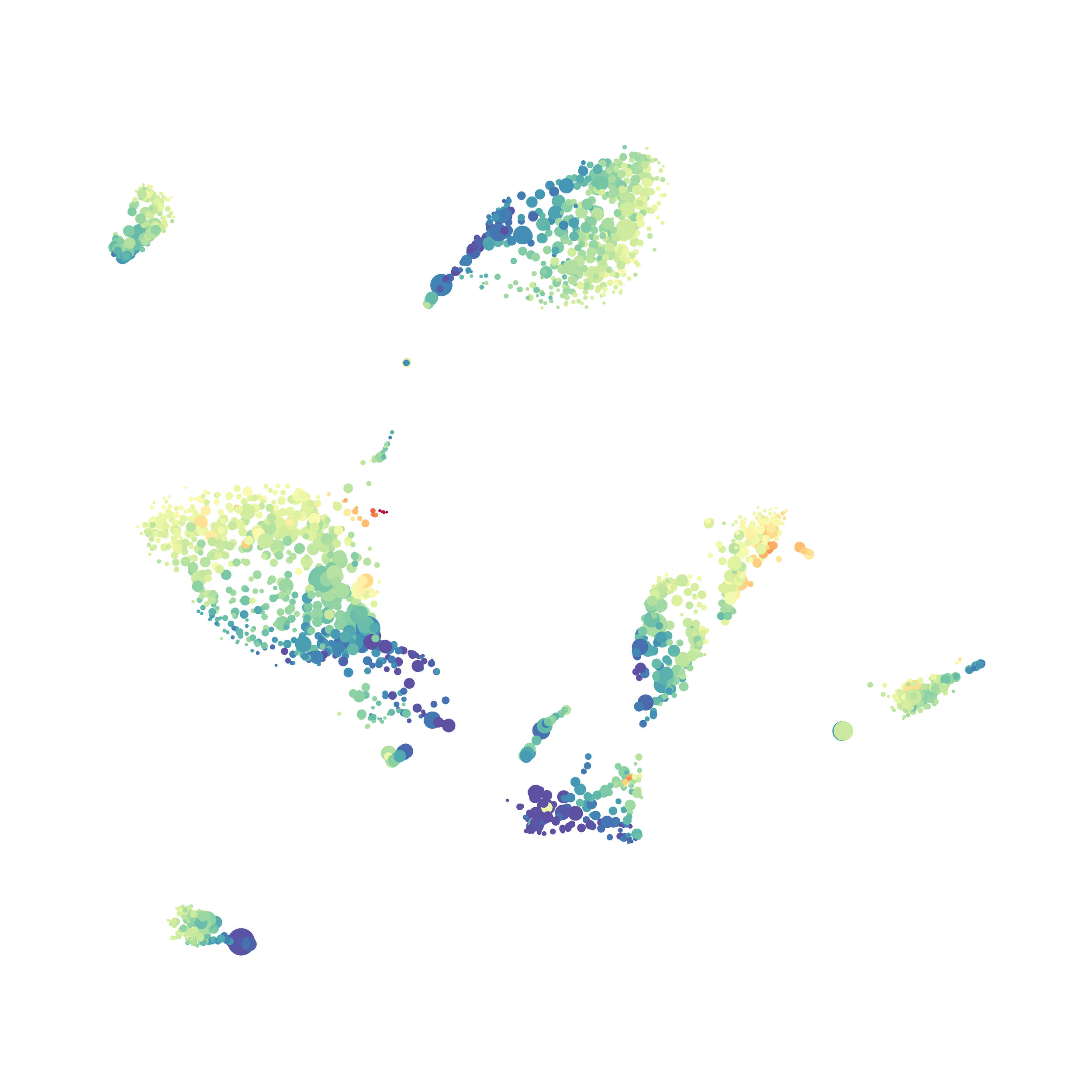
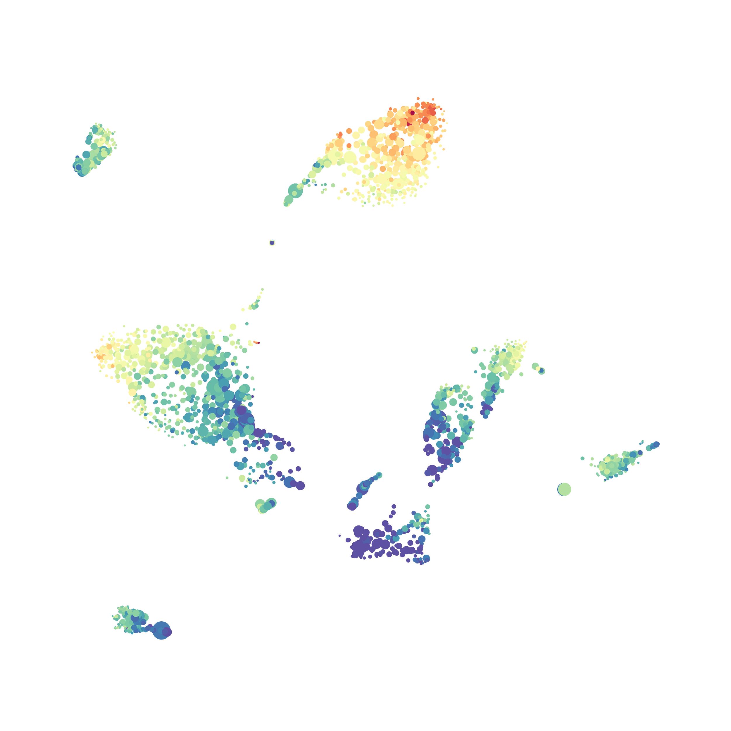
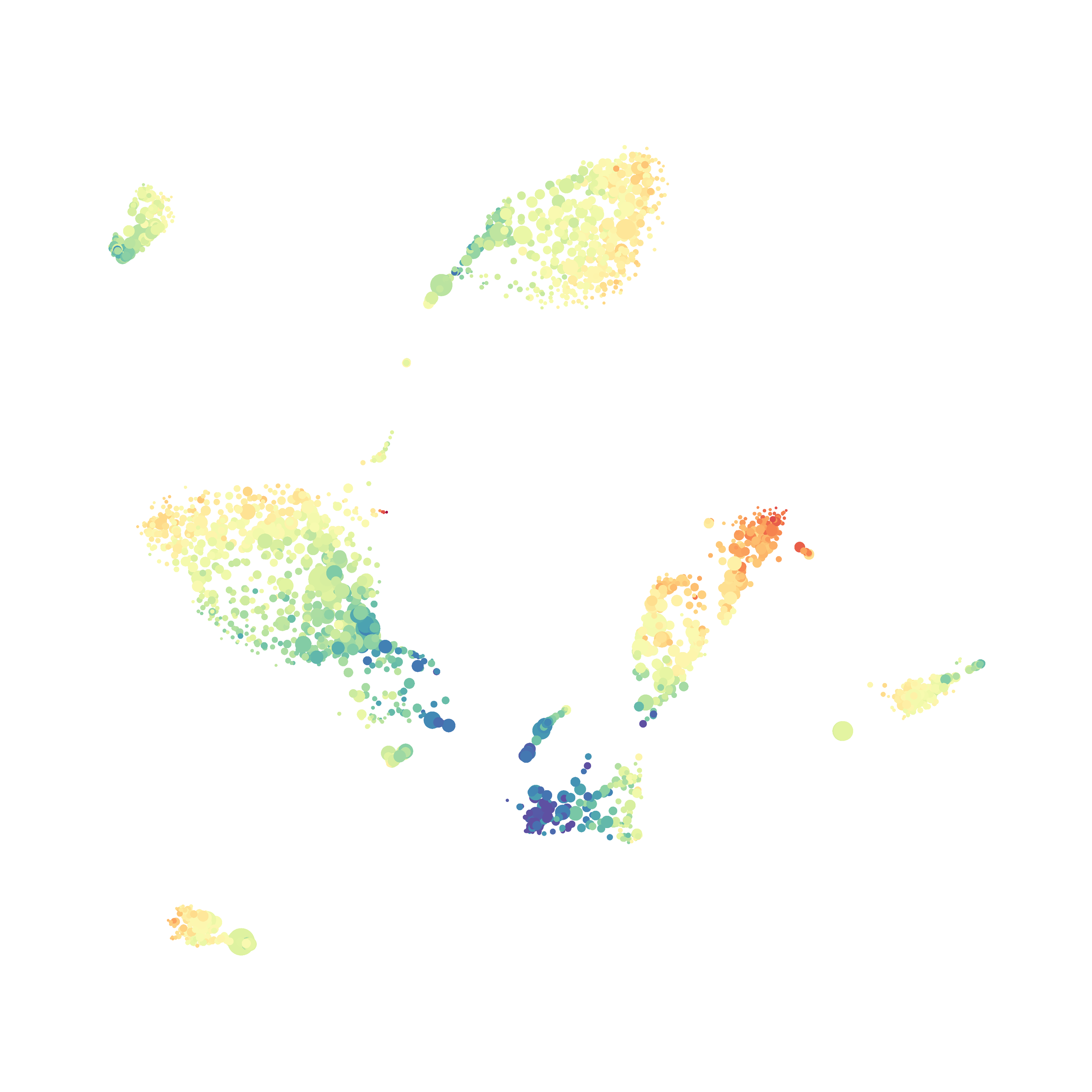
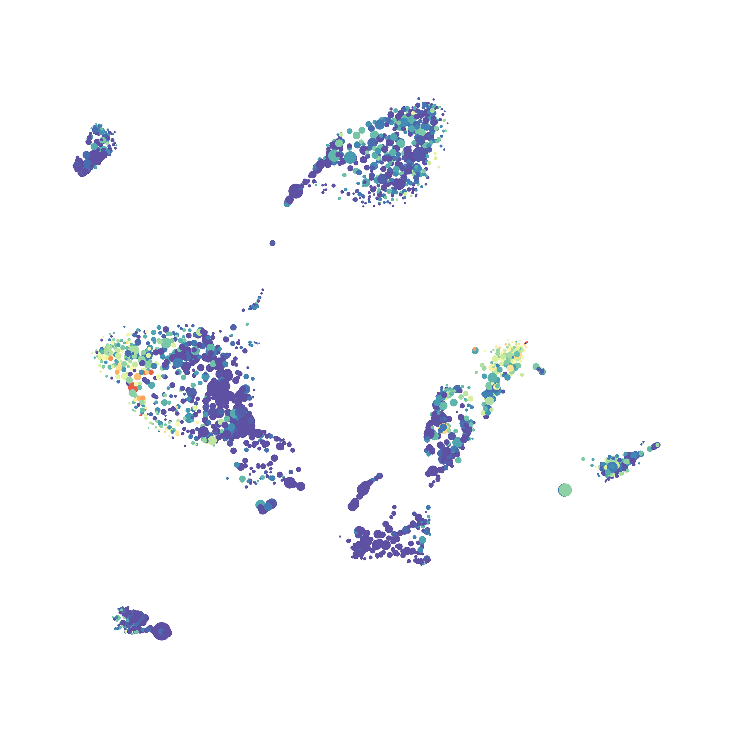
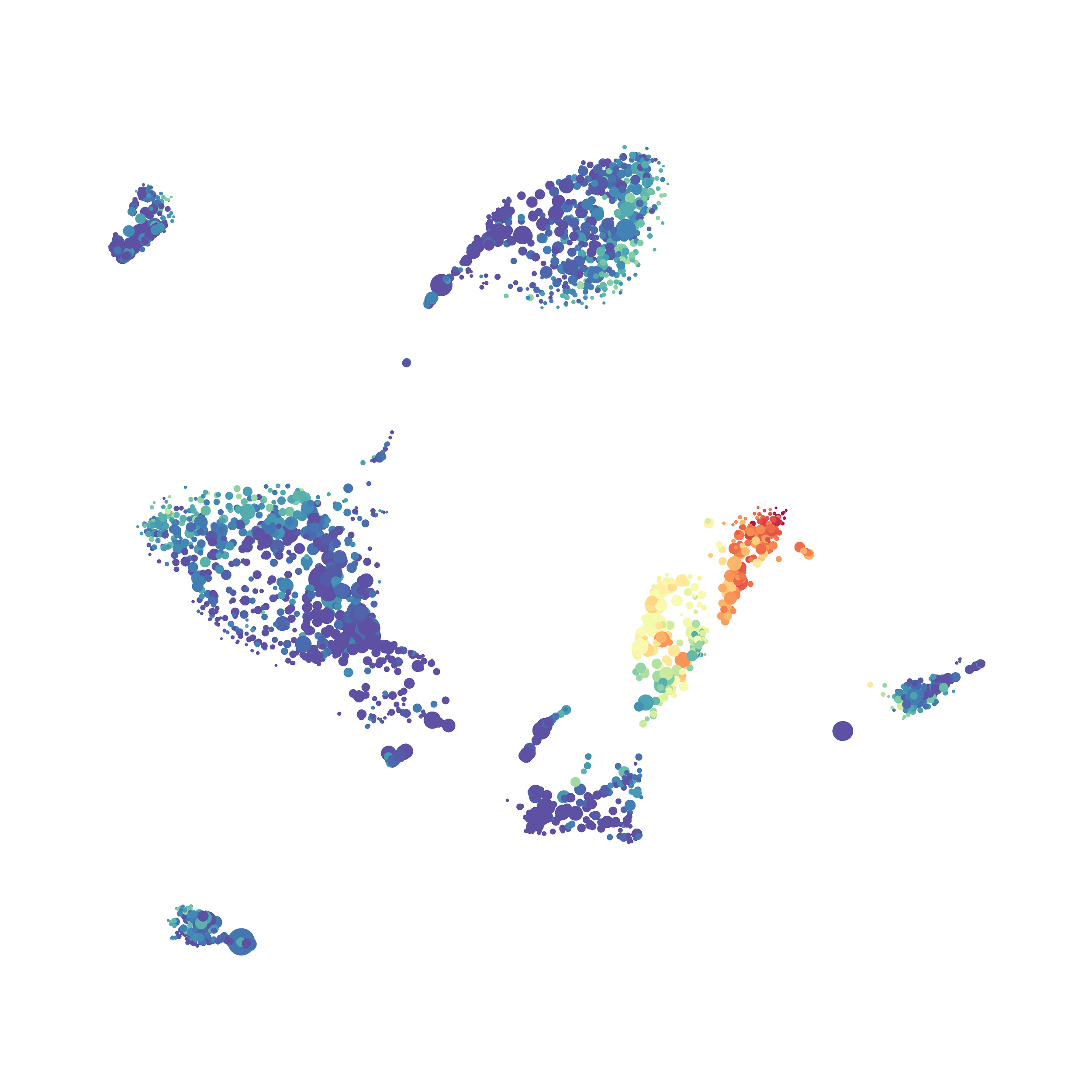
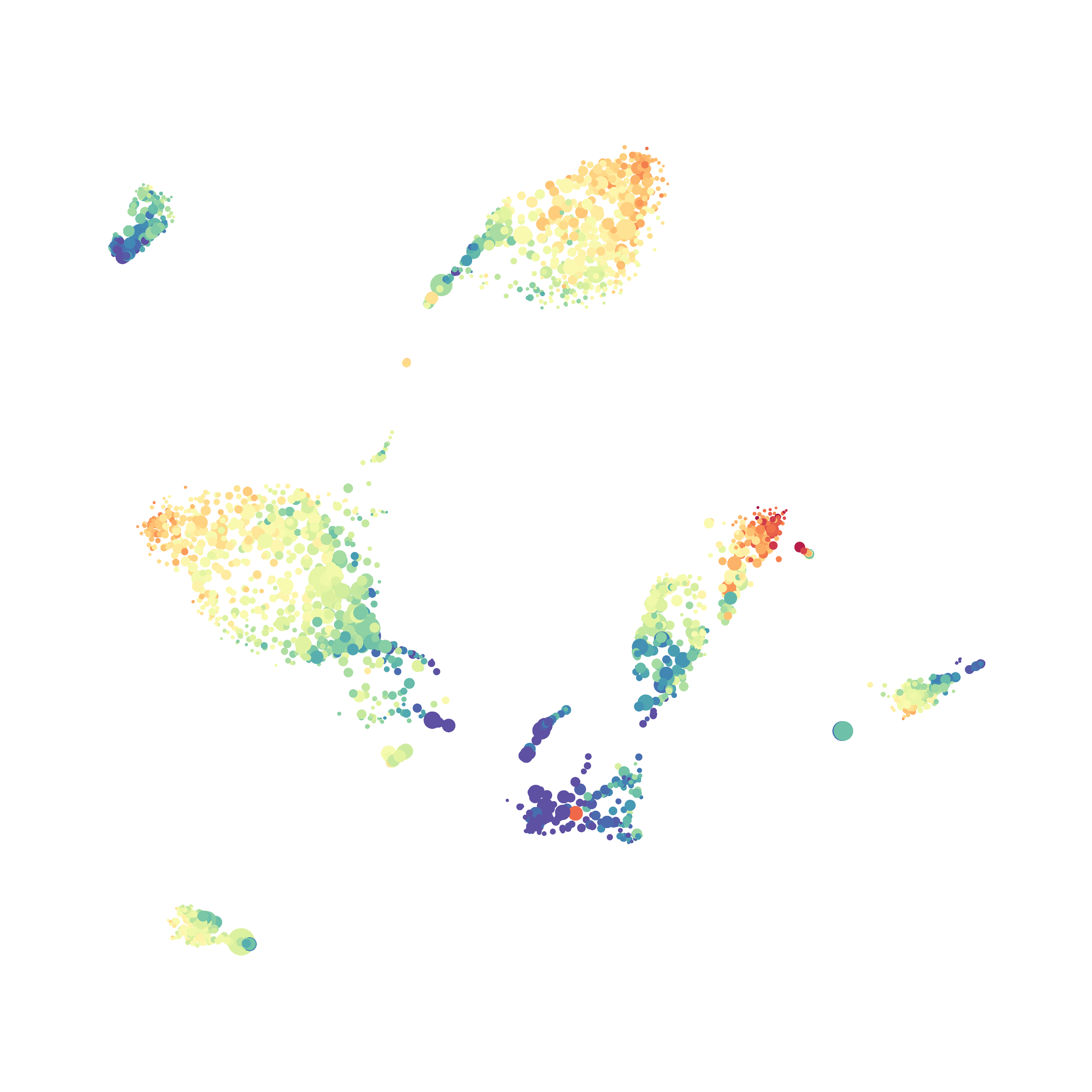
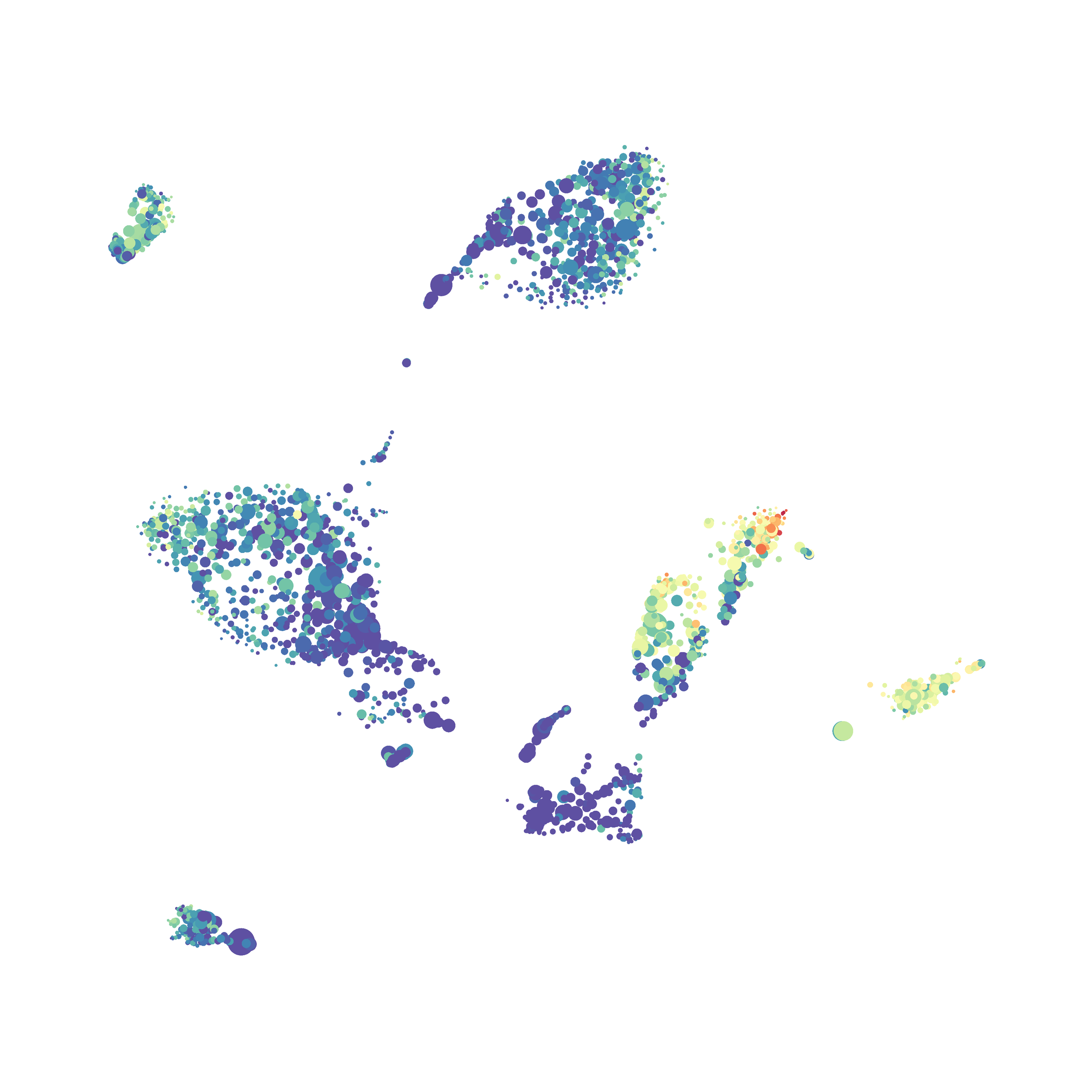
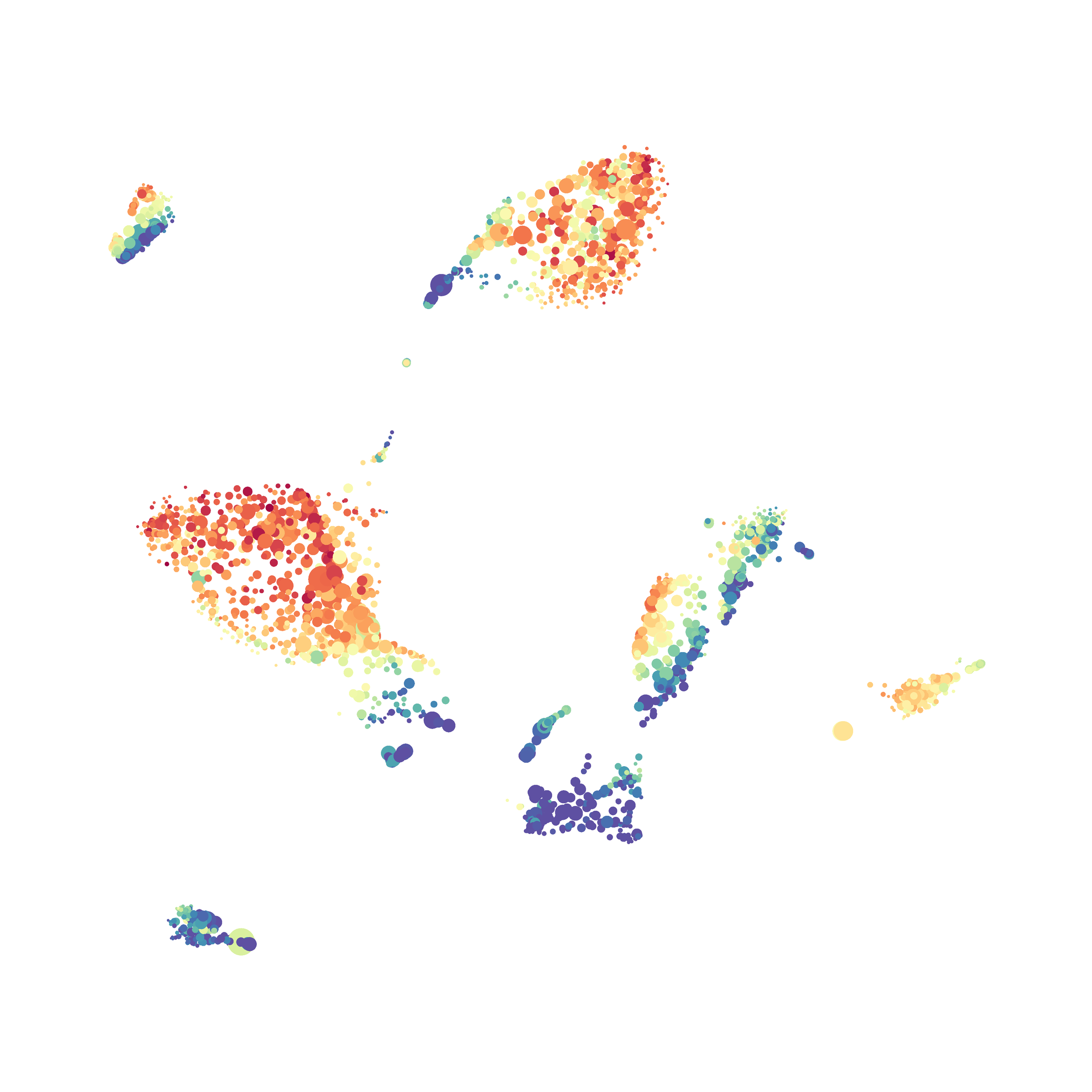
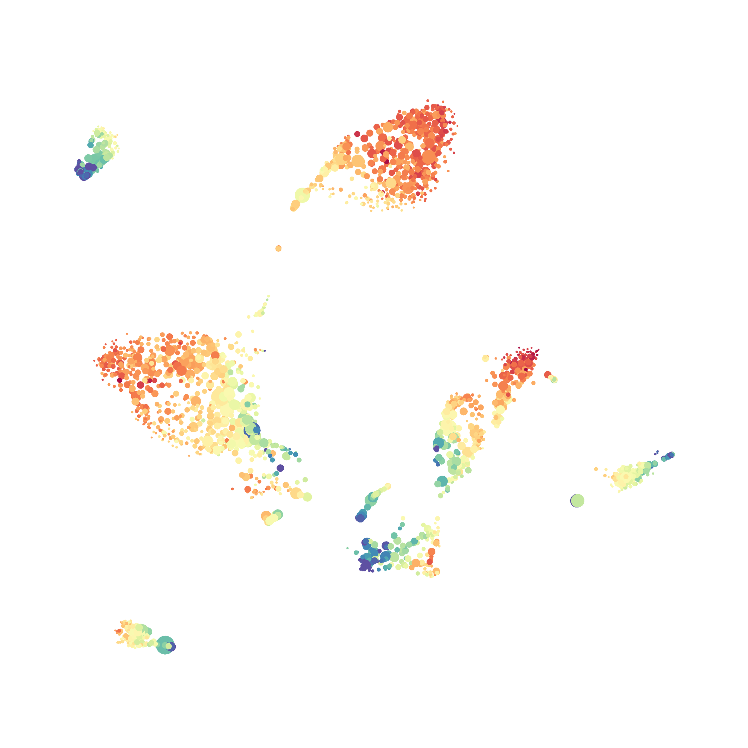
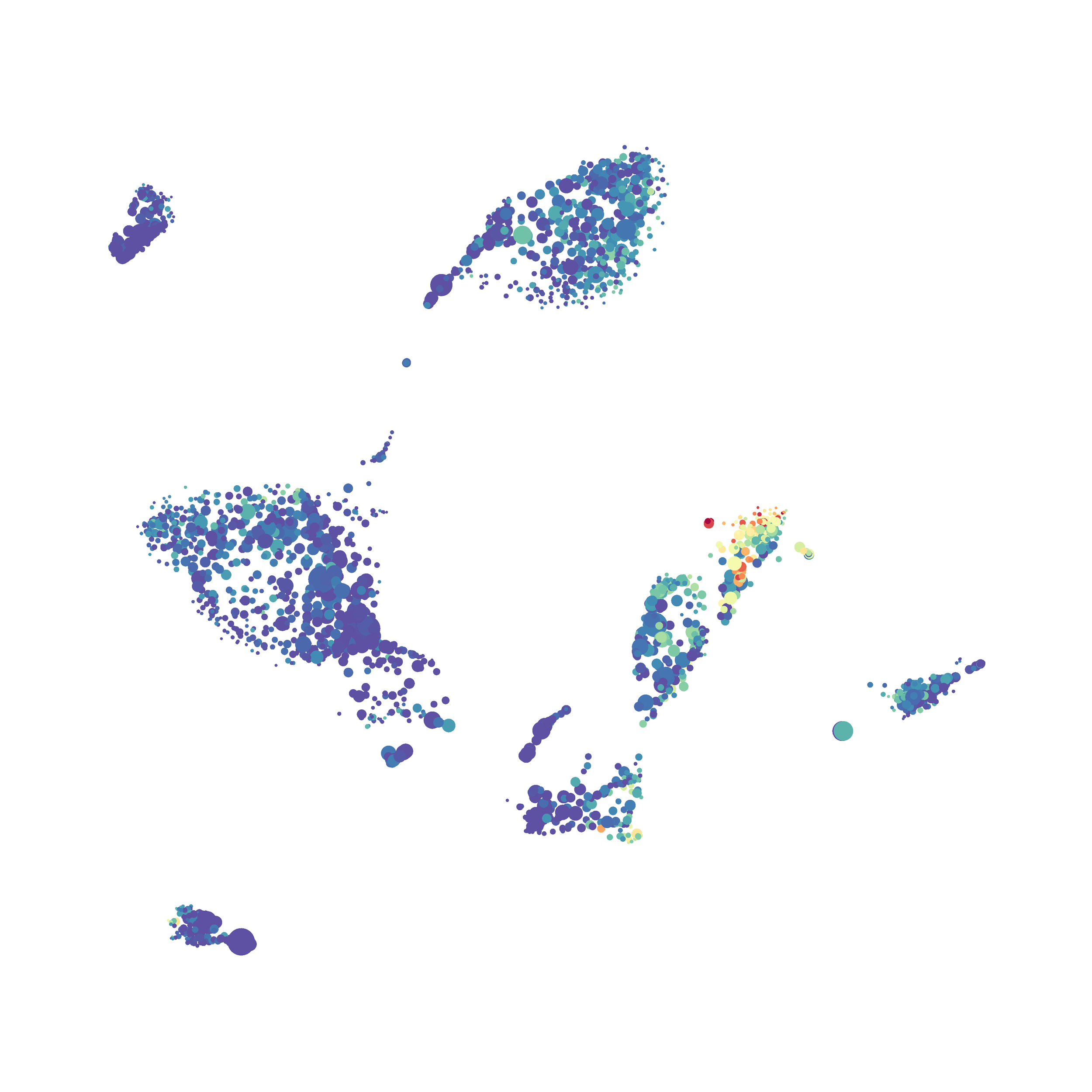
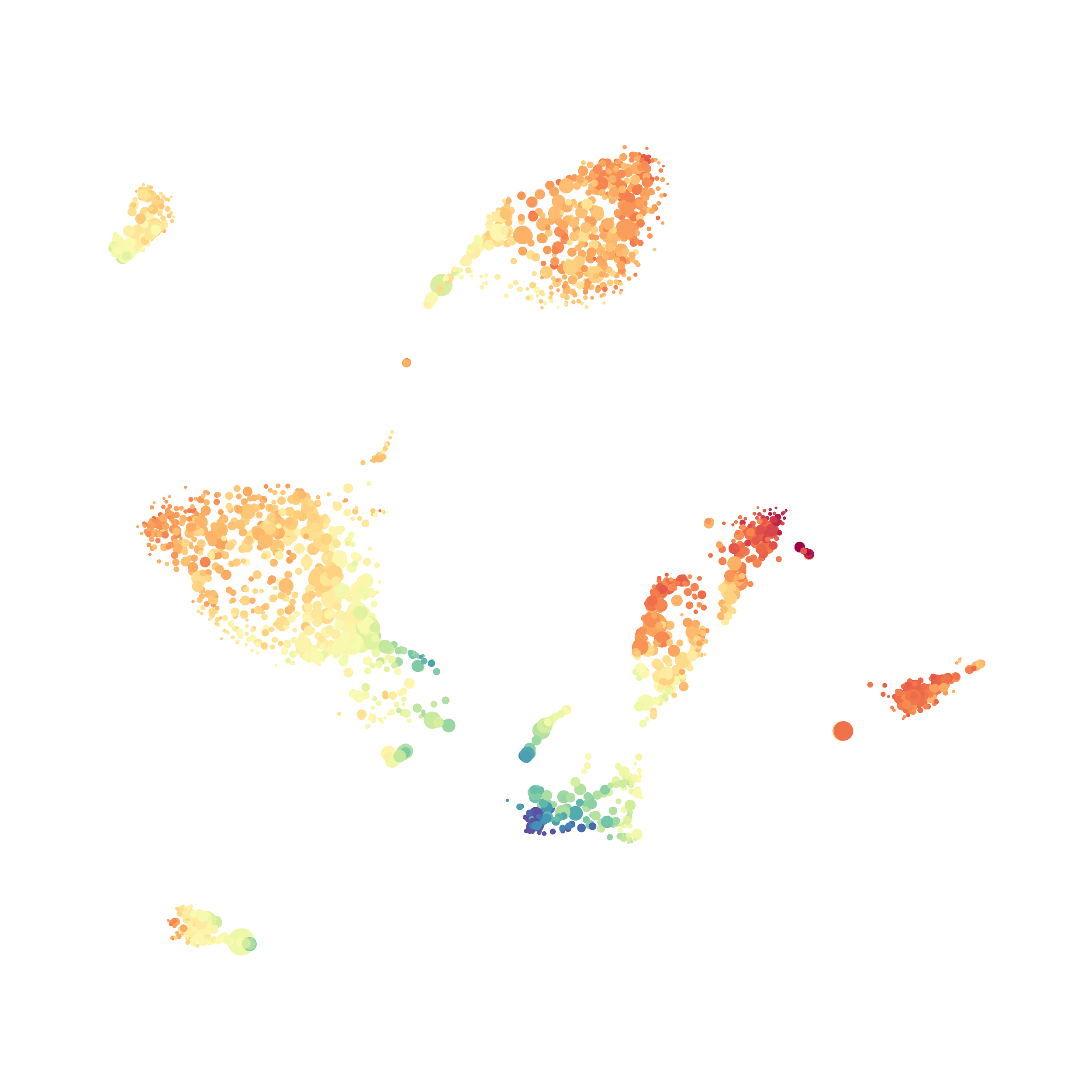
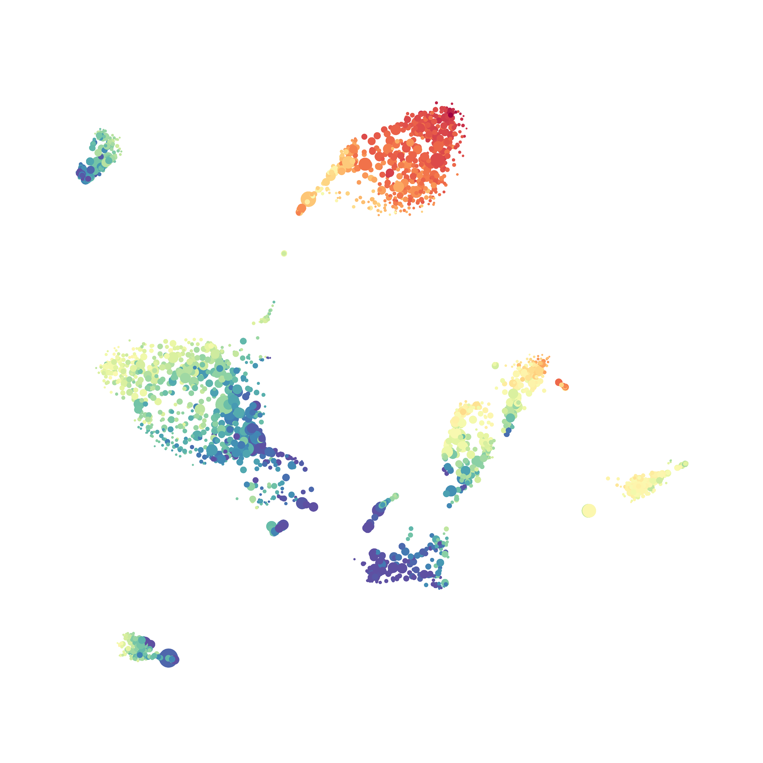
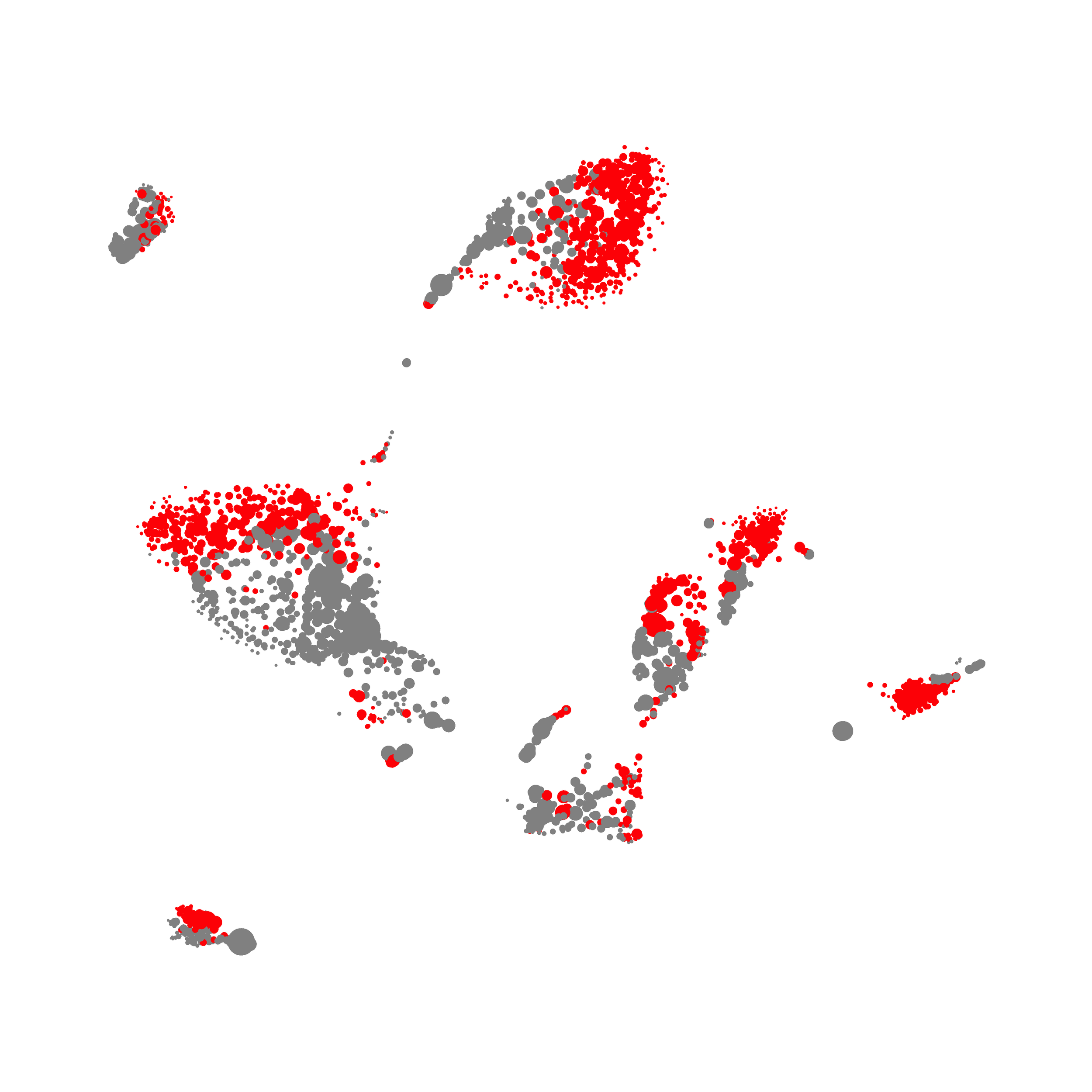
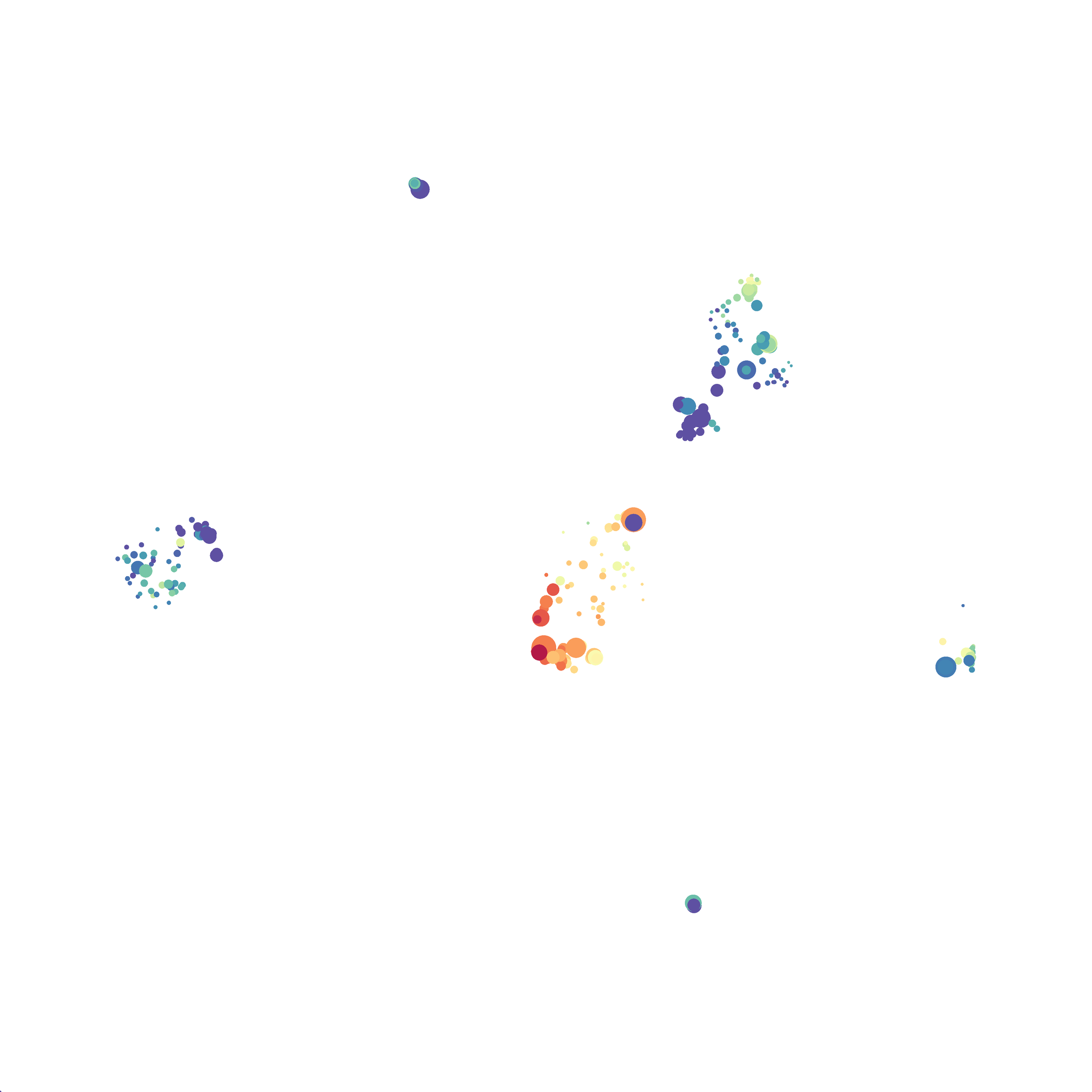
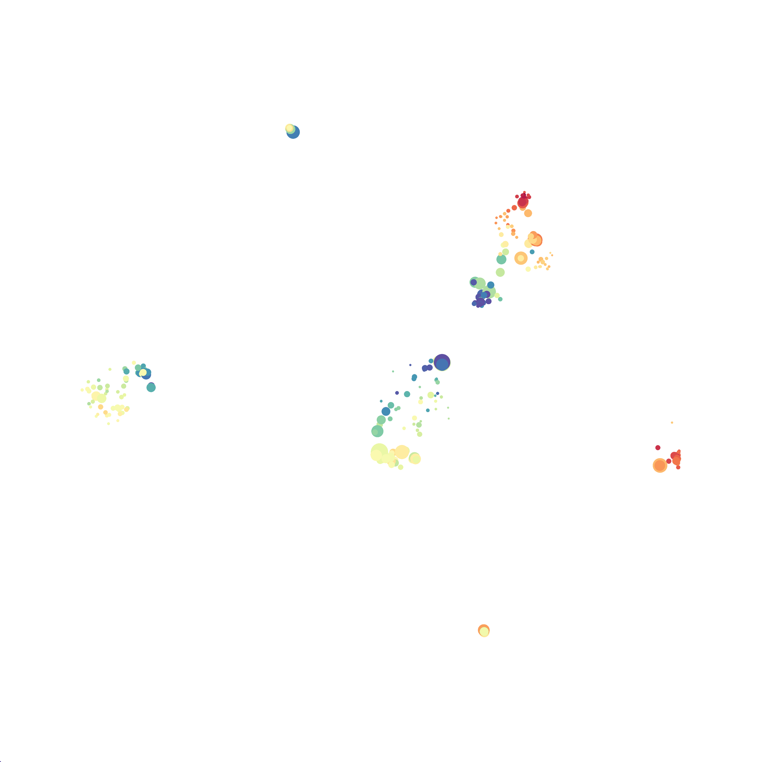
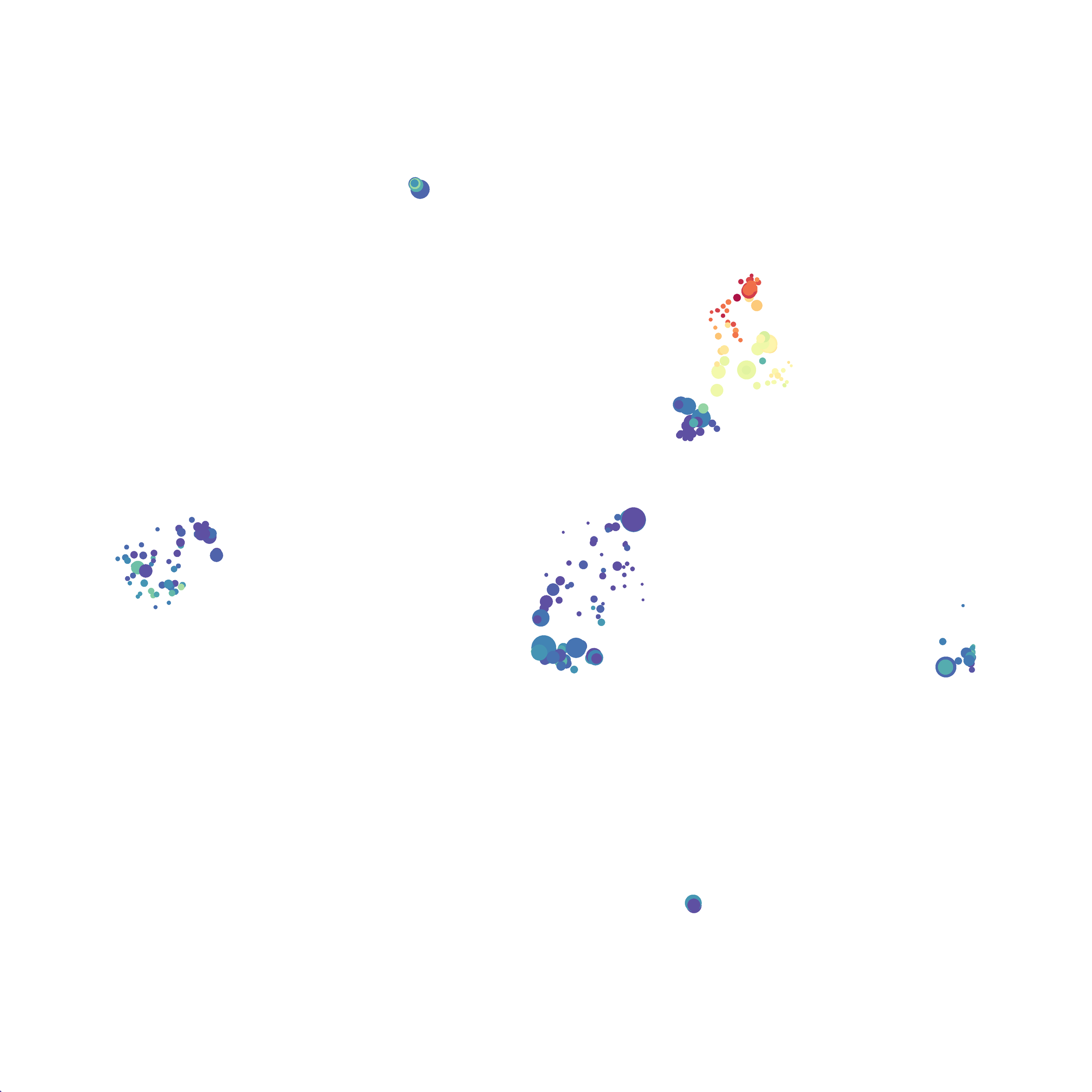
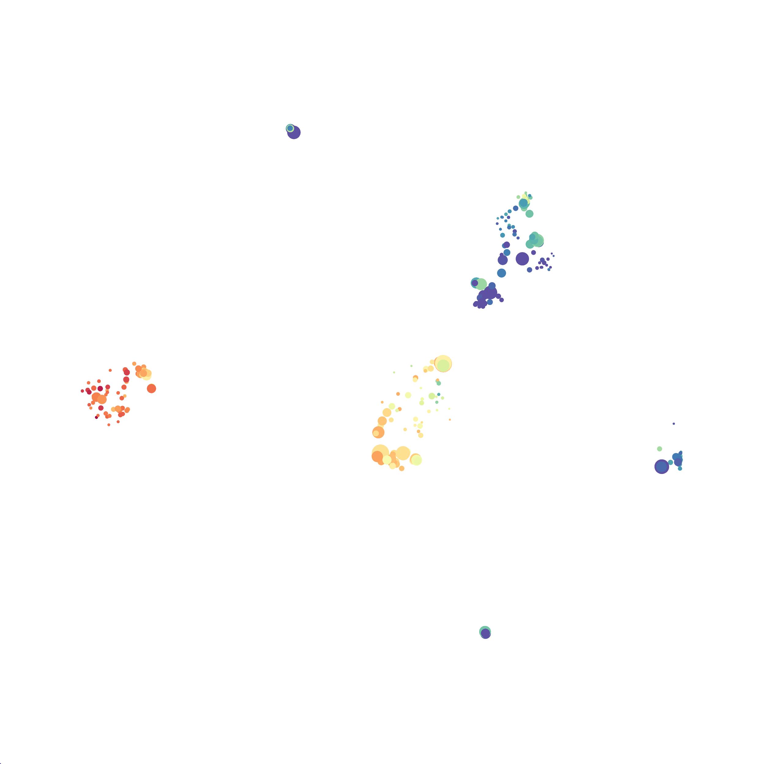
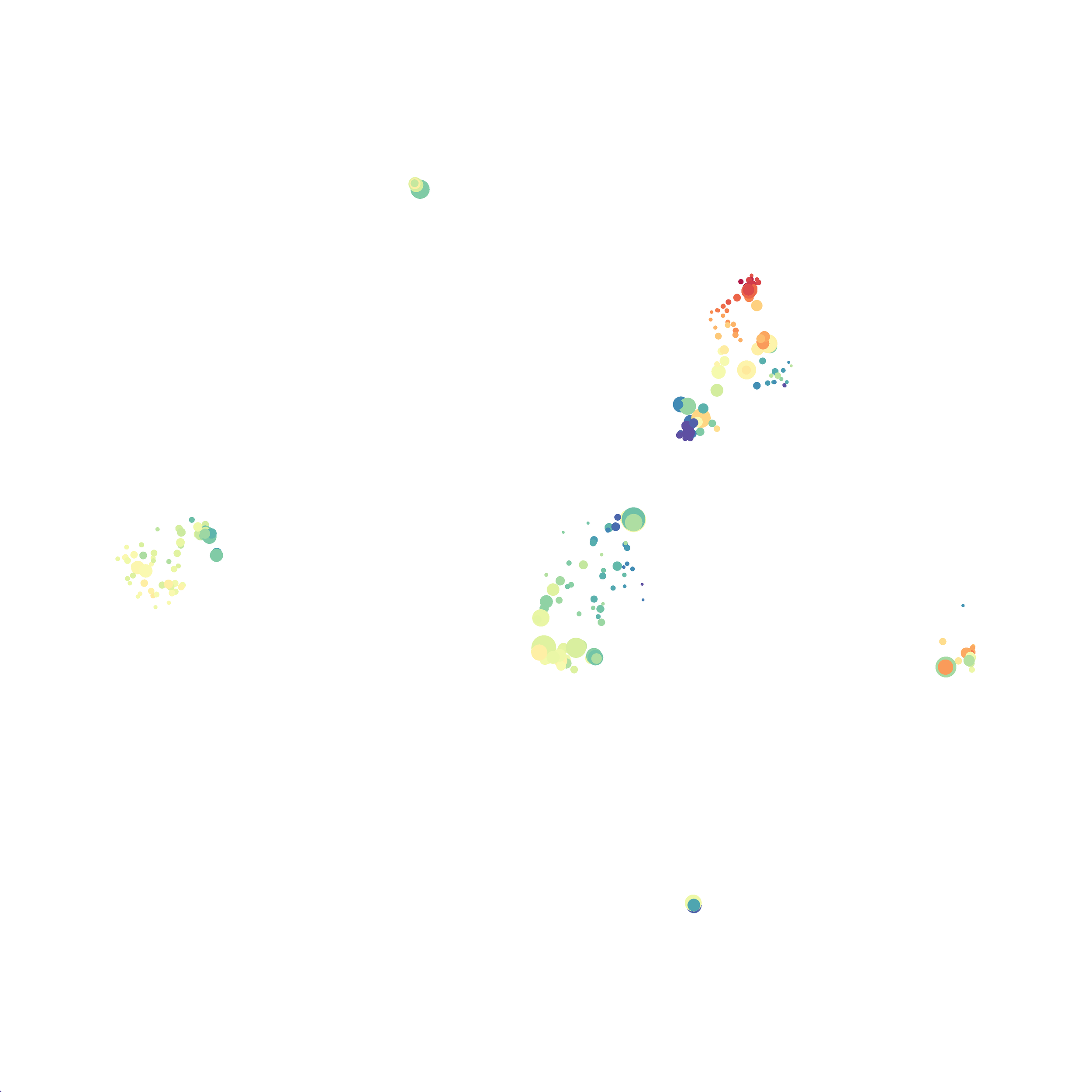
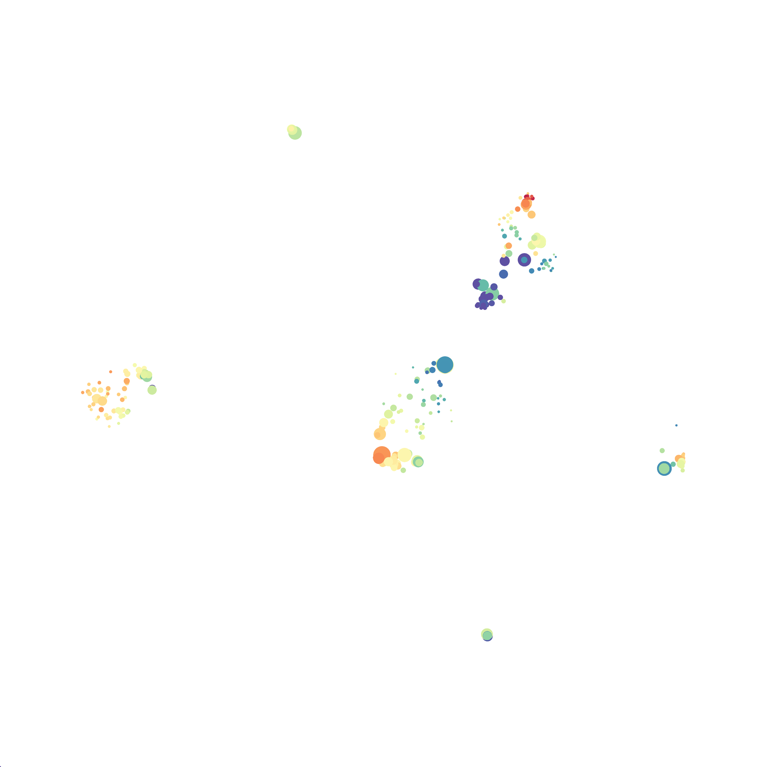
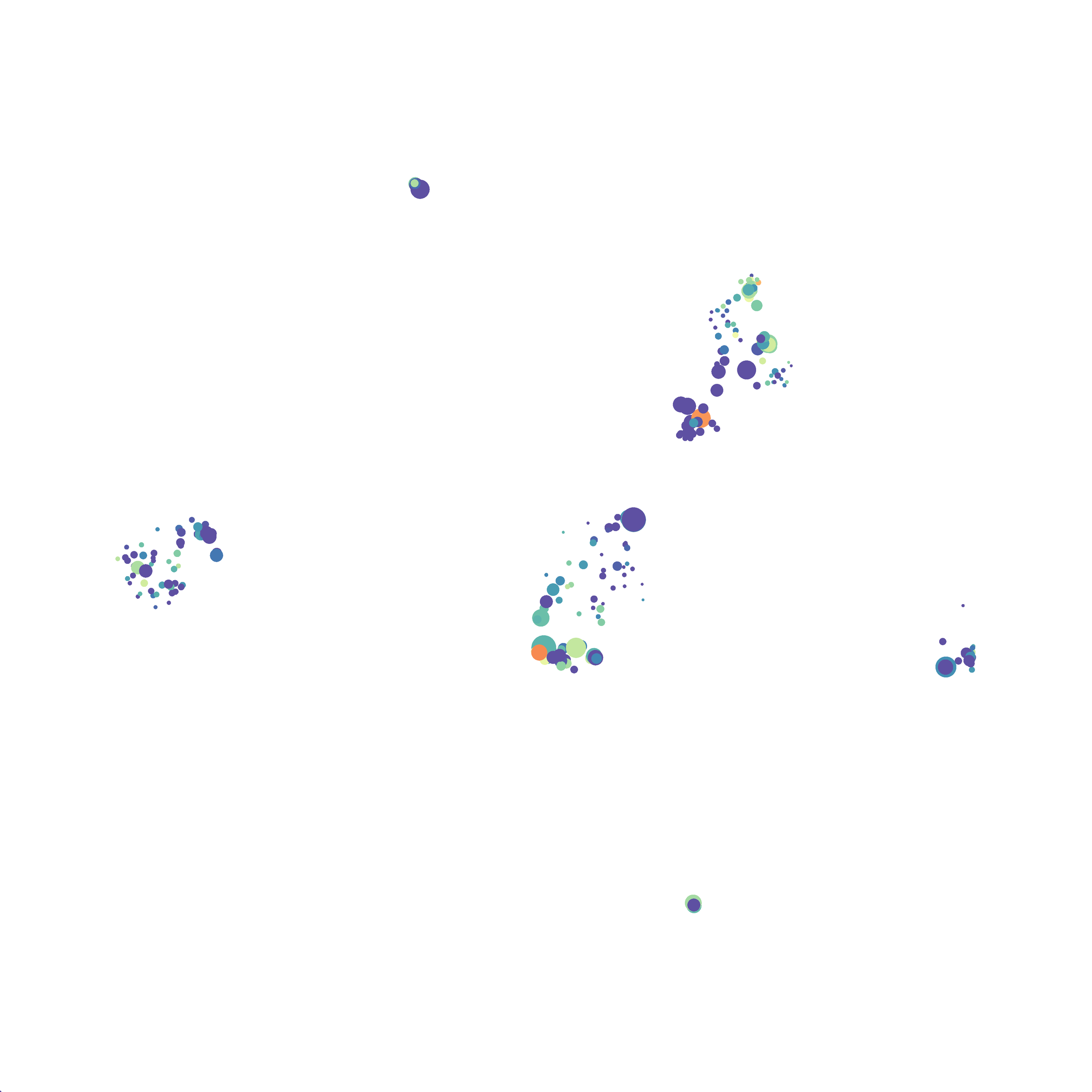
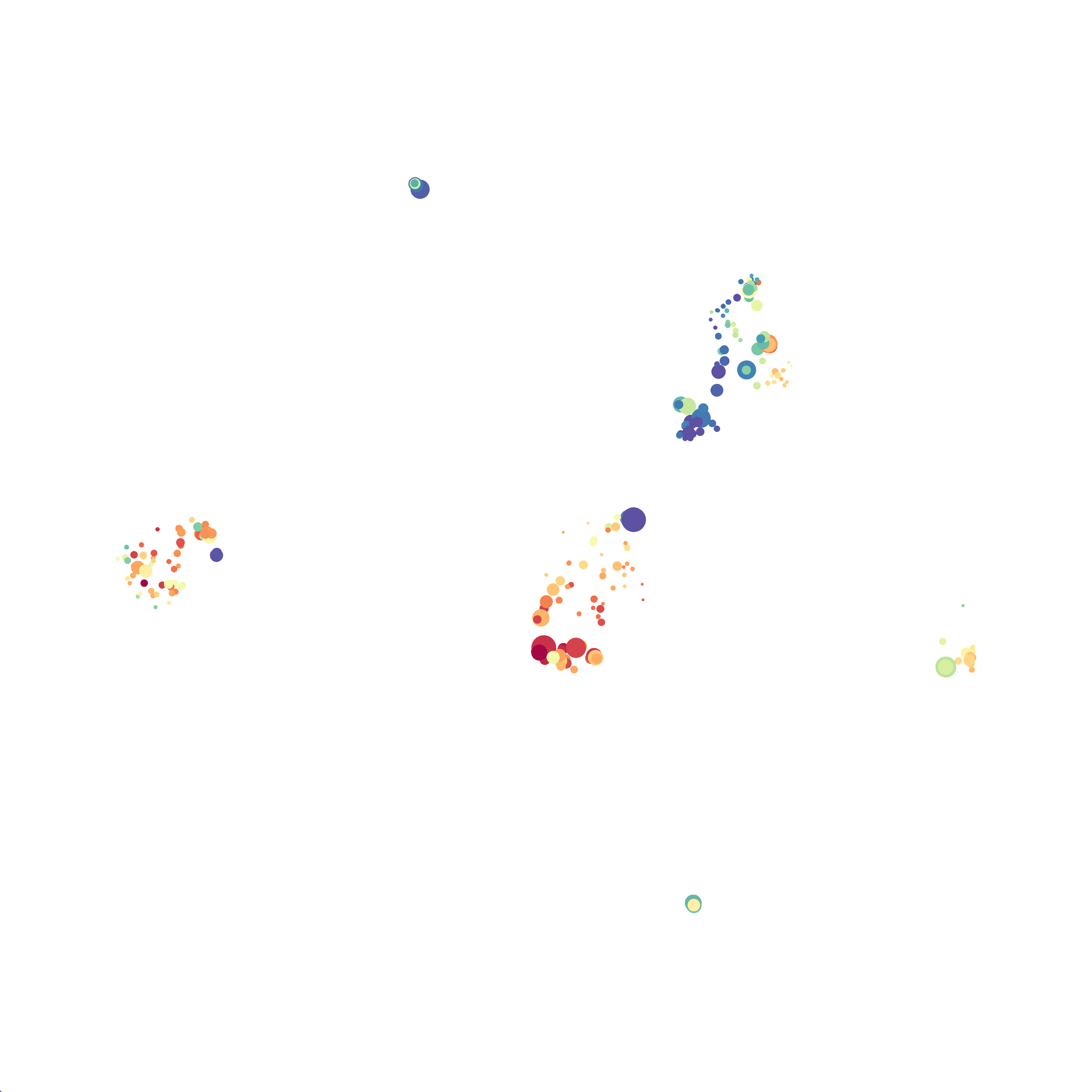
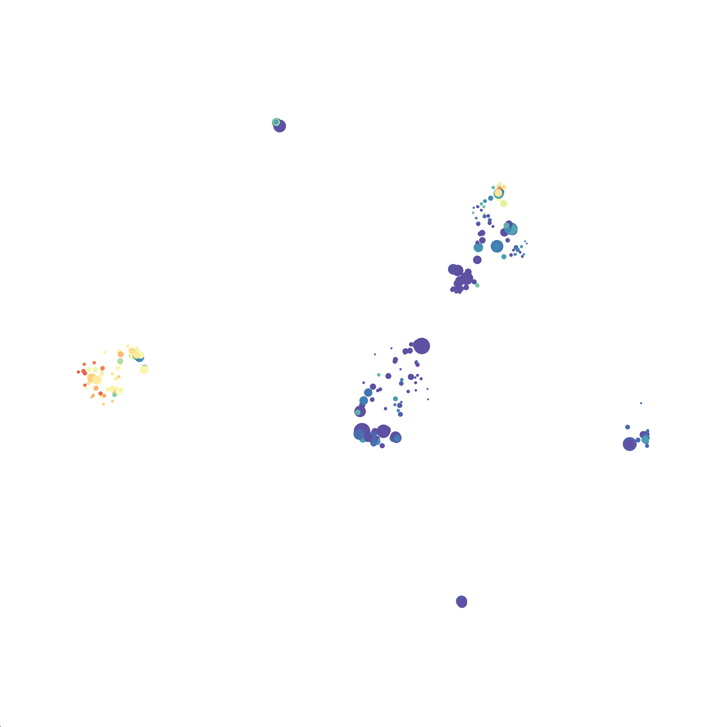
The UMAP plugin has very similar issues to the tSNE plugin that I discussed recently in the following post. The main issue is that there is no expedient way to run an analysis on all of the samples at once. For instance, for viSNE (used in Cytobank) or tSNE in Cytosplore you upload each FCS file (e.g. 9 FCS files total), select all of the files for clustering (e.g. B6 #1-5; IL10KO #1-4), determine an input methods (equal events, all events, etc.) and then select markers for clustering. After clustering is finished you can visualize all of the input events on the tSNE plot, or select each individual sample. This is essential for comparison between samples as the geography of each tSNE plot will be identical (e.g. the CD4 T cells are are the 2 o clock position), but the abundance of events in each island, and the expression of various markers, will differ between samples. Like so:

Kimball, AK … ET Clambey, J Immunol 2018
I determined a way to work around this issue in the previous post, but I will be contacting FlowJo to suggest they resolve this issue.
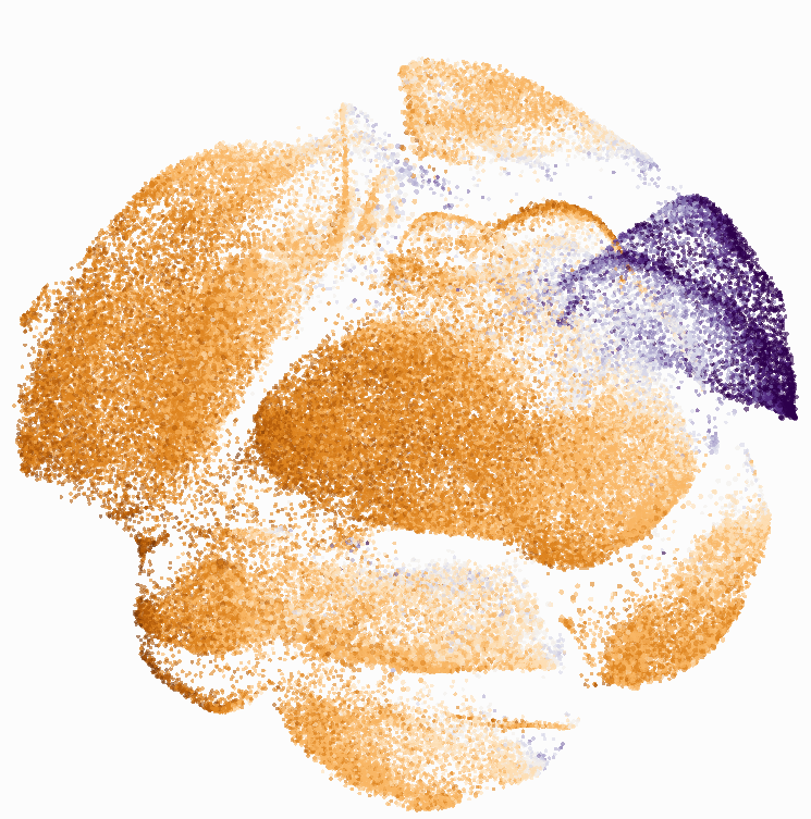
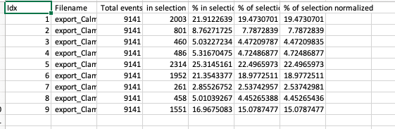
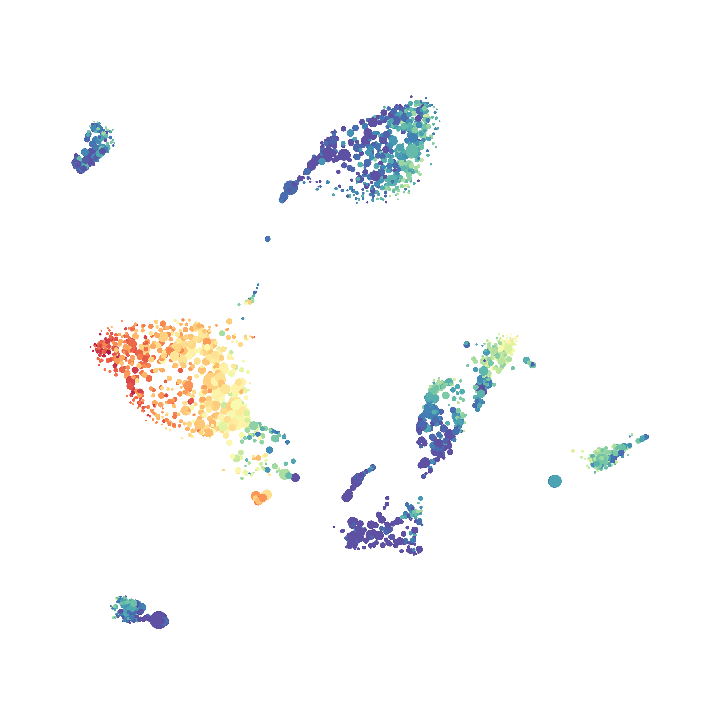
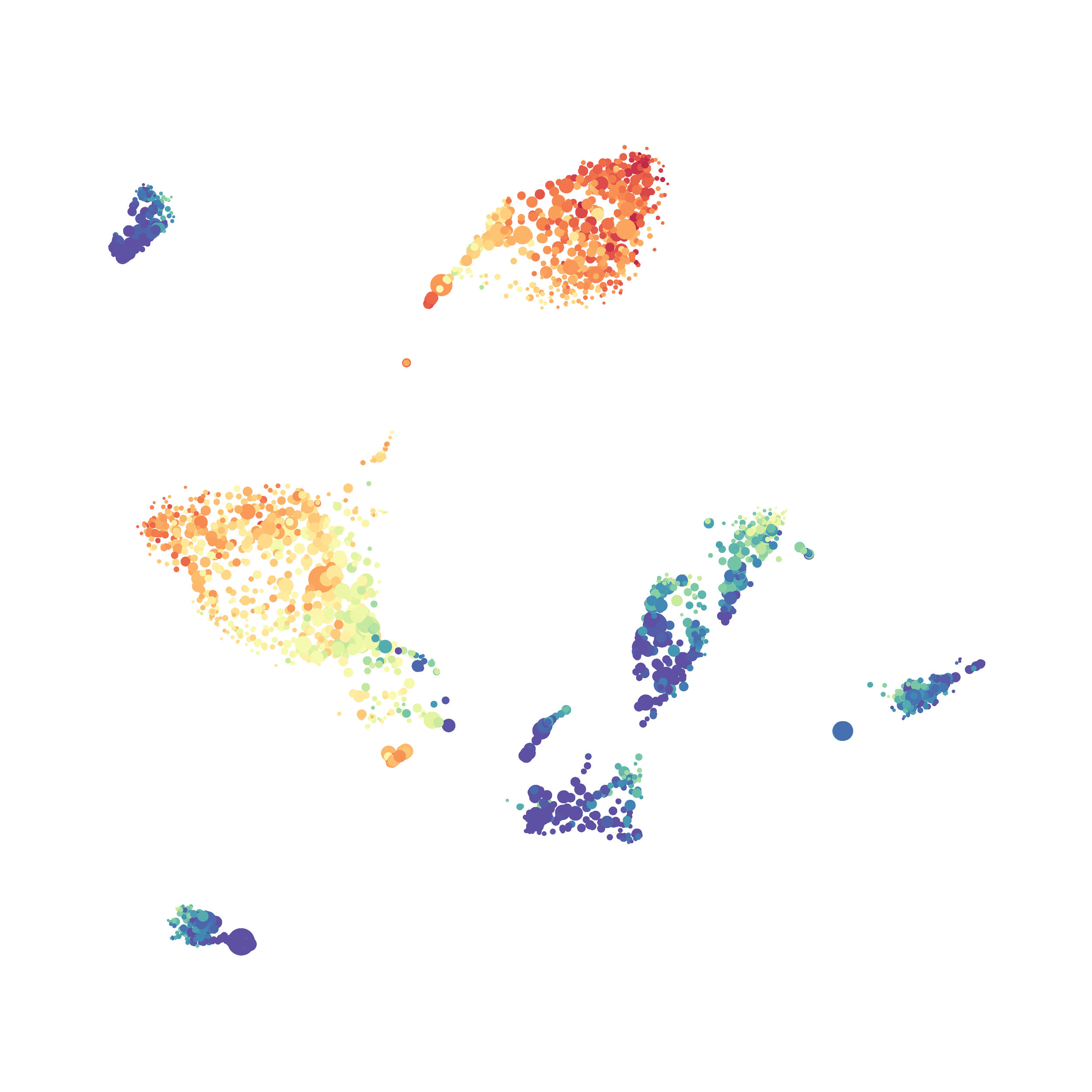
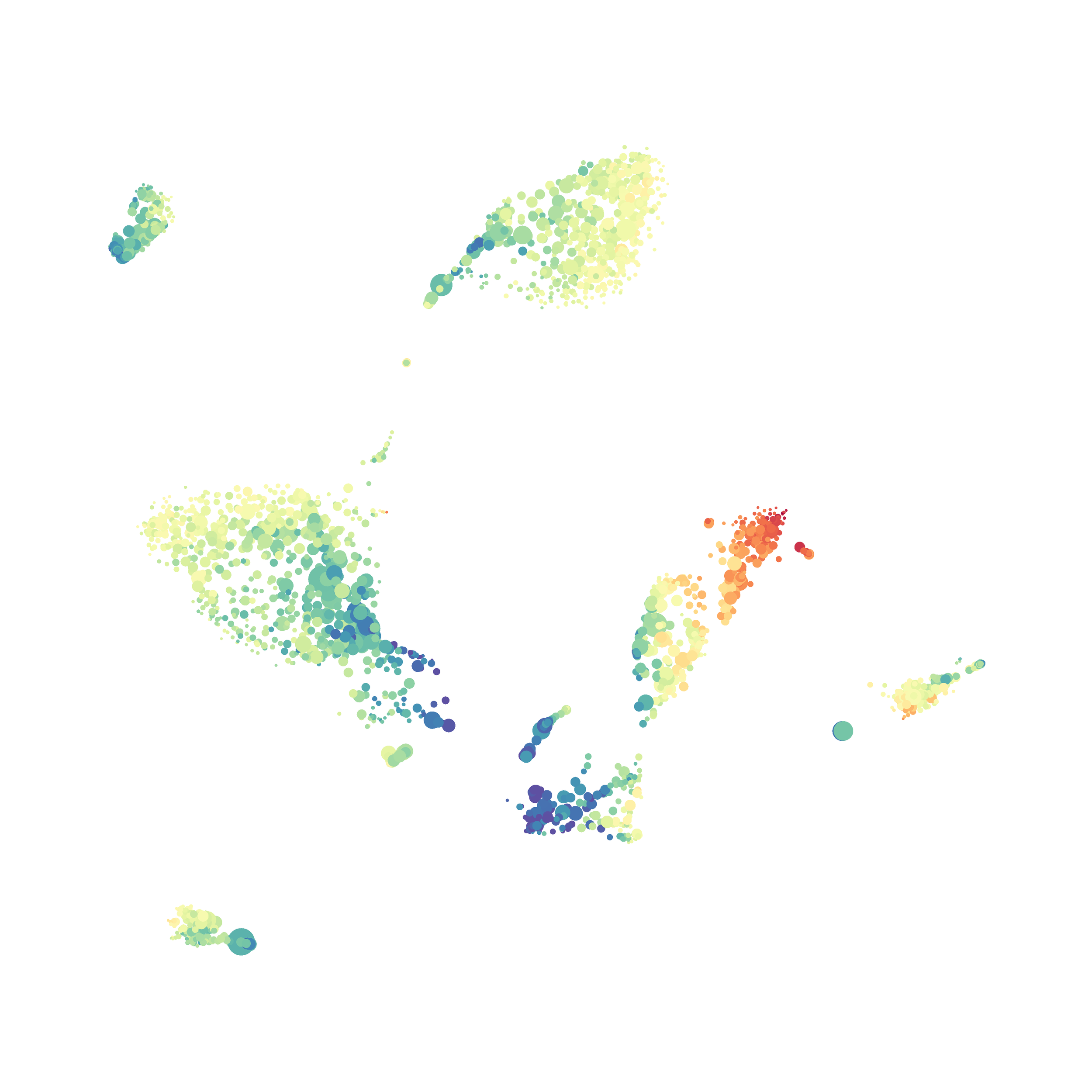
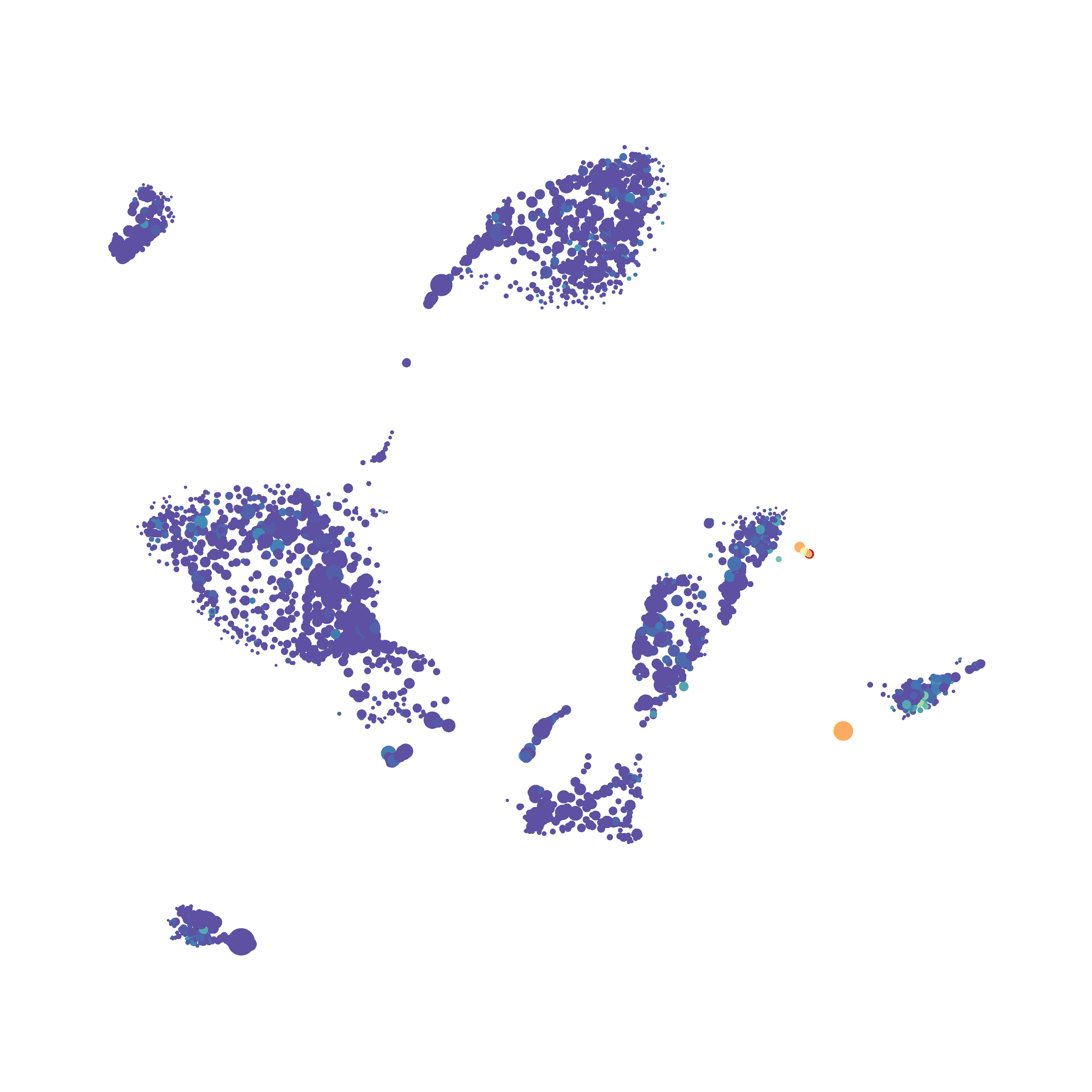
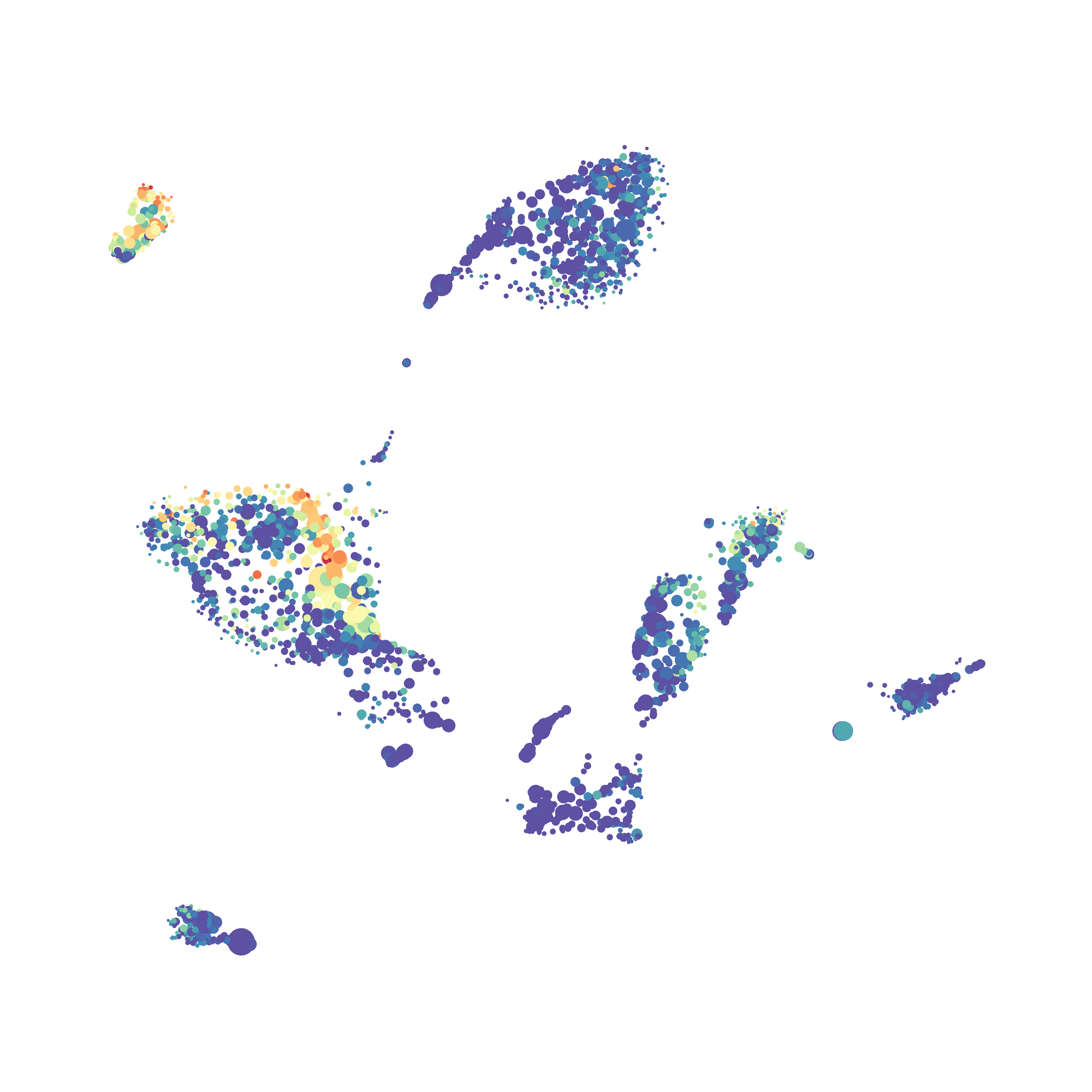
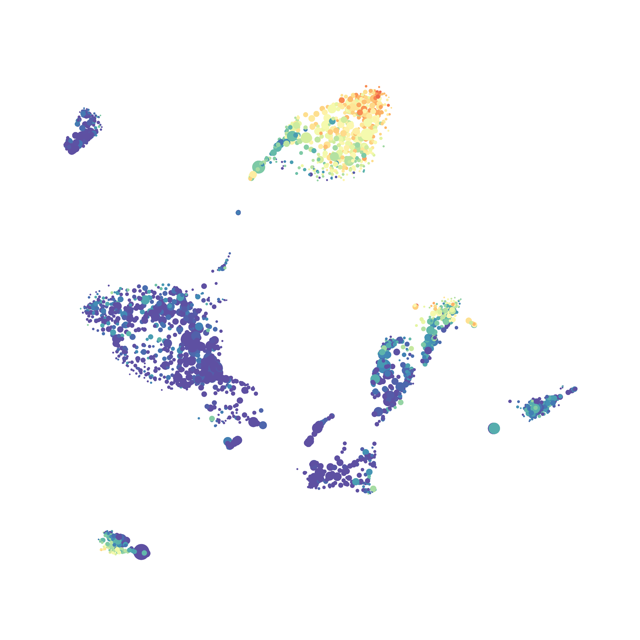
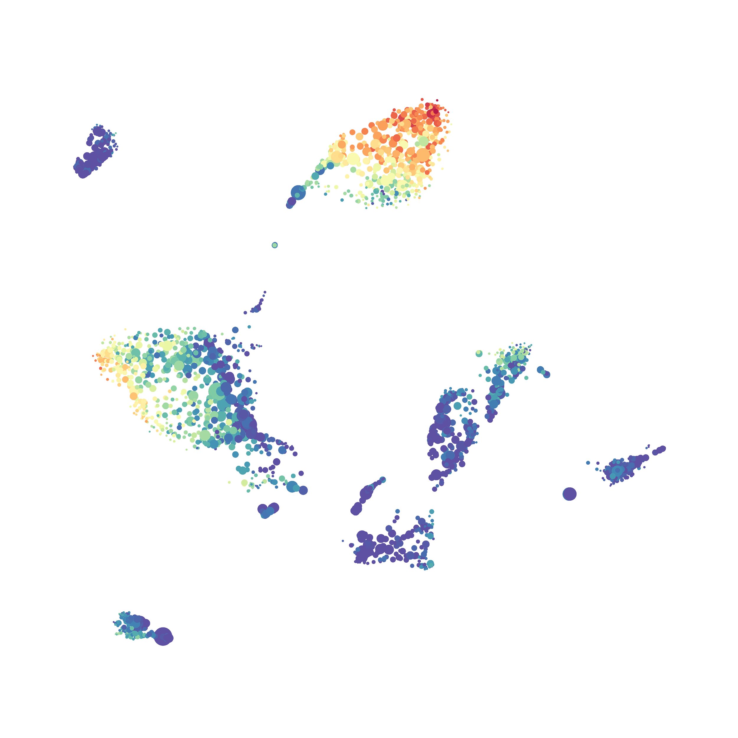
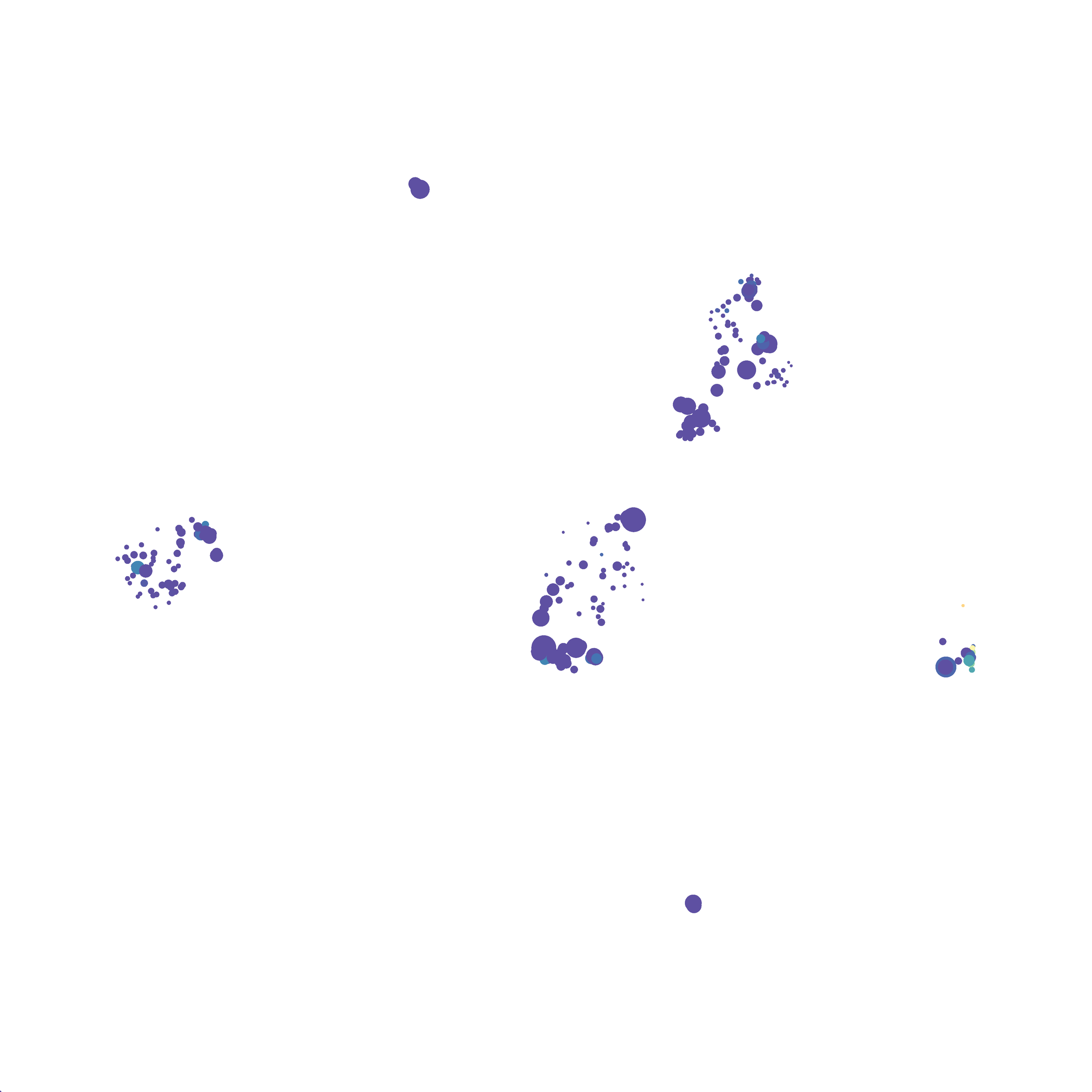
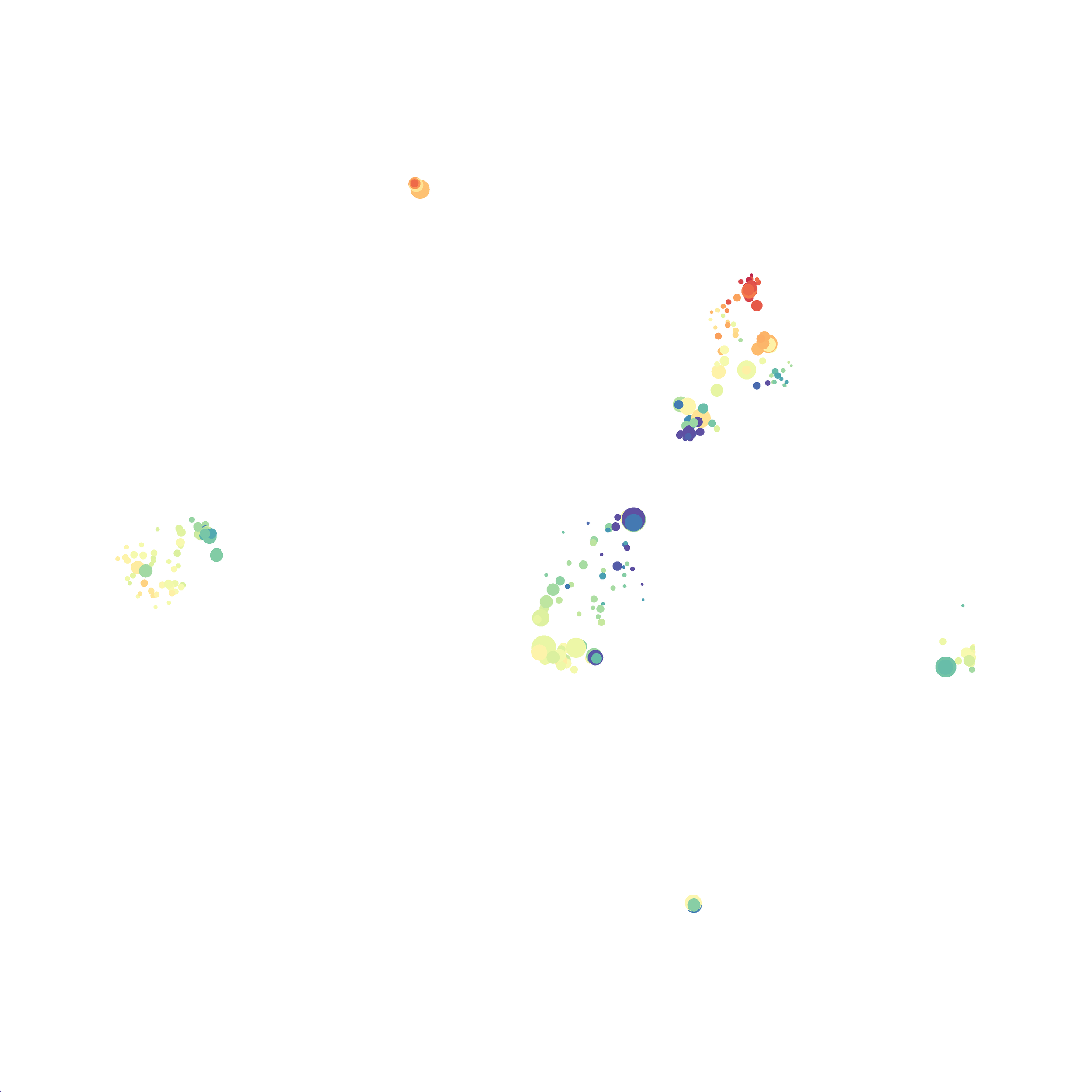
In order to assess UMAP’s ability to process a lot of events I analyzed all of the events from each replicate used in Kimball et al 2018. The total event # ranged from 9,141 to 266,644 events.

Data from: Kimball, AK … ET Clambey, J Immunol 2018
I clocked the analysis times and 9,141 events x 35 parameters took less than 1 min to complete, and 266,644 events x 35 parameters took about 10 minutes. For comparison, a tSNE analysis of 10,000 events in FlowJo took about the same amount of time, however 266,644 events crashed the program, indicating that UMAP truly does preform better than tSNE with higher event numbers. However, when I concatenated all of the events together and attempted a UMAP run (~1.2 million events x 35 parameters) it analyzed the data for about 2 hours and ended up crashing. I hypothesize that this failure may be due to FlowJo and not UMAP, as FlowJo is prone to crashing in my personal experience, even when analyzing simple flow cytometry data. I anticipate that UMAP preforms much better in Python or R.
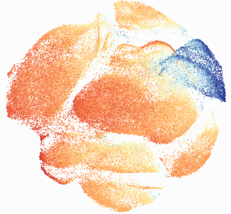
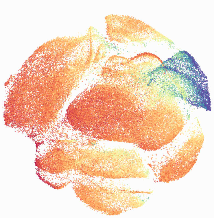
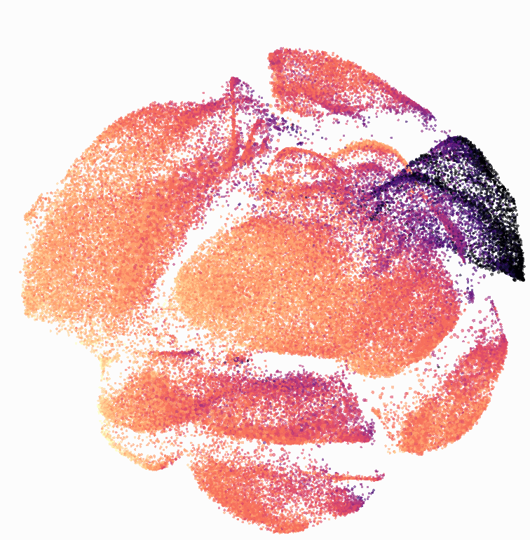
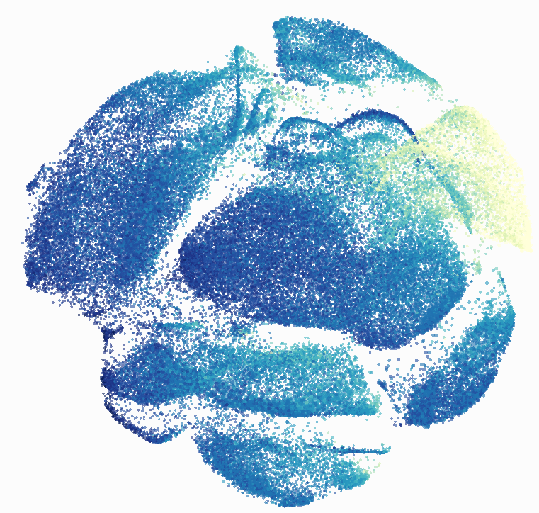
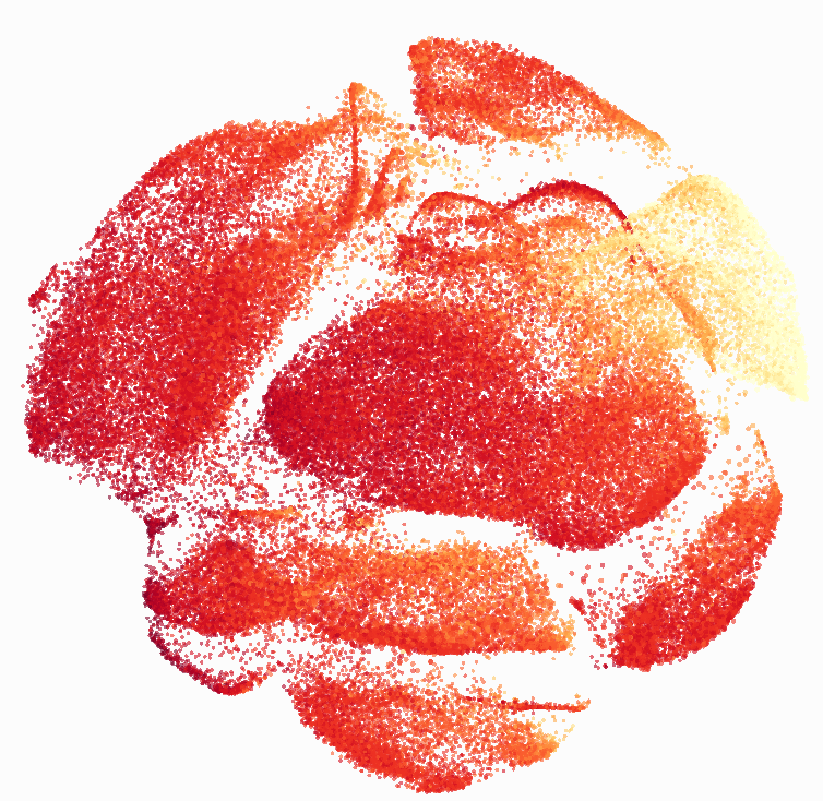
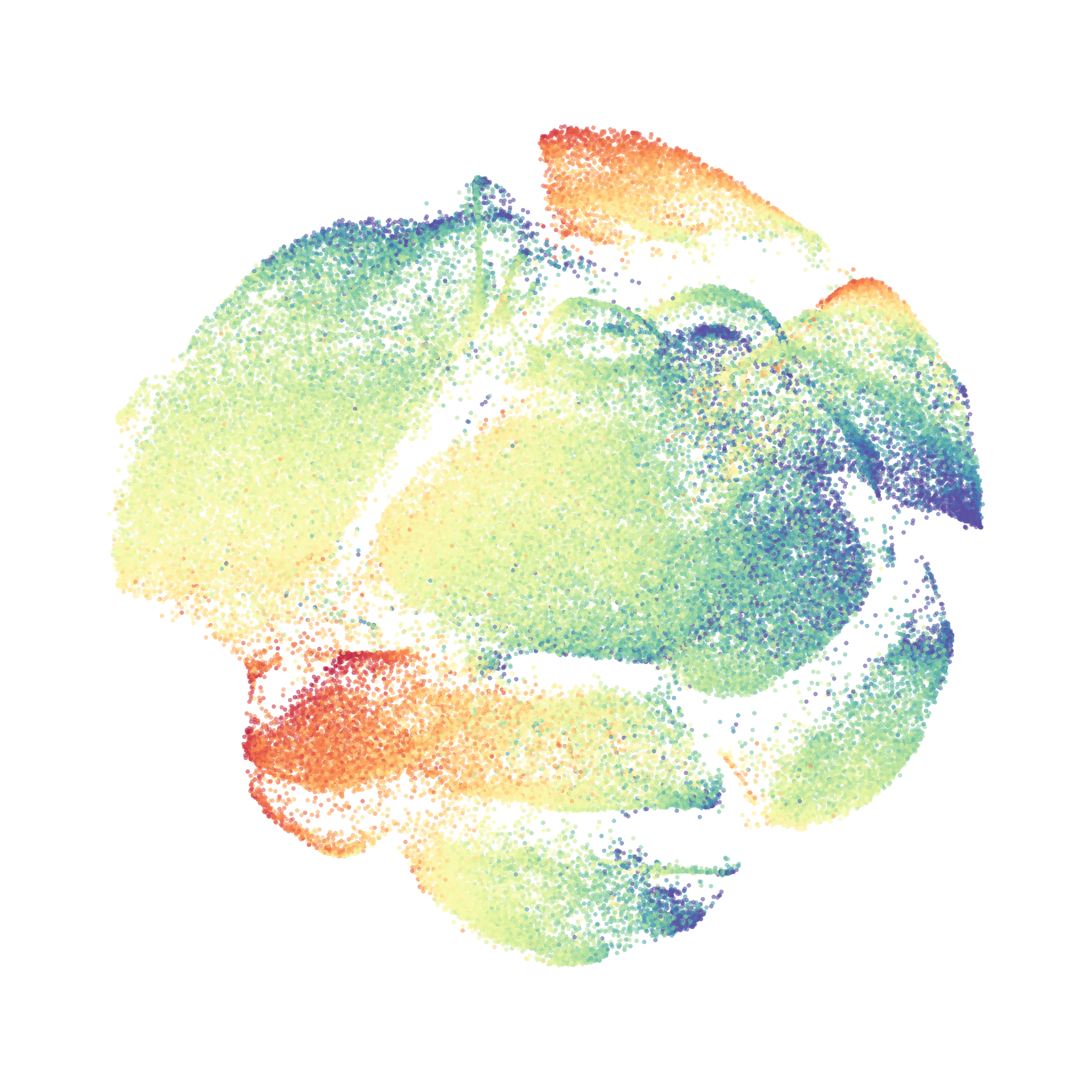
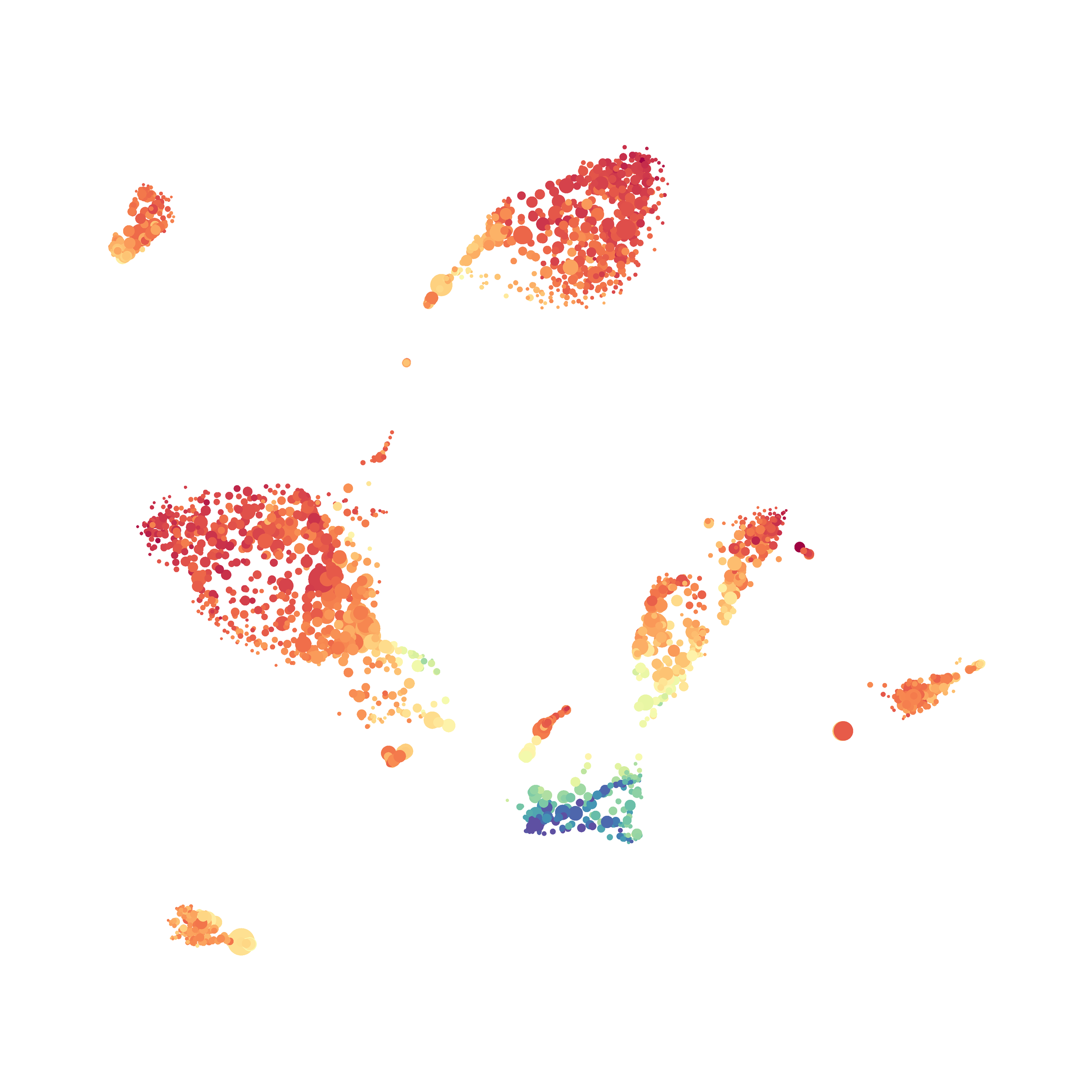
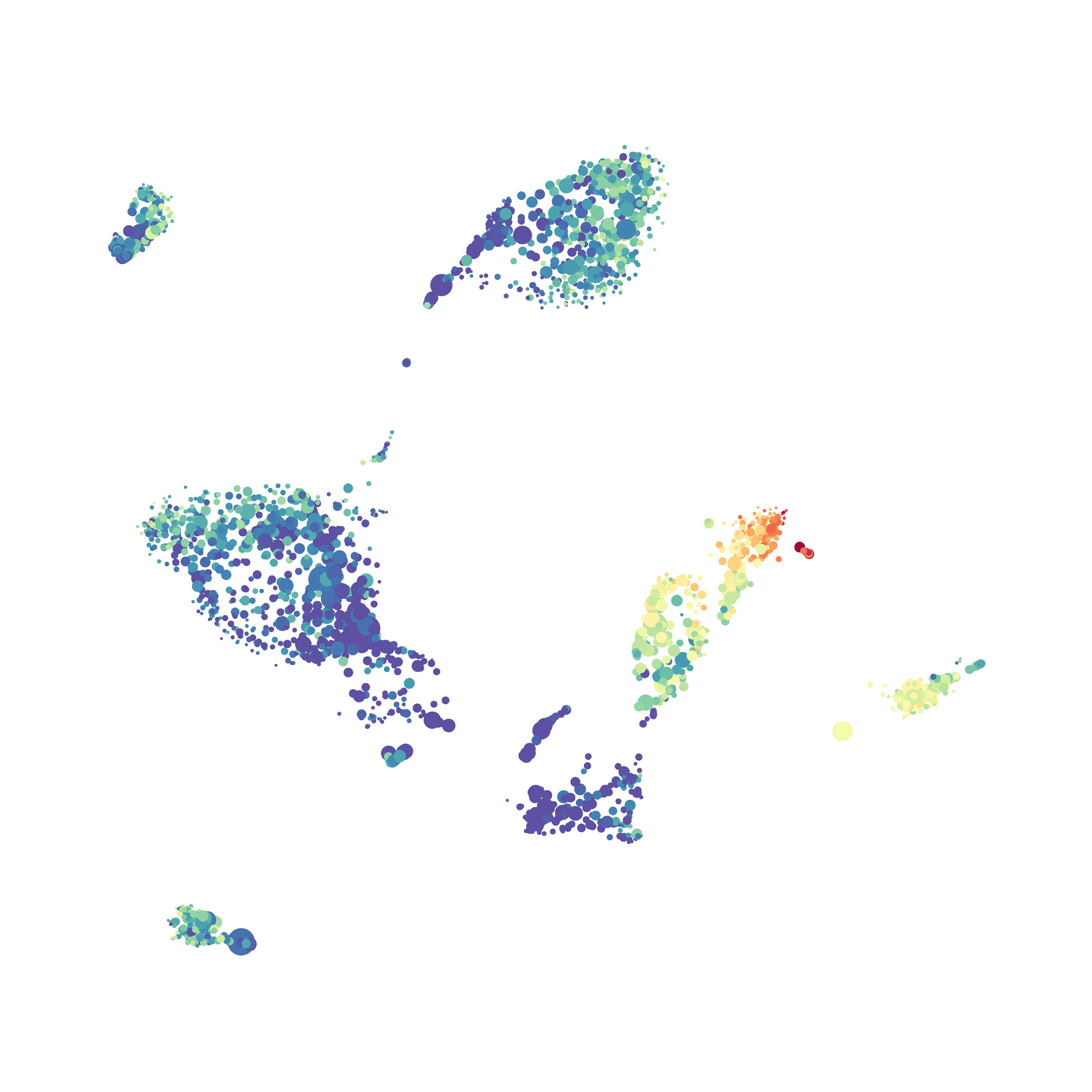
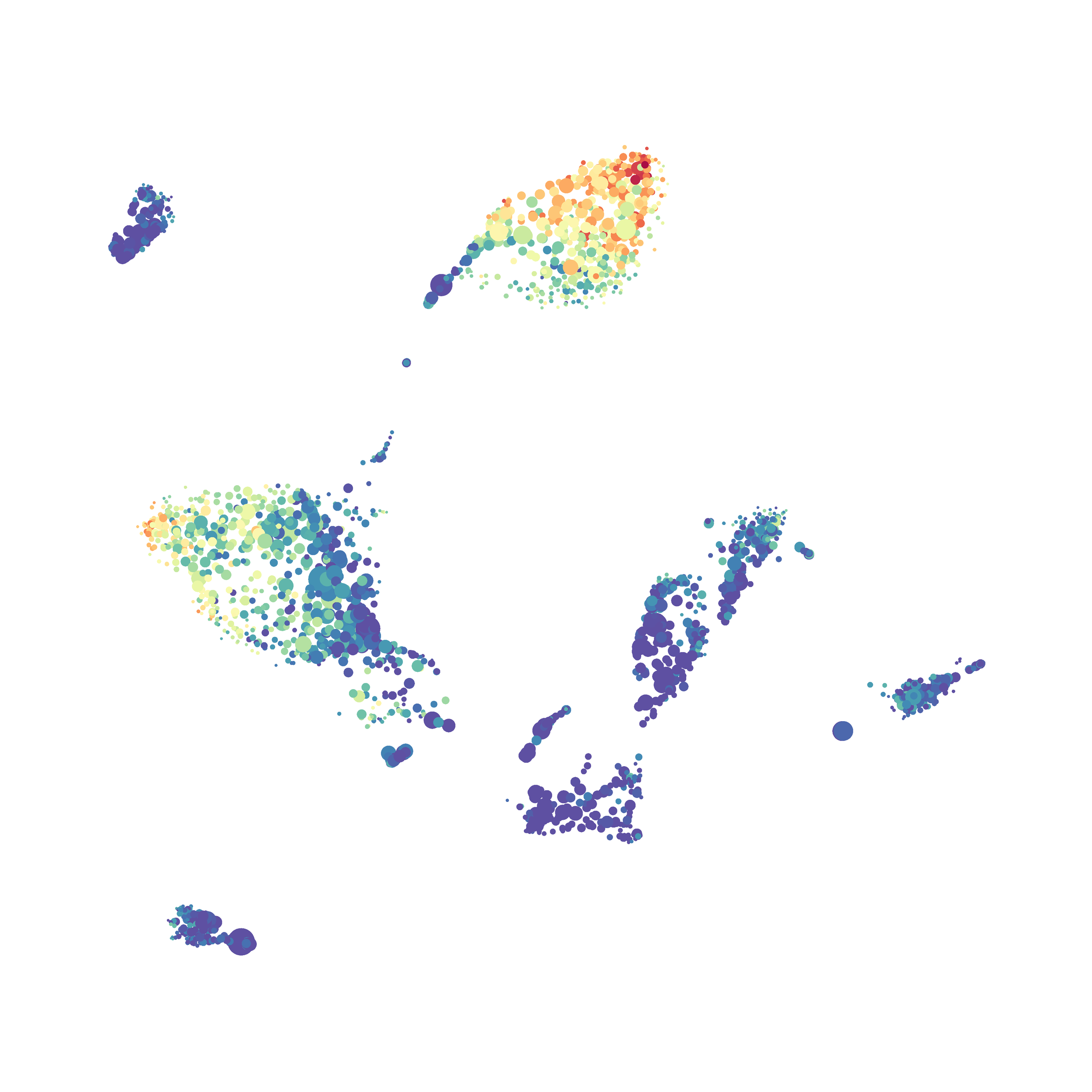
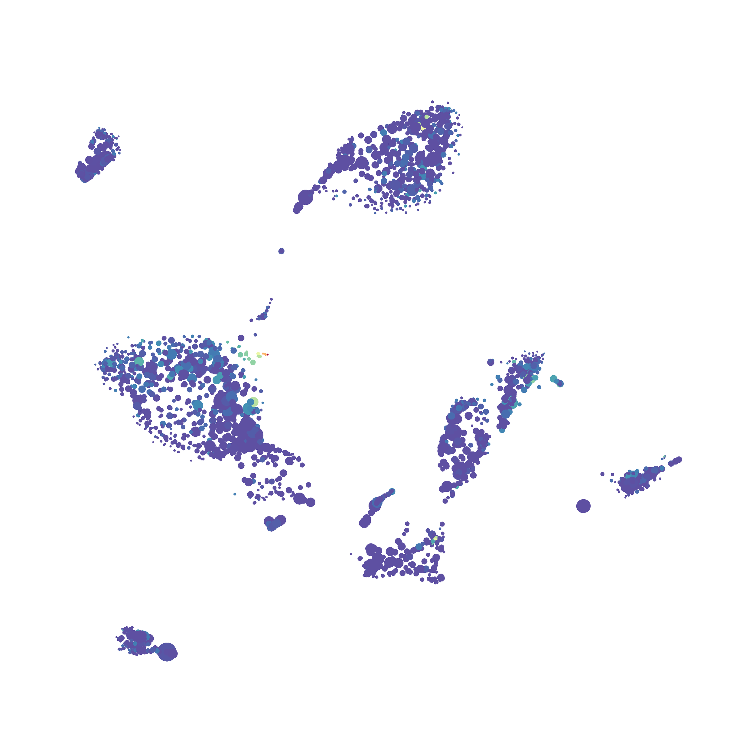
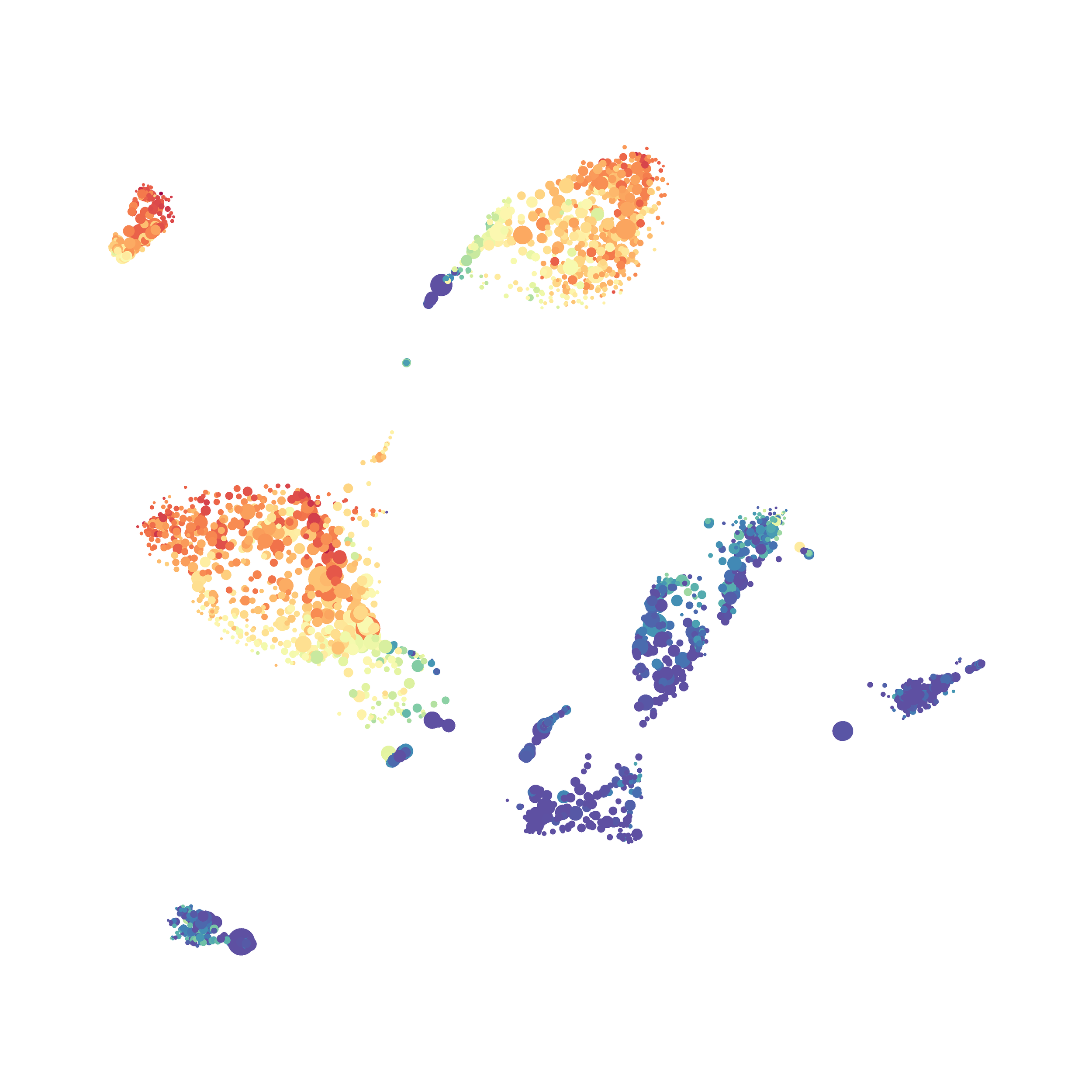
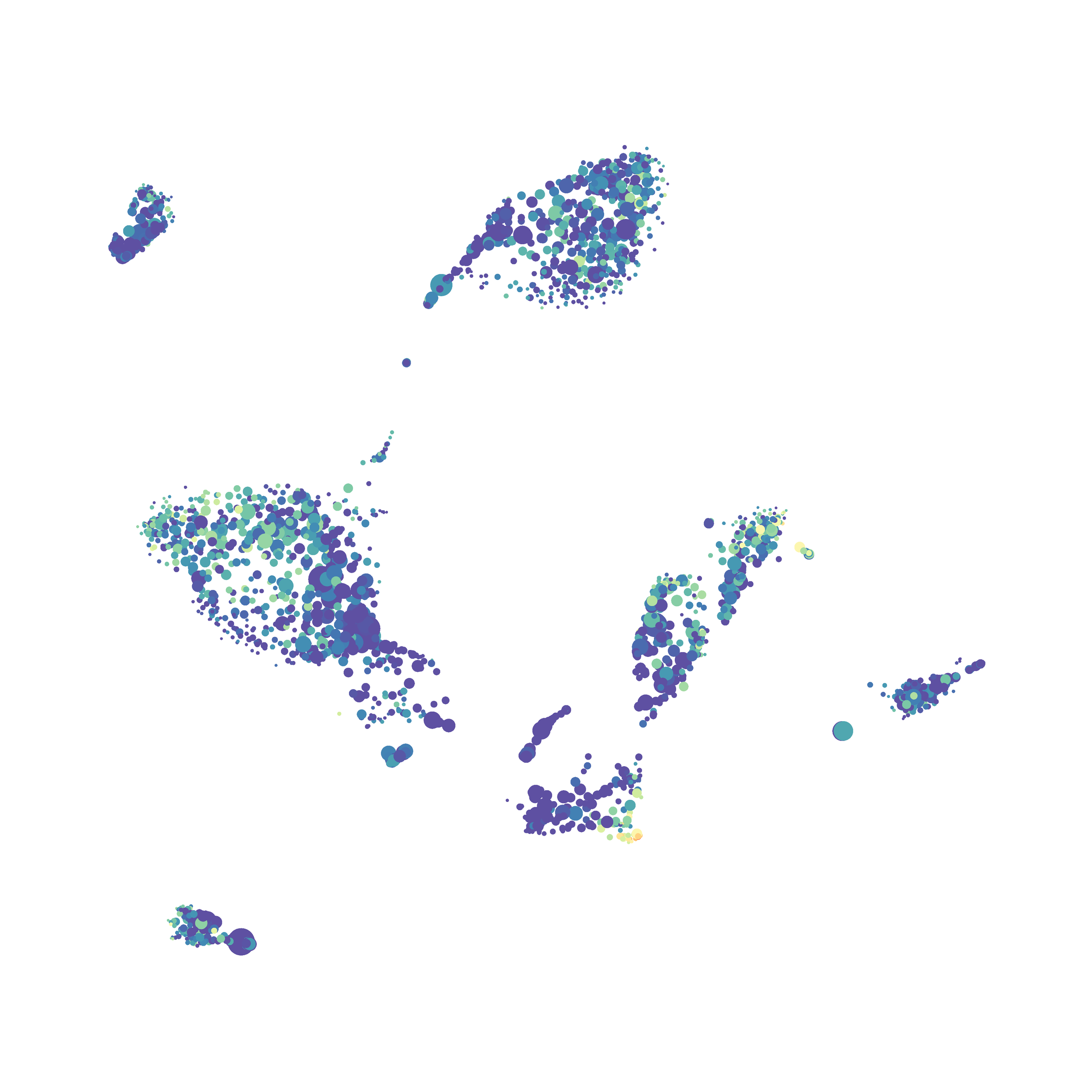
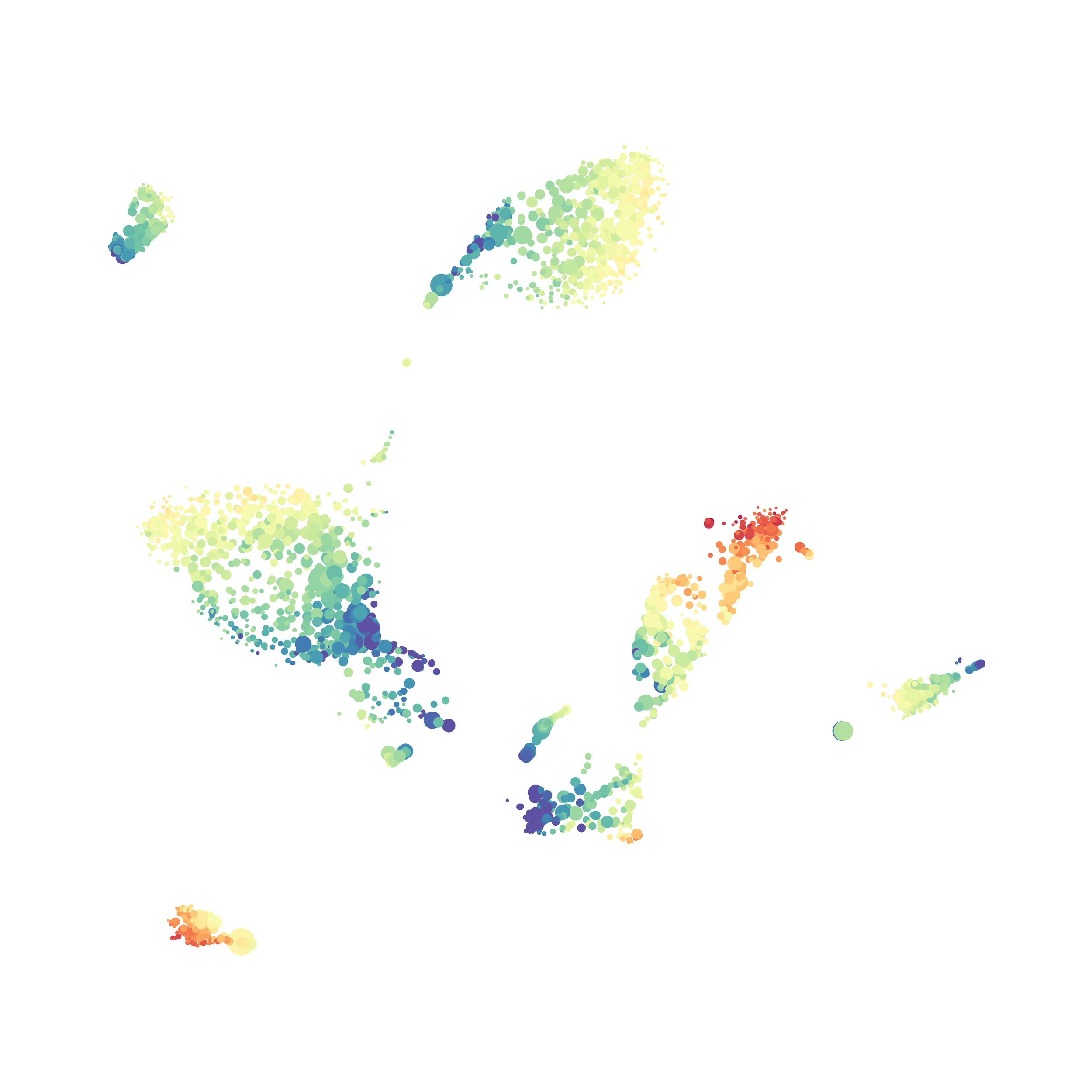
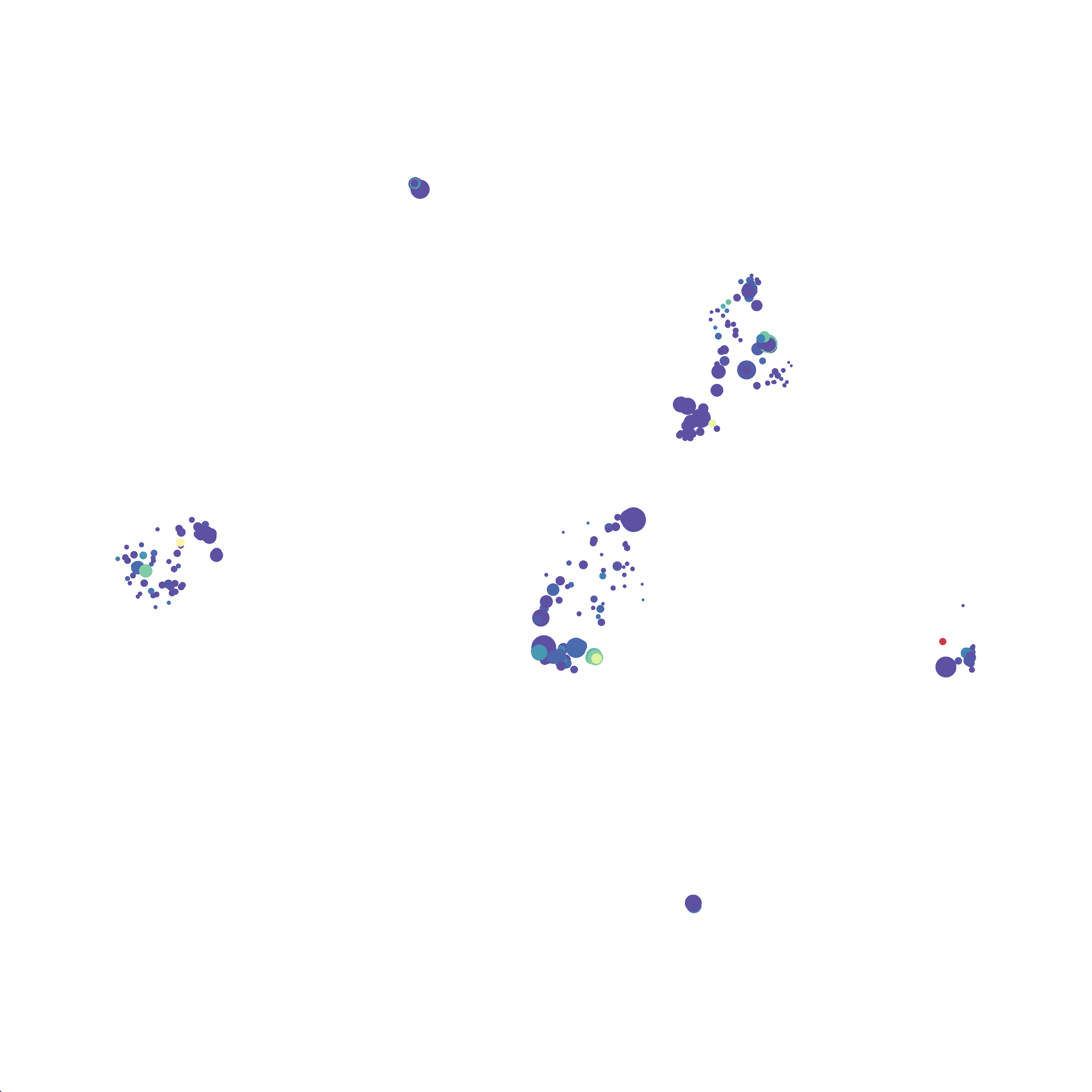
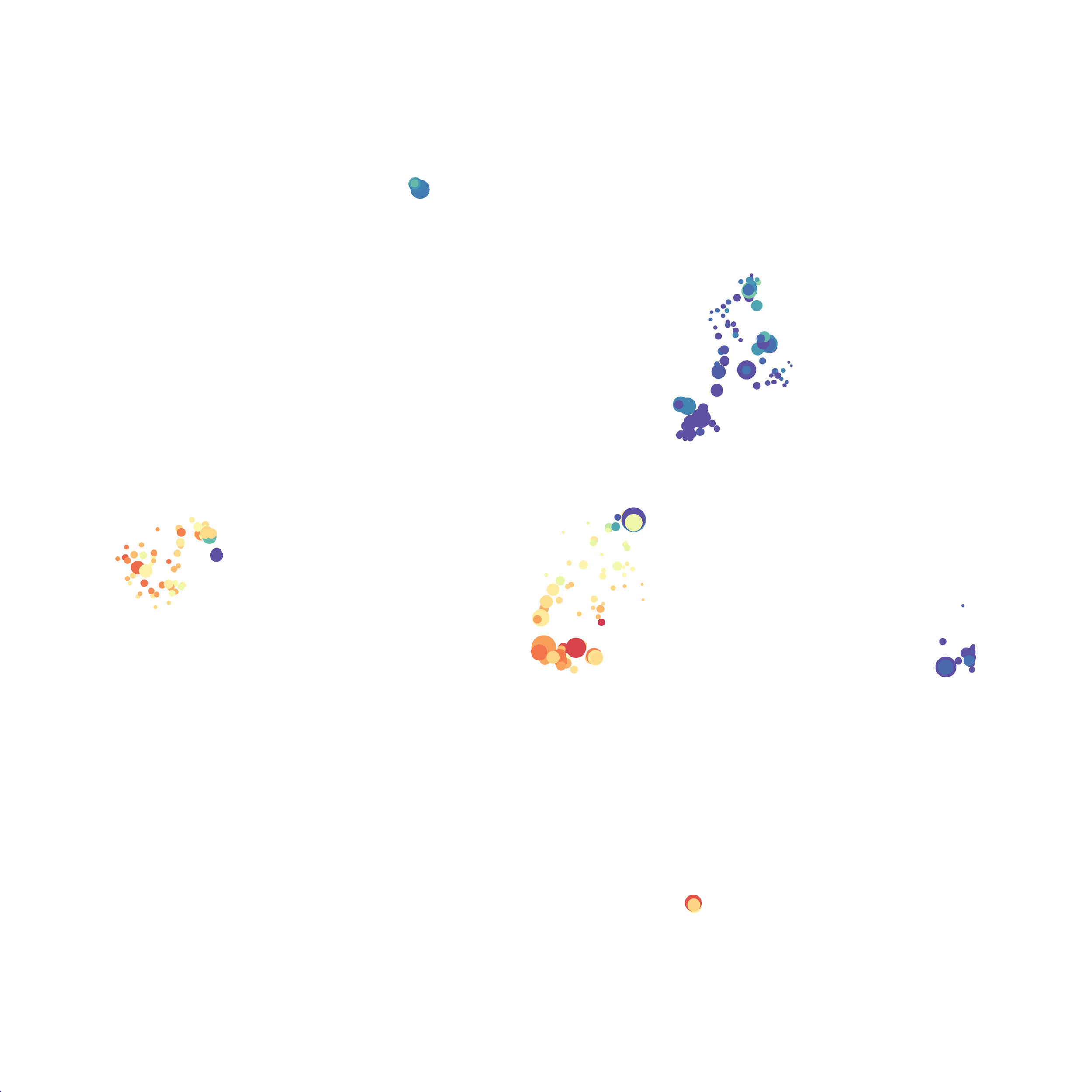
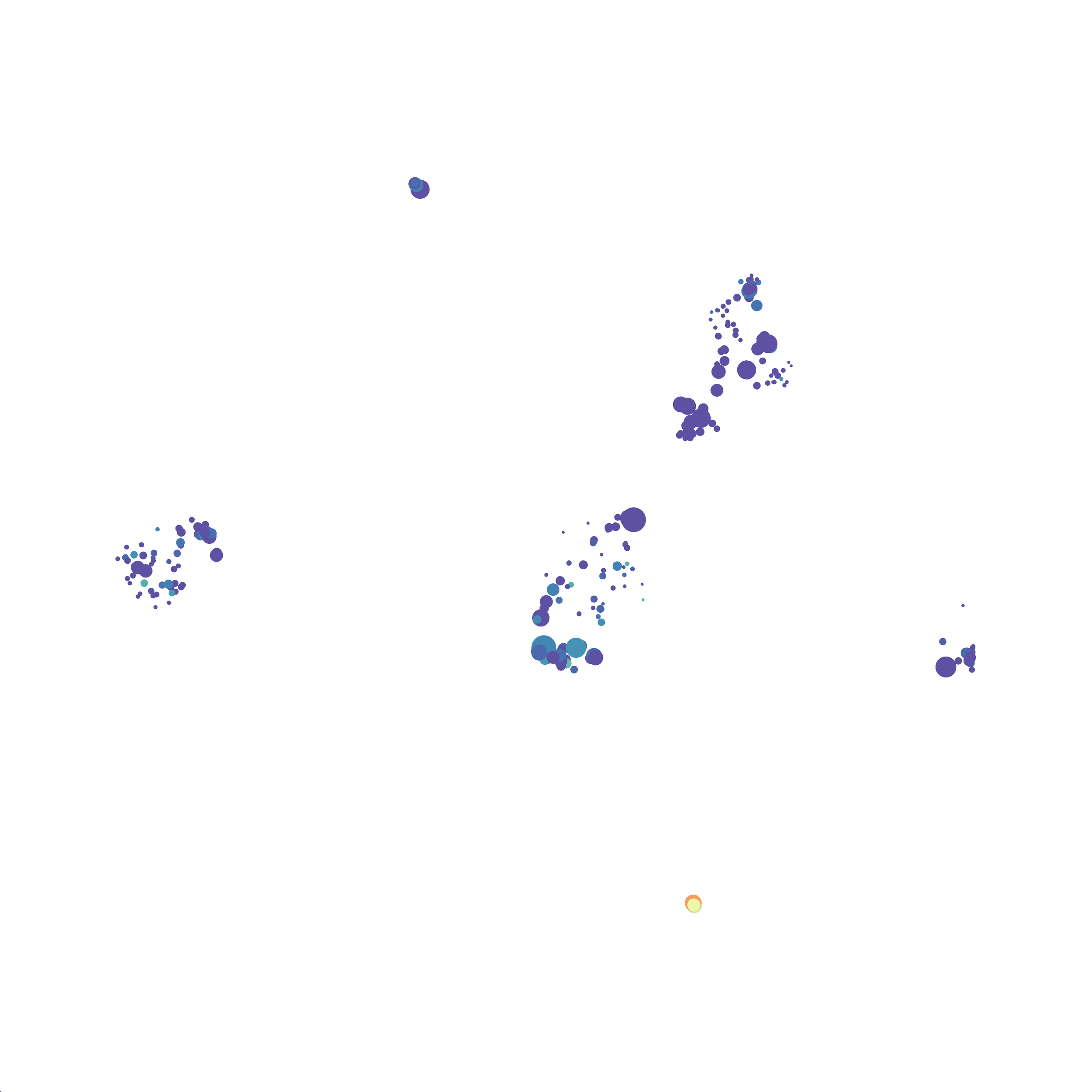
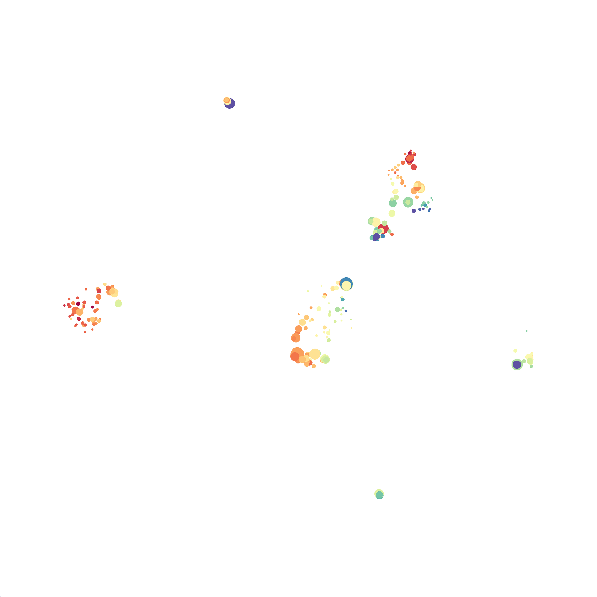
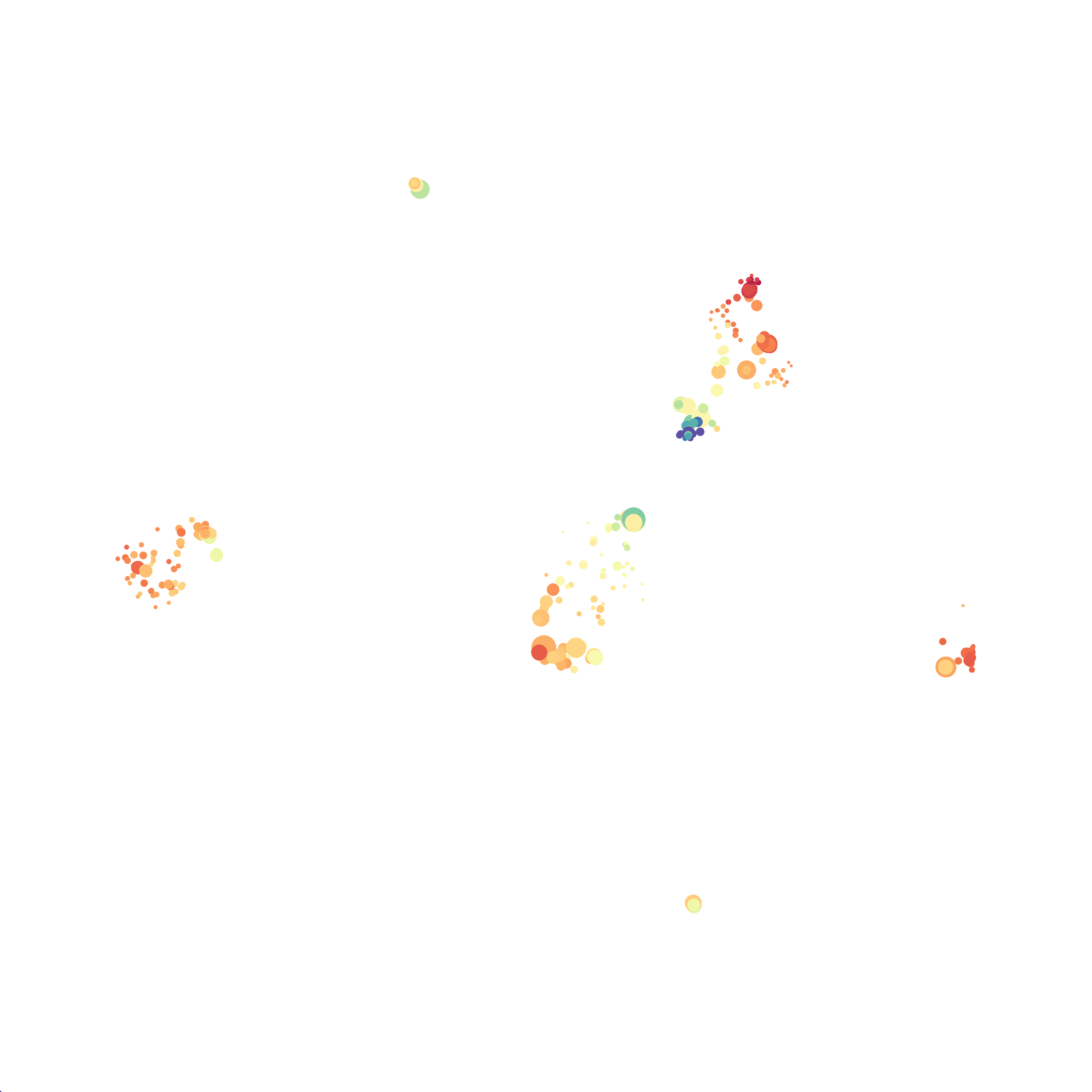
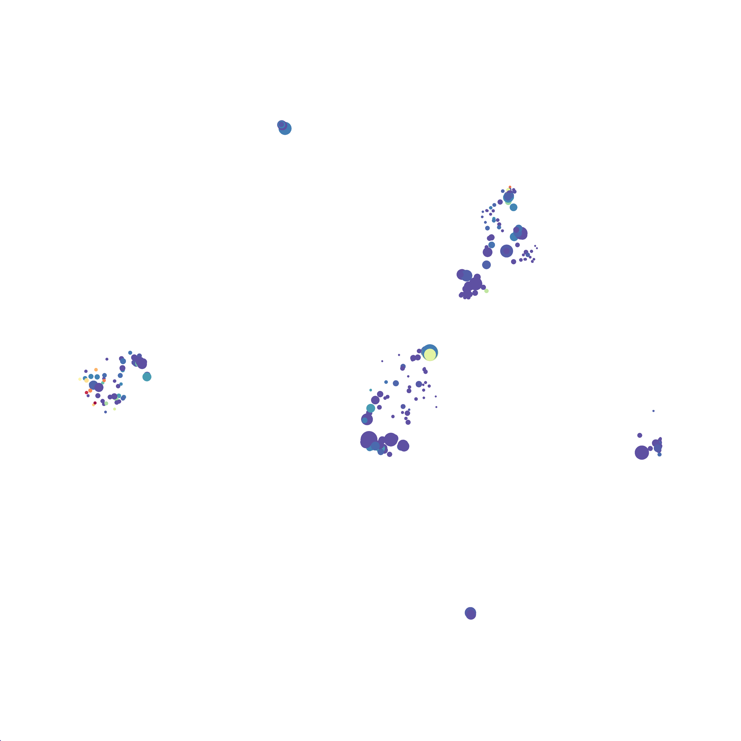
Here is a comparison of a B6 replicate analyzed by tSNE and UMAP in FlowJo. Although UMAP allows the rapid analysis of more events, the overall expression and organization appear highly similar between the two methods:

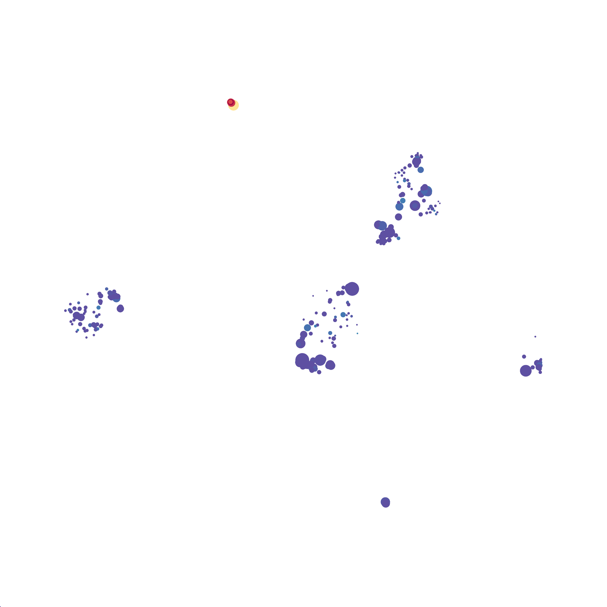
Data from: Kimball, AK … ET Clambey, J Immunol 2018
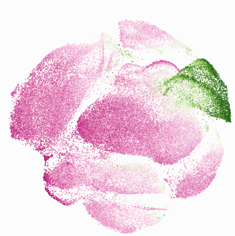
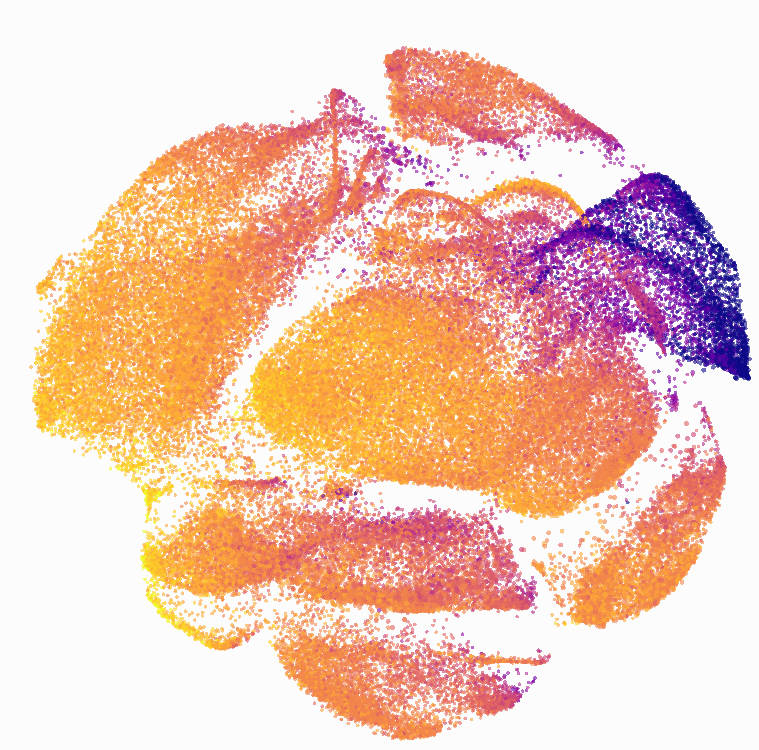
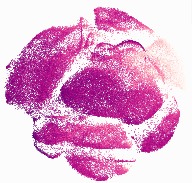
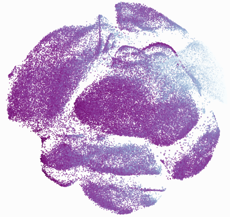
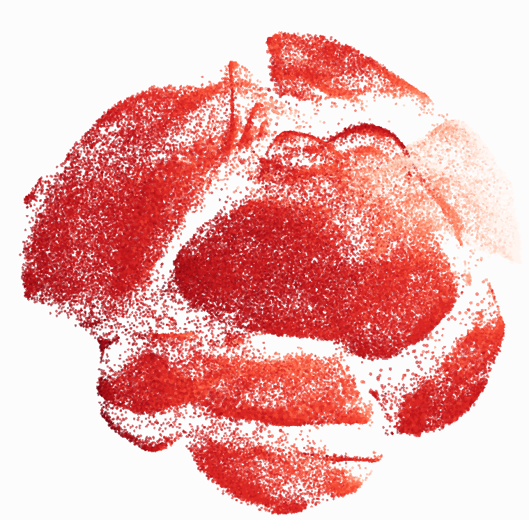
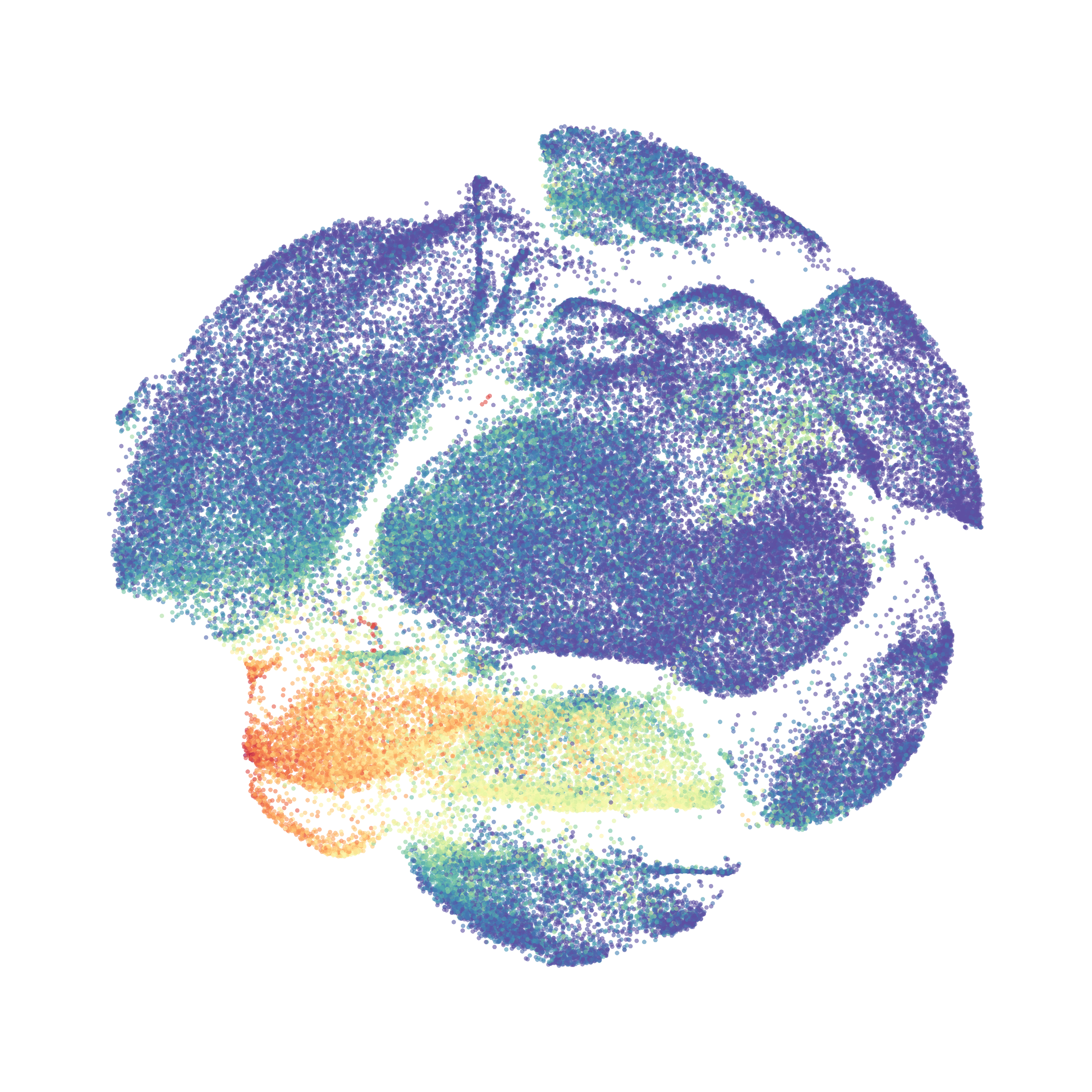
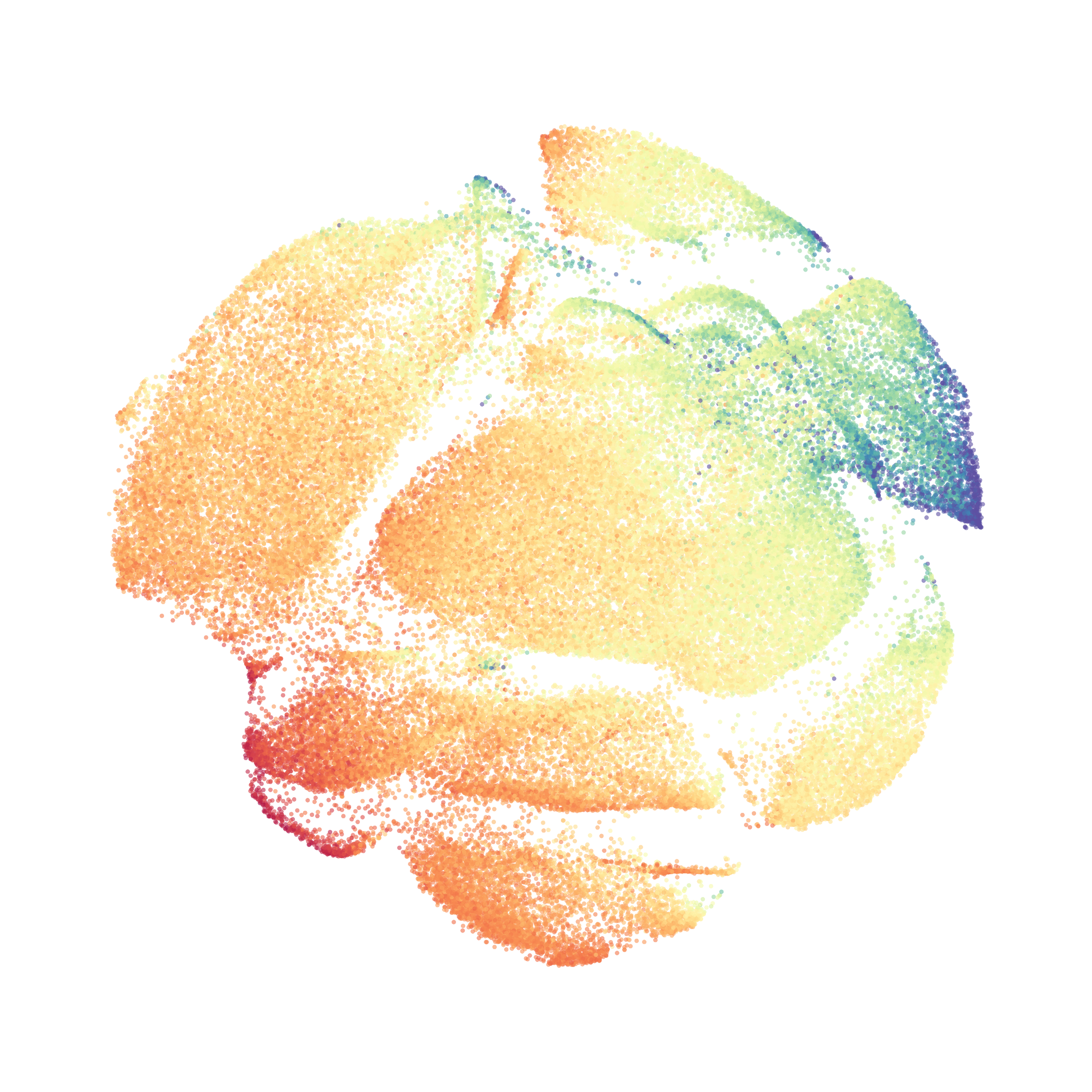
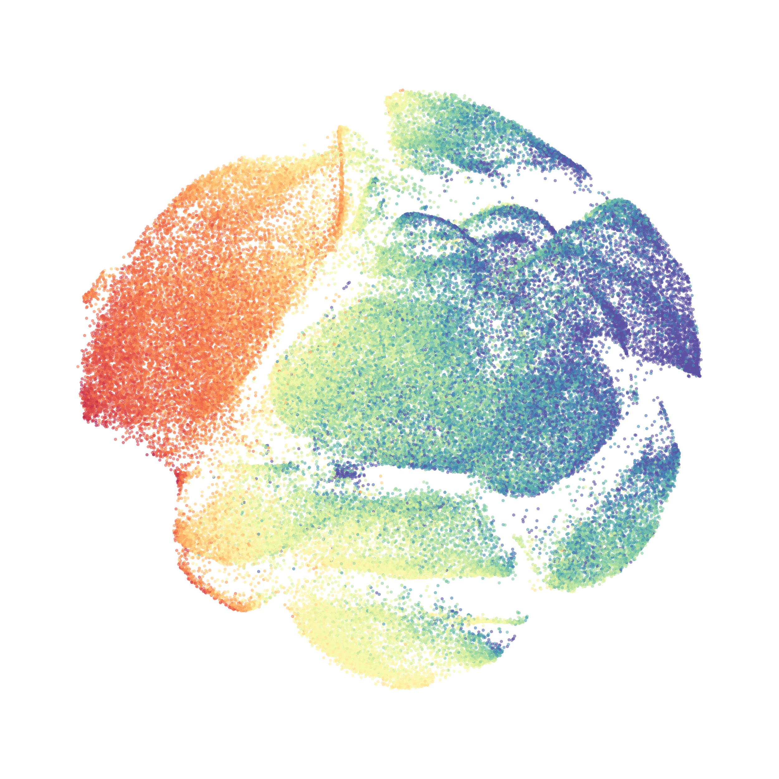
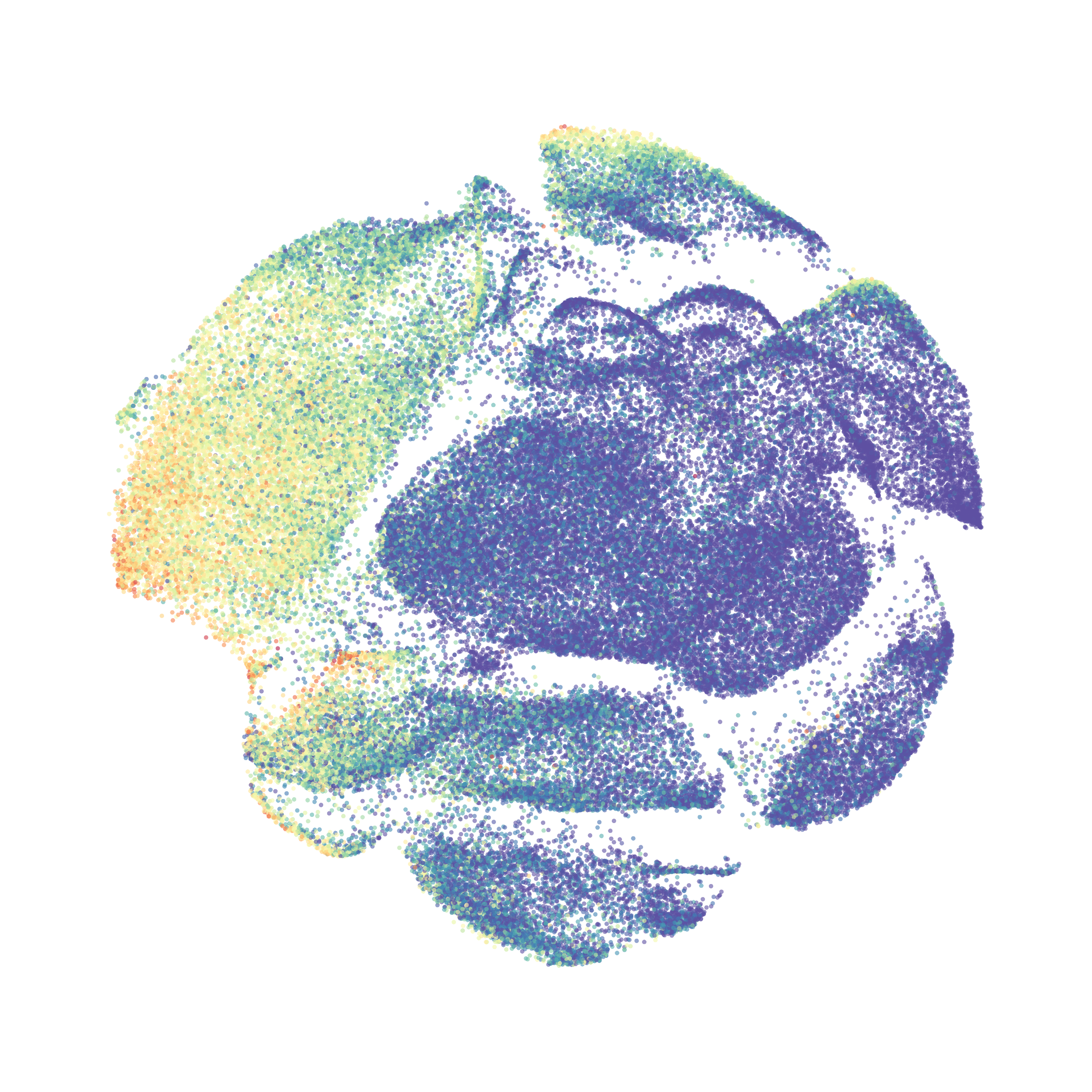
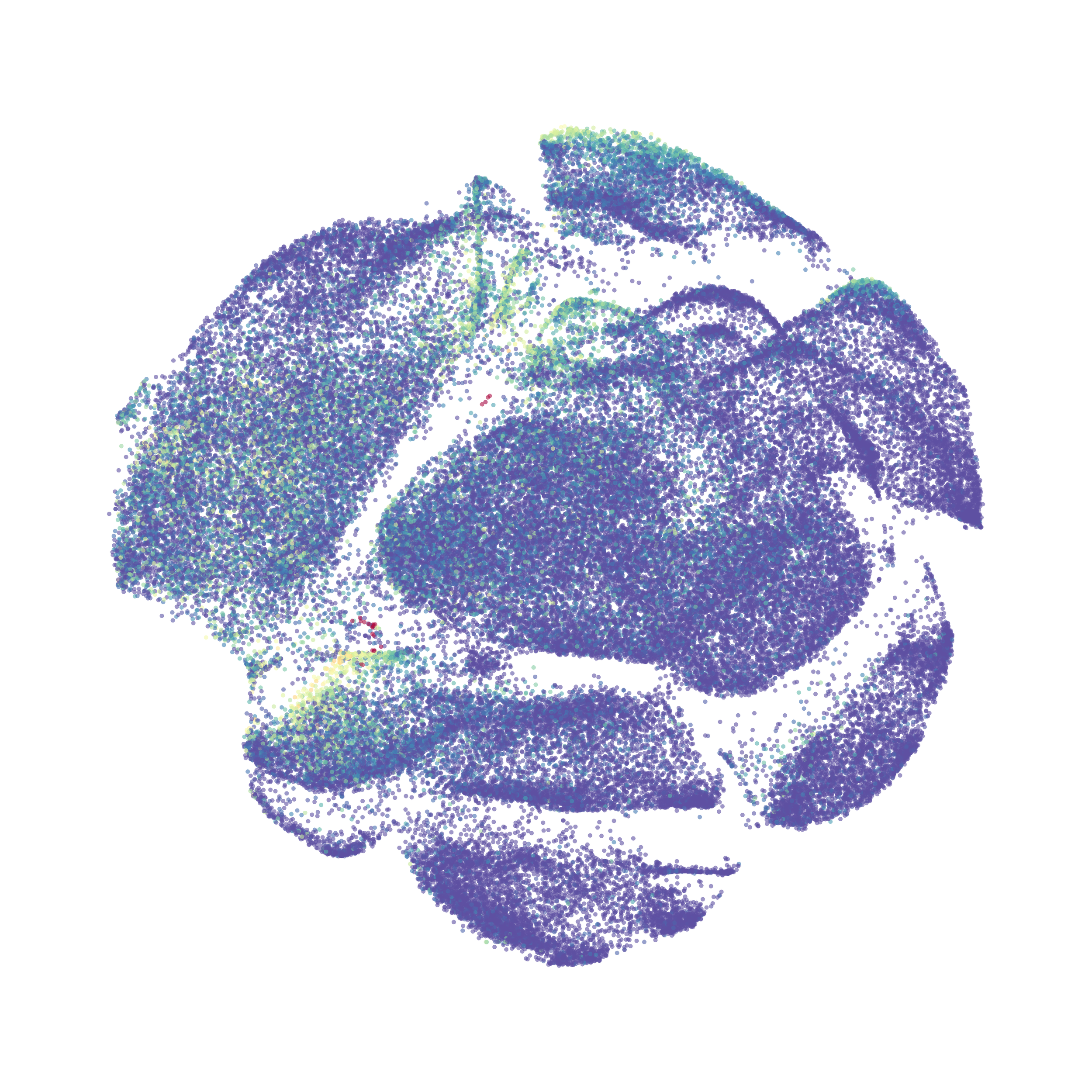
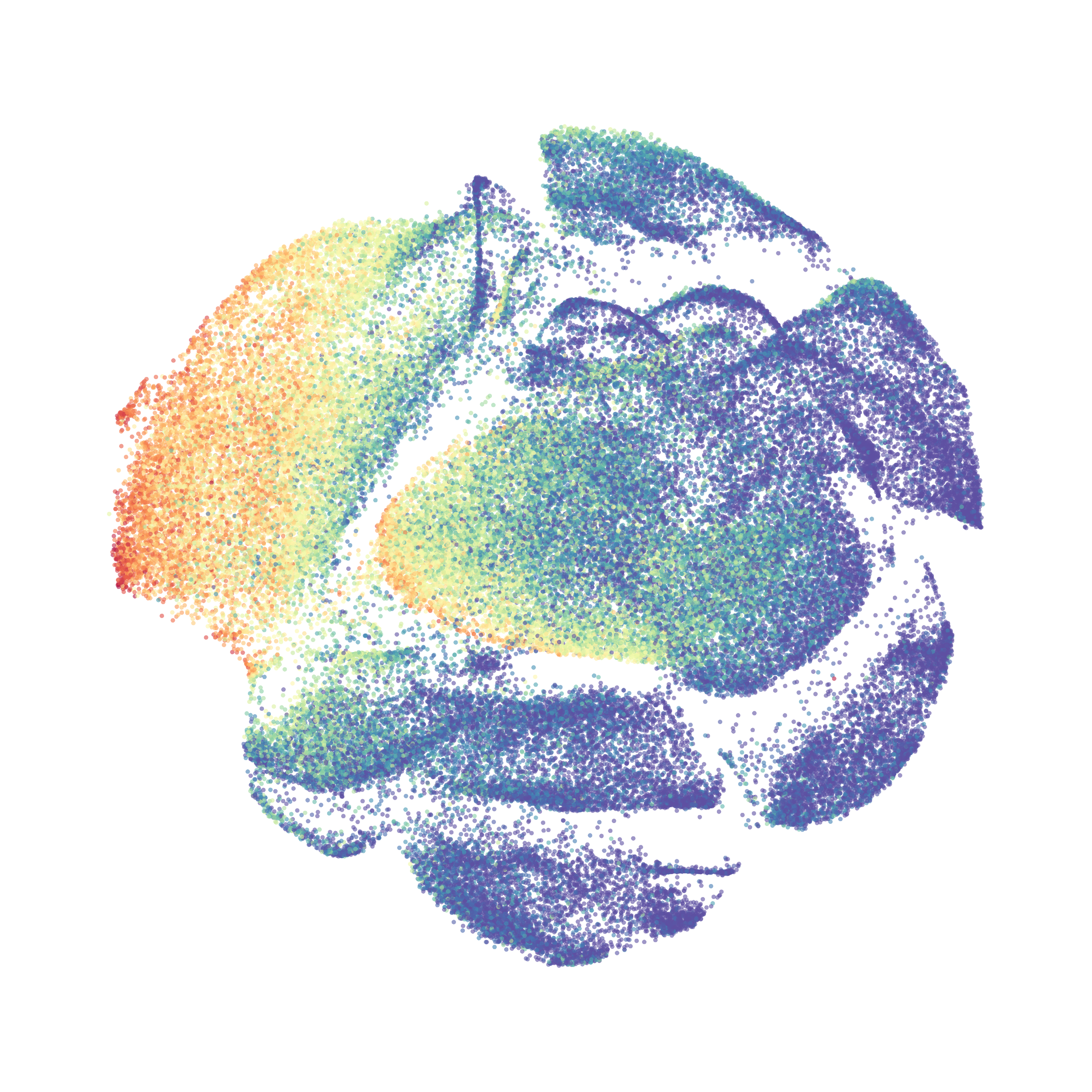
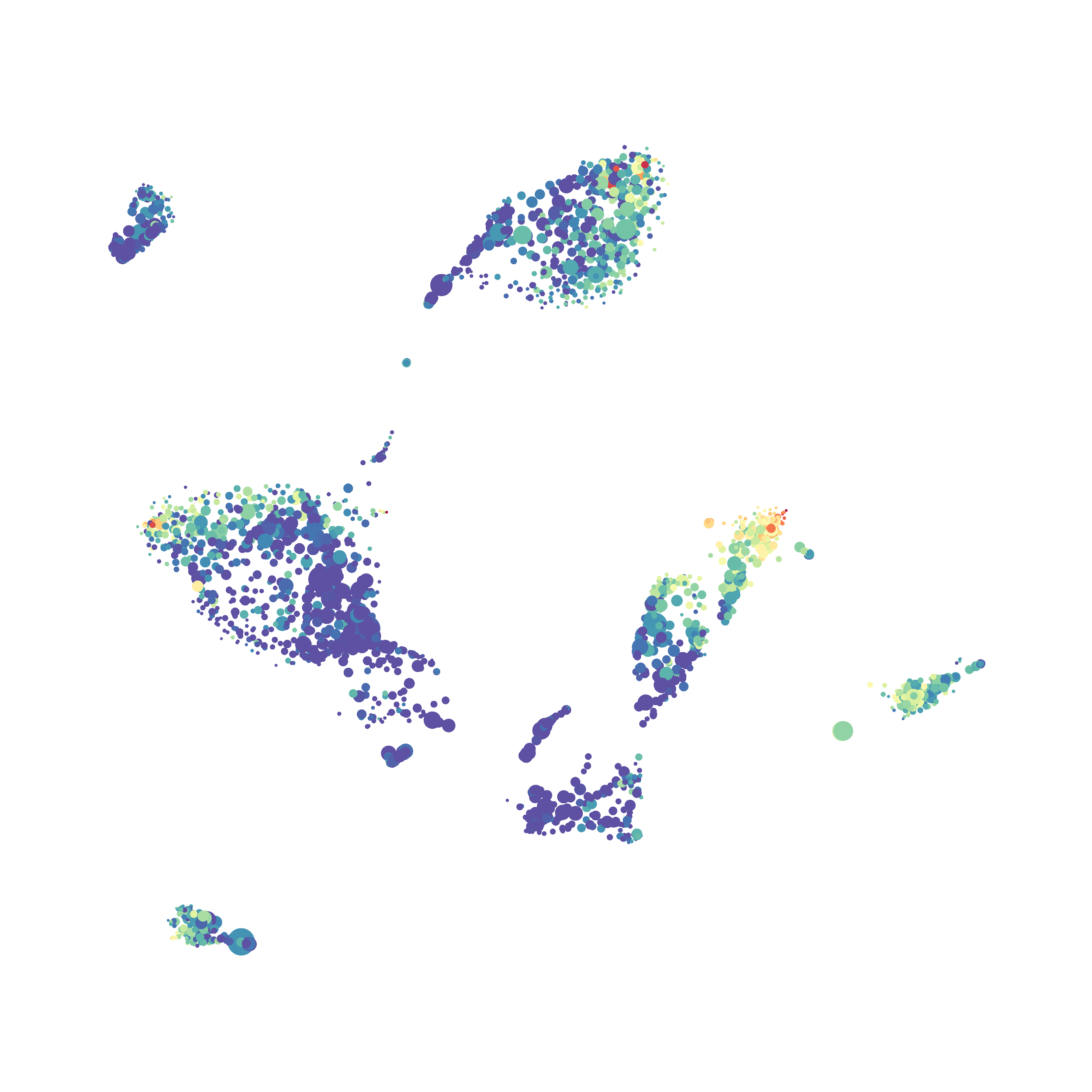
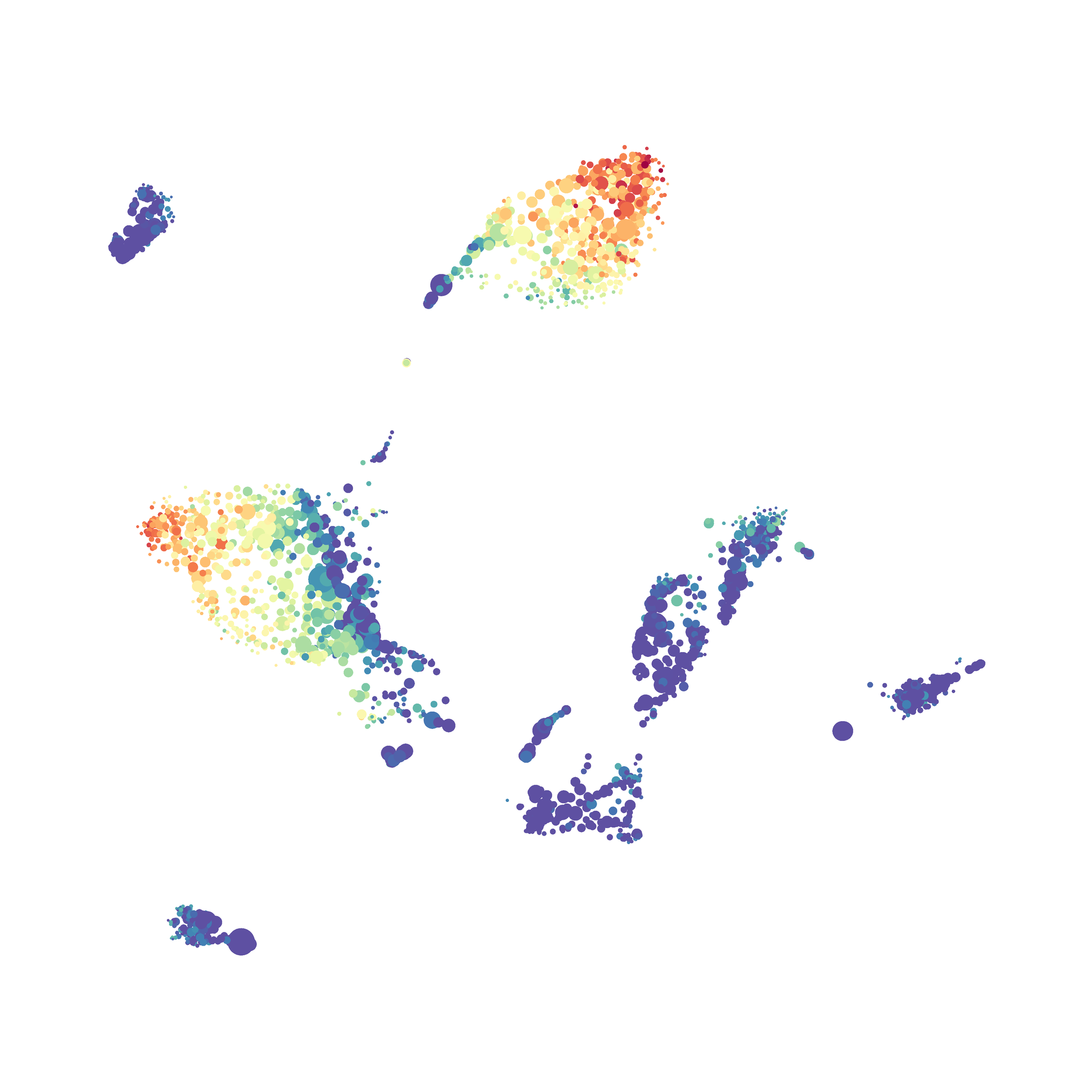
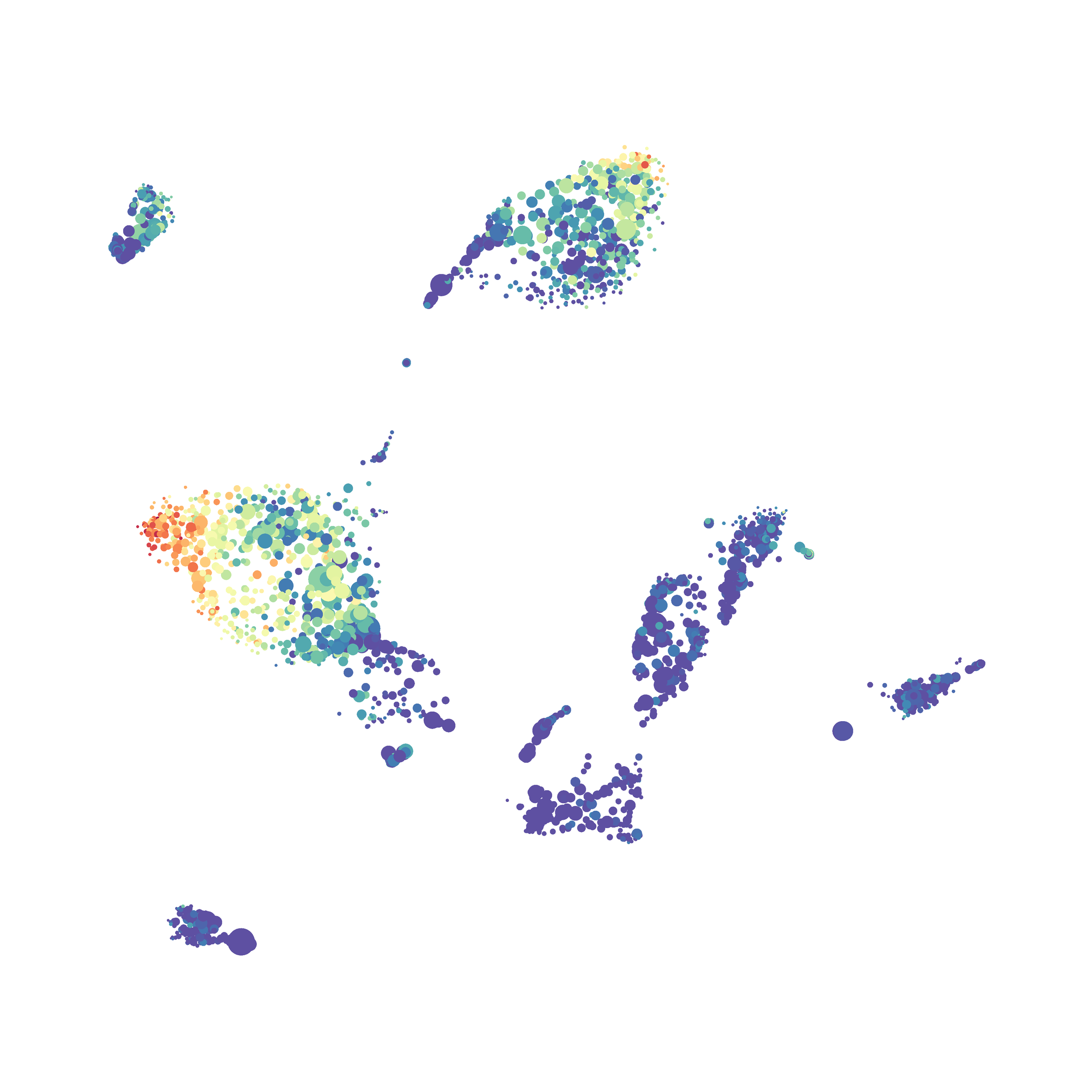
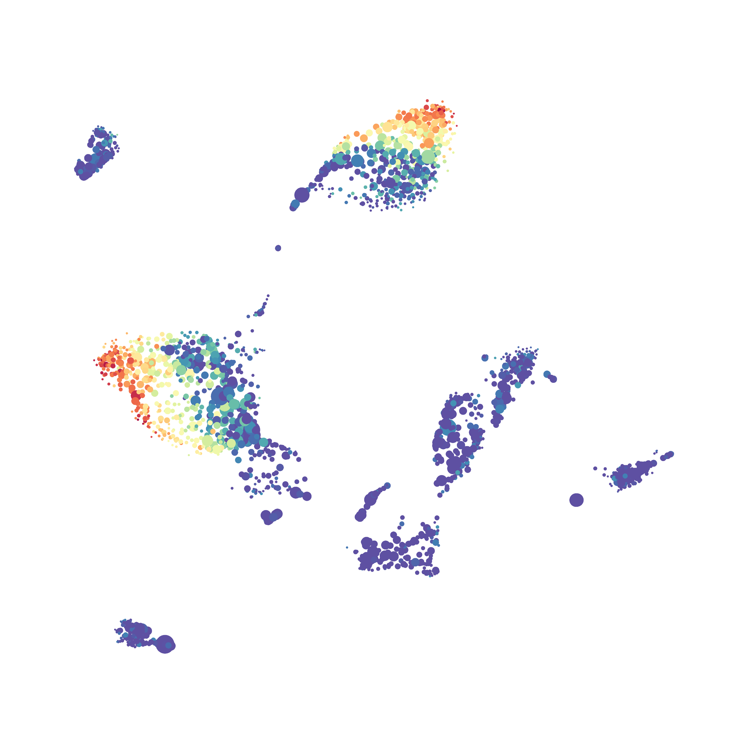
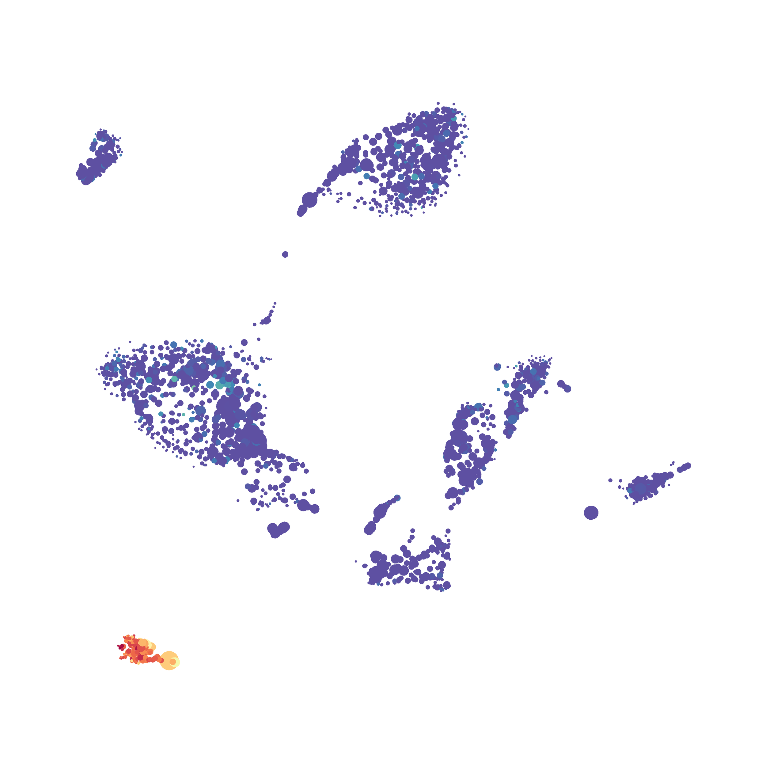
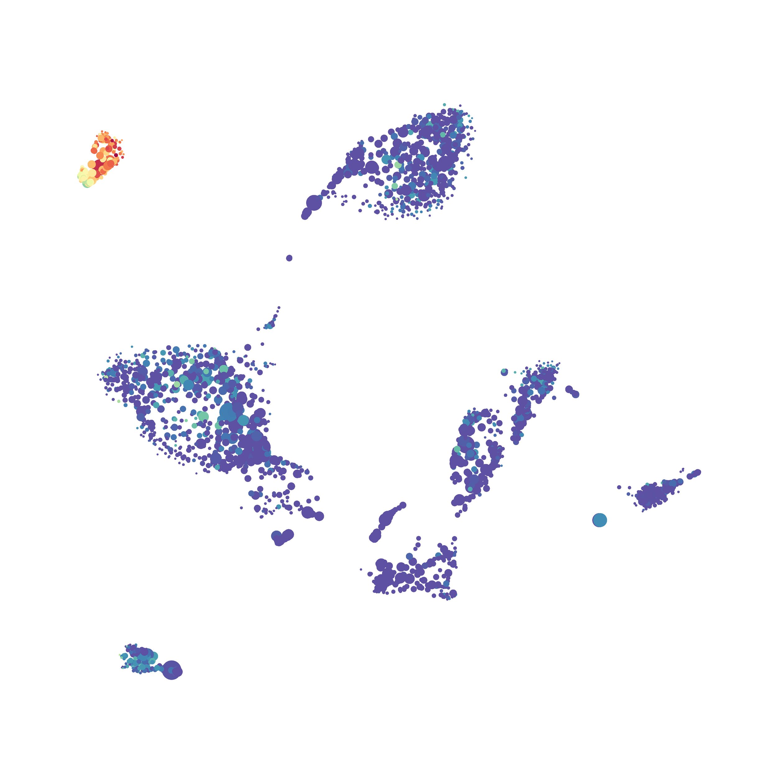
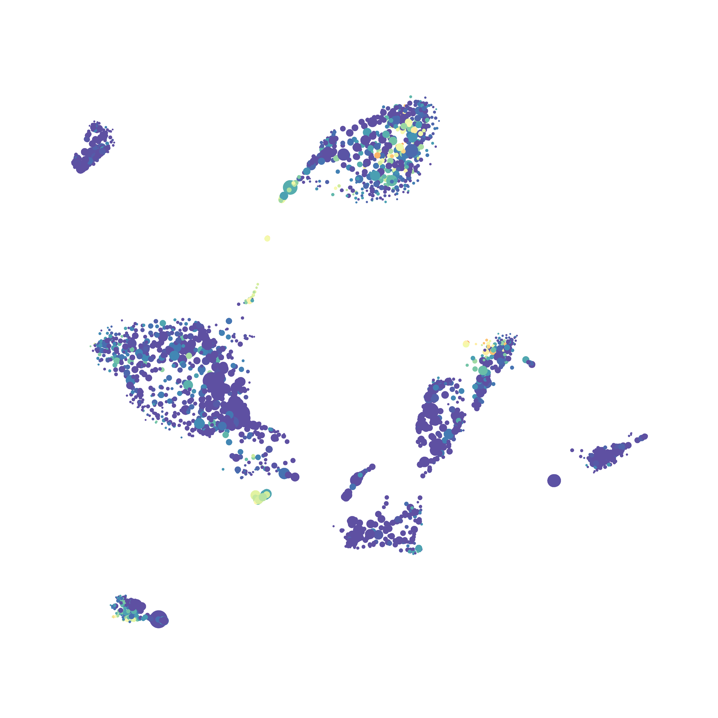
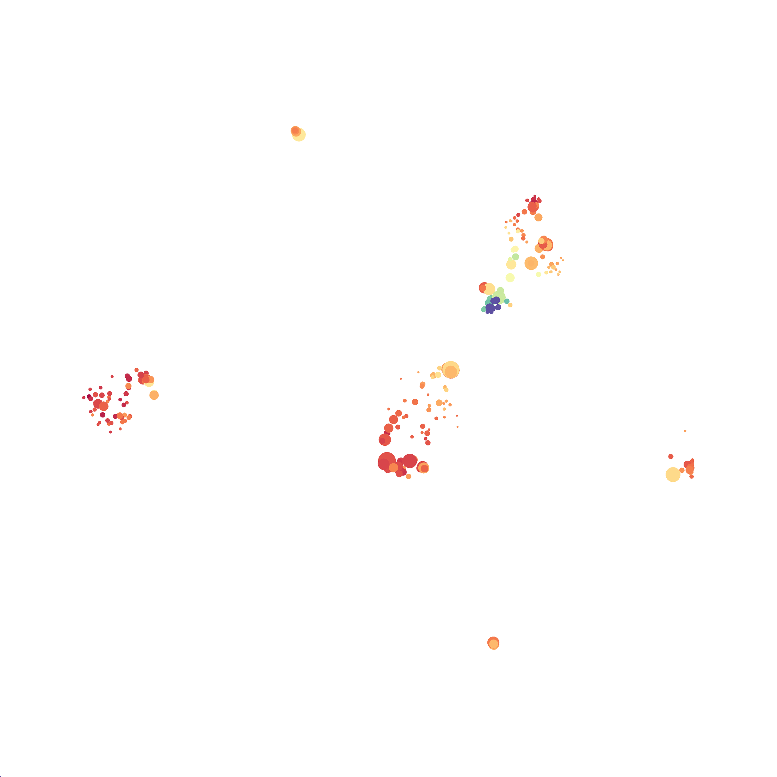
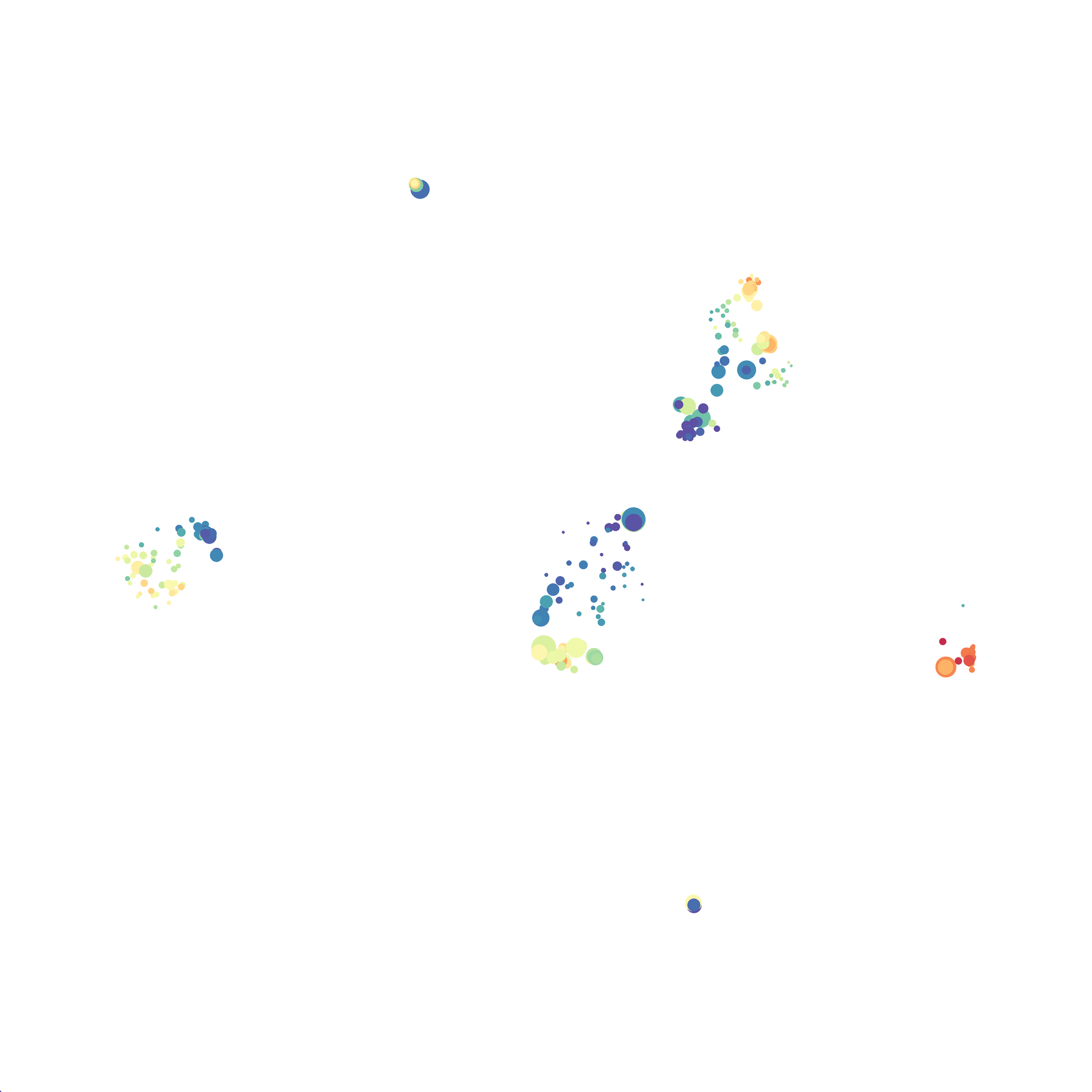
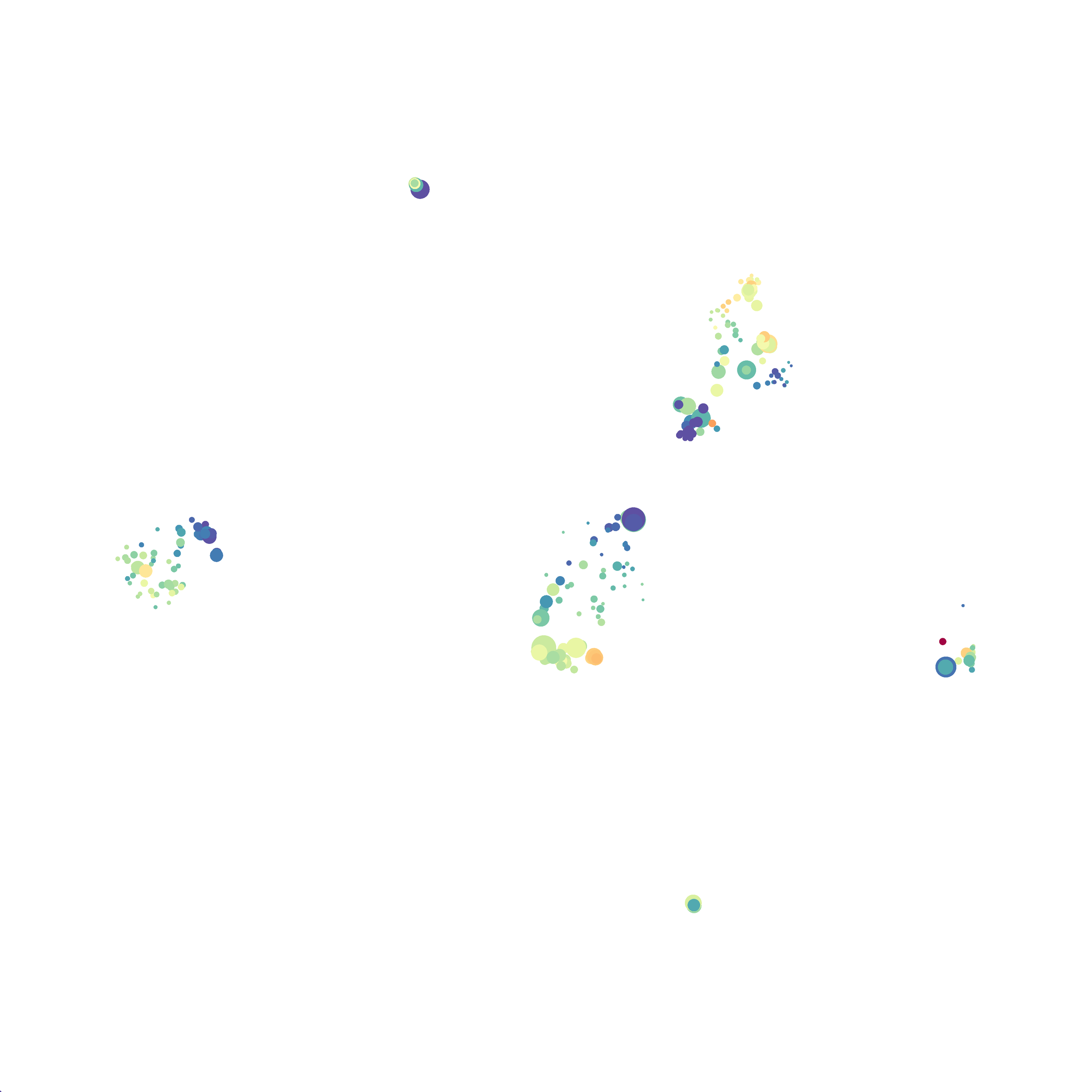
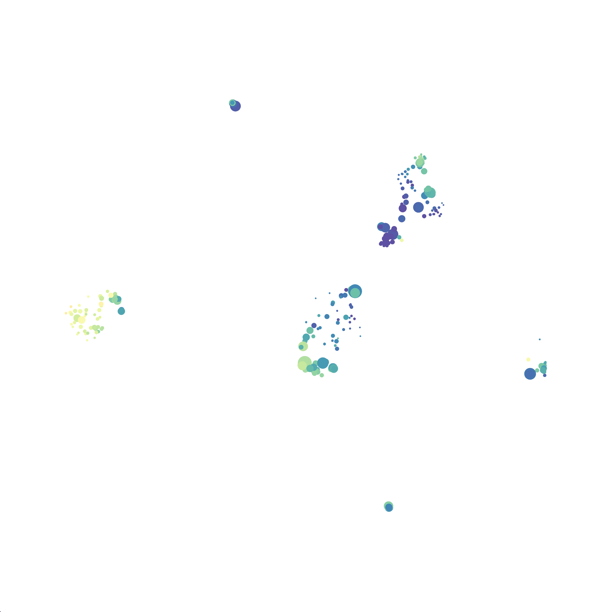
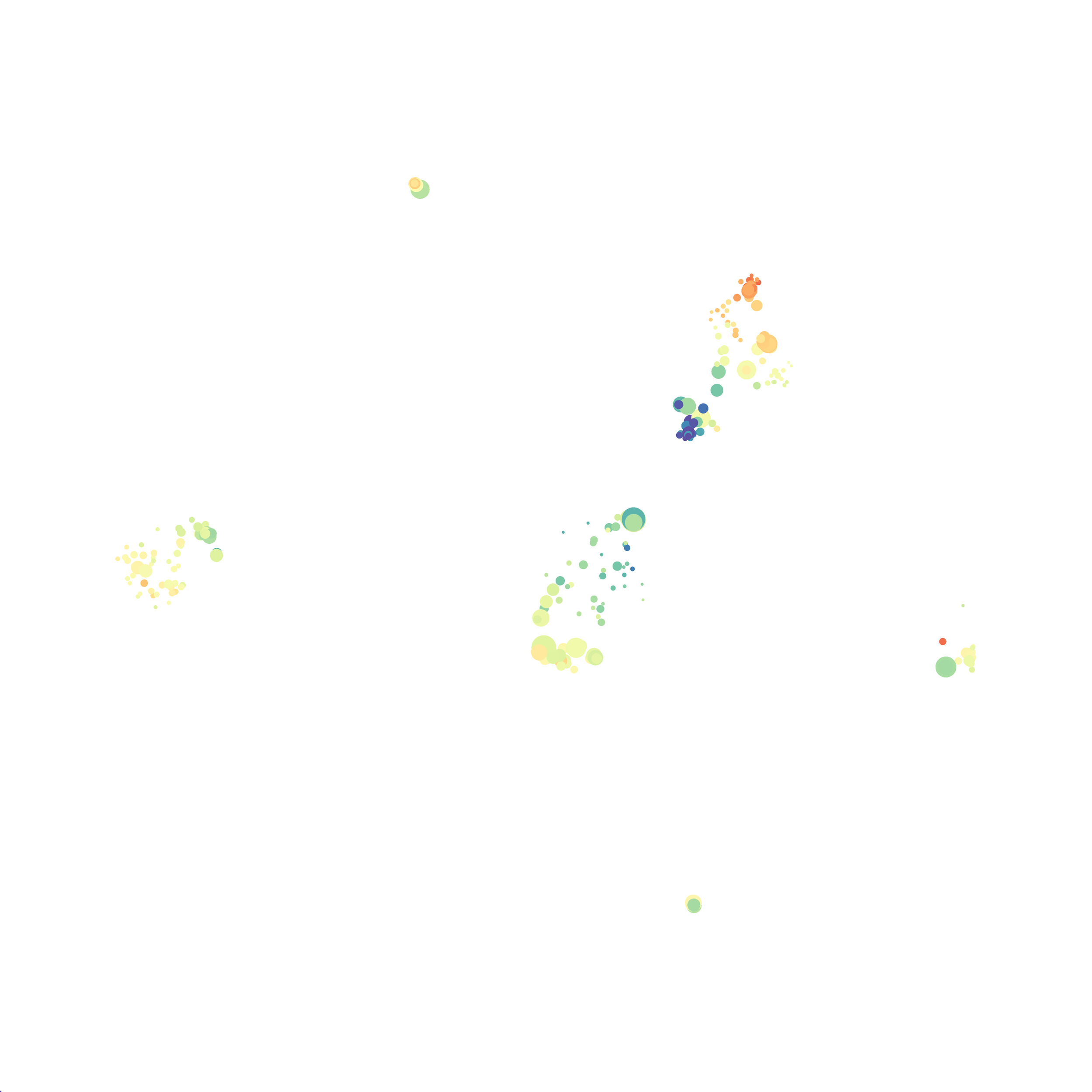
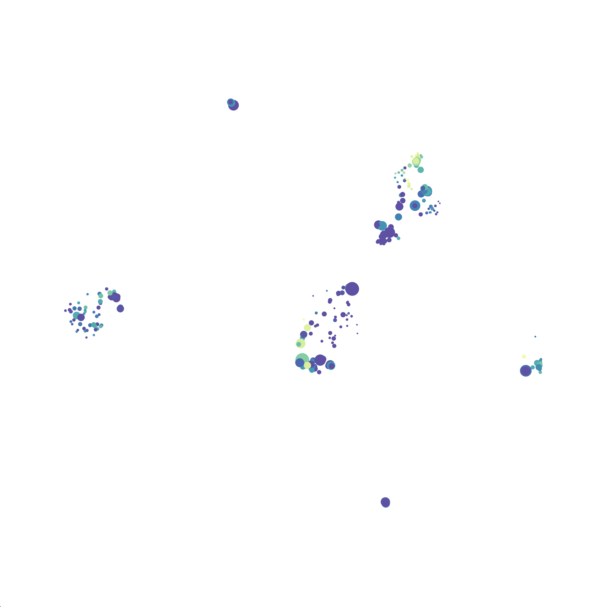
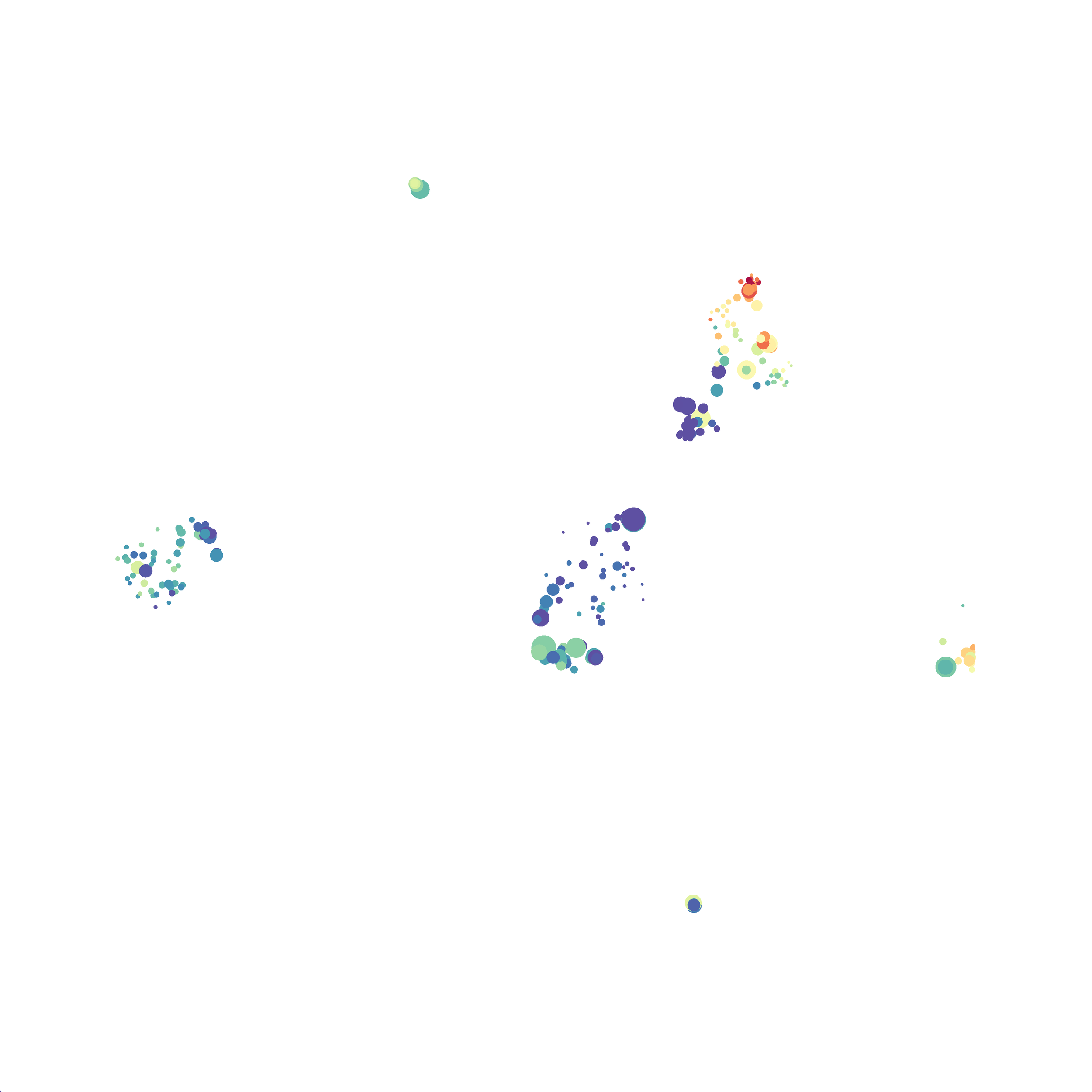
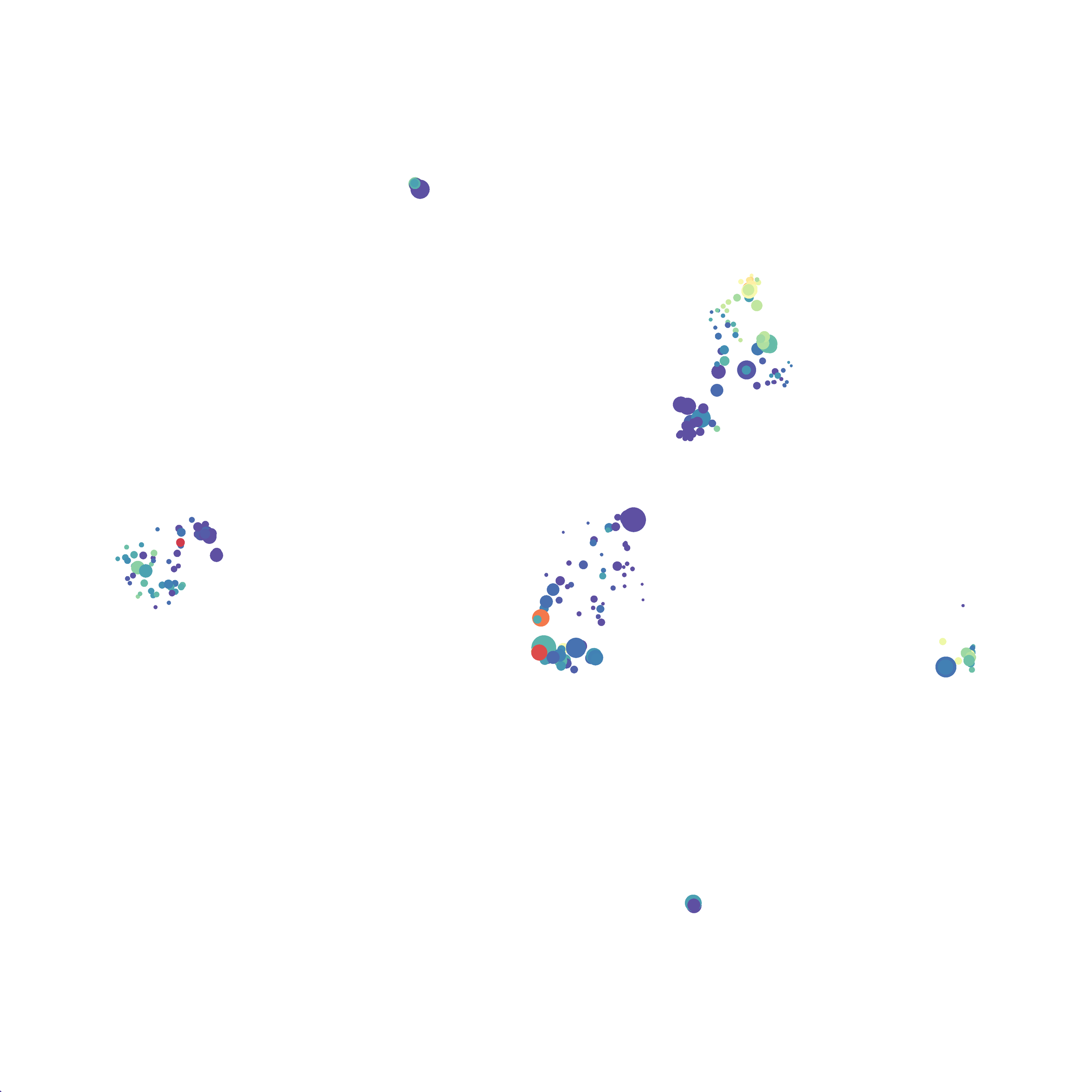
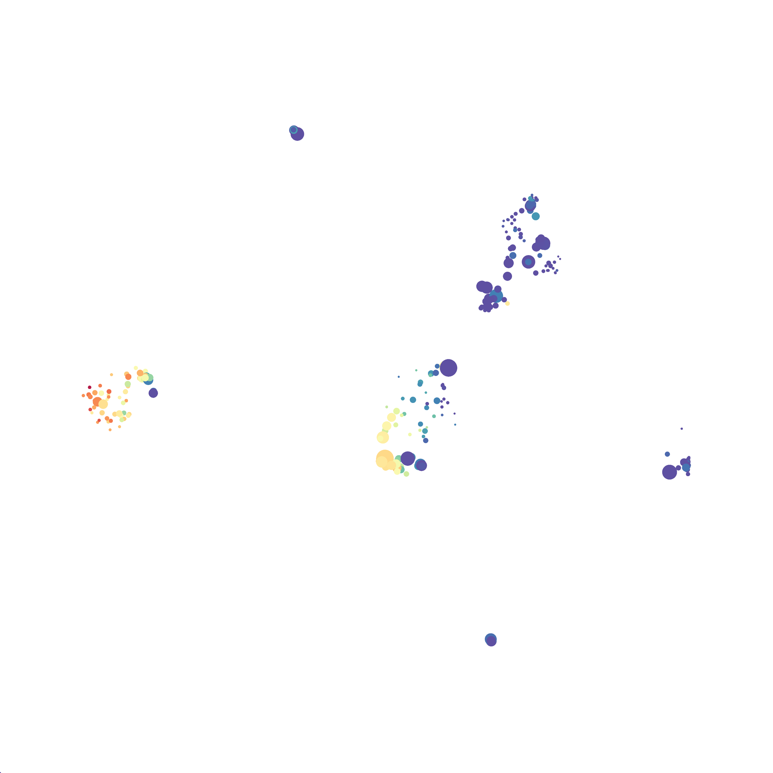
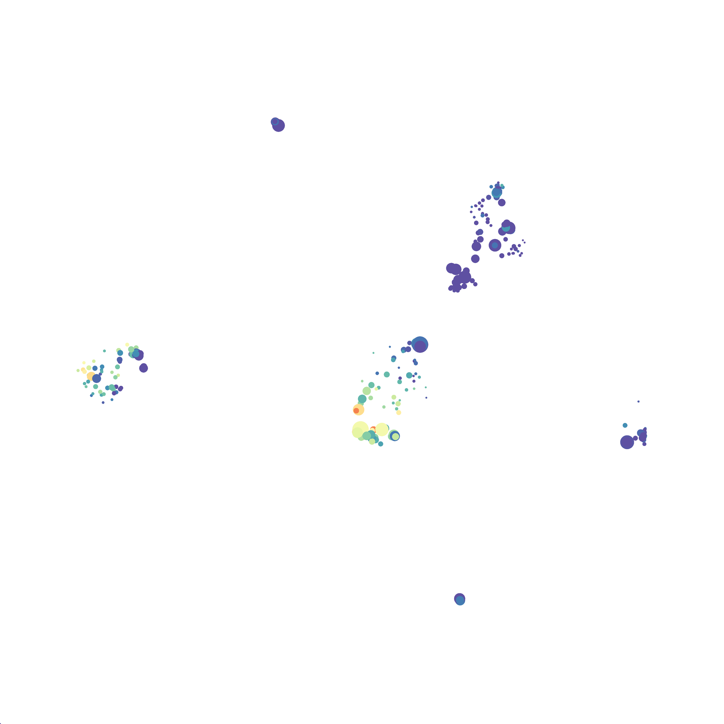
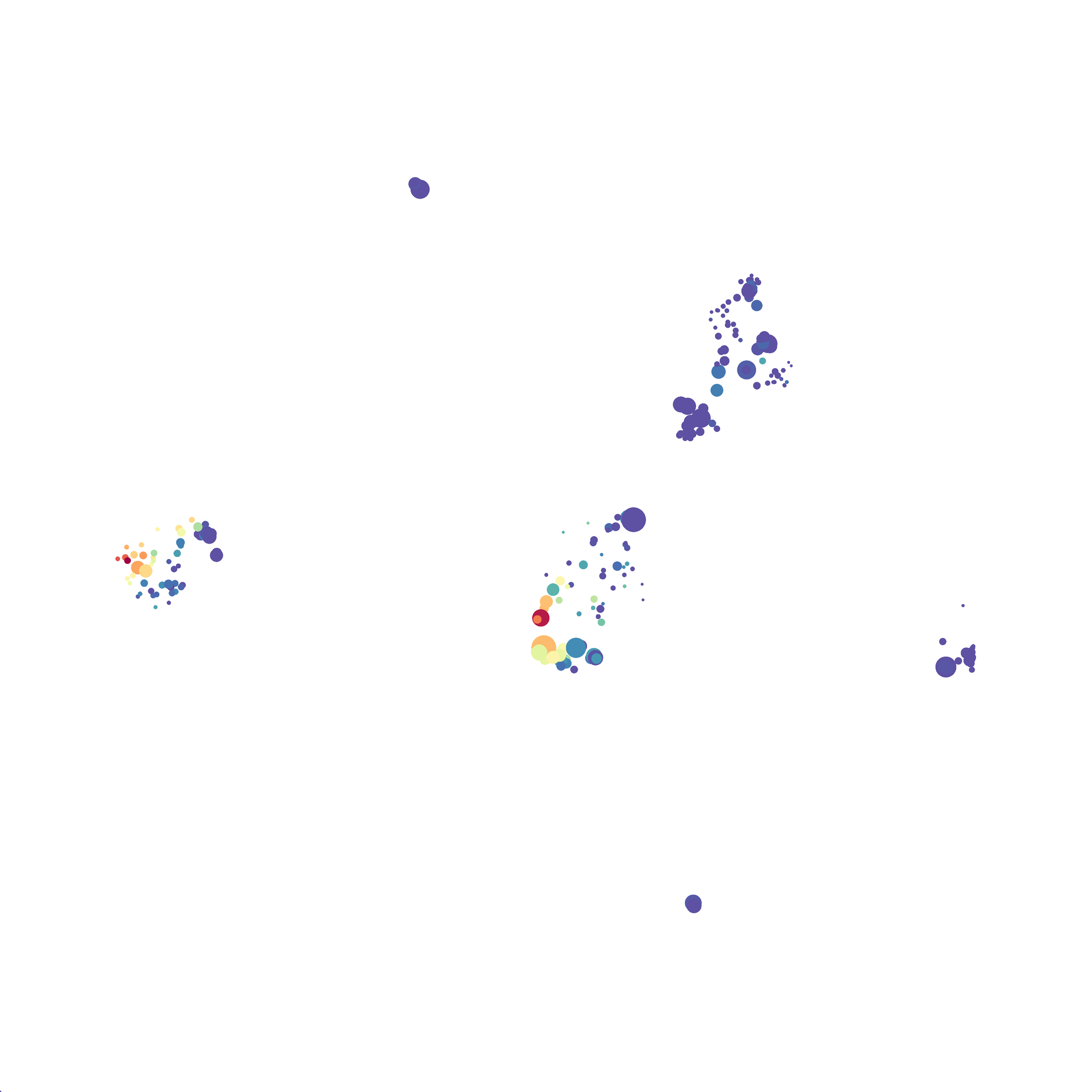
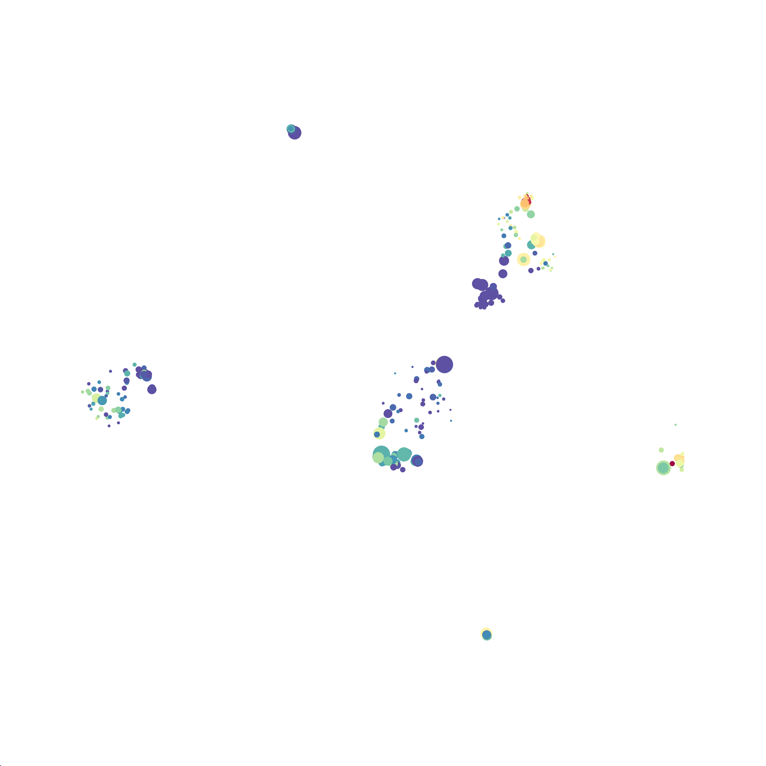
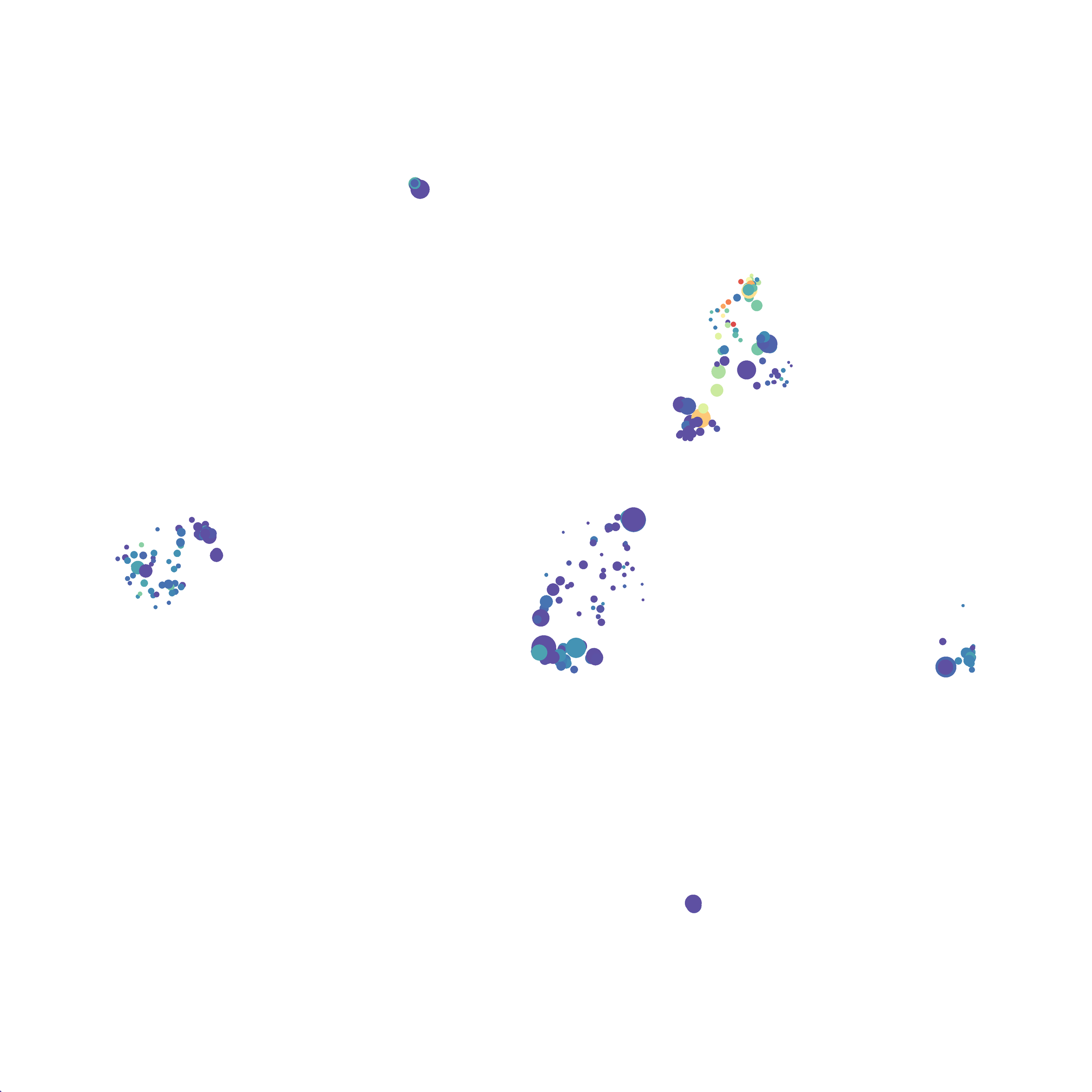
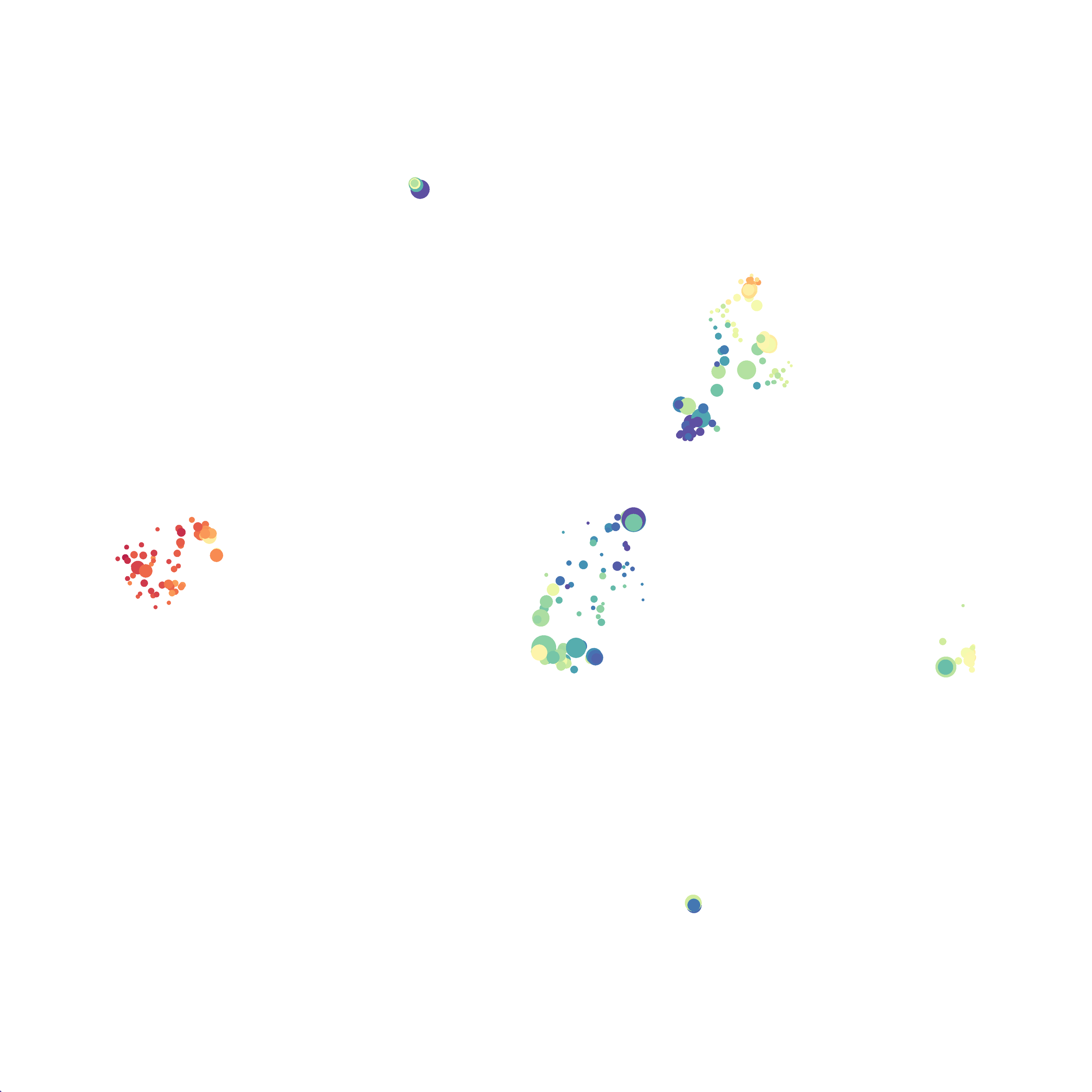
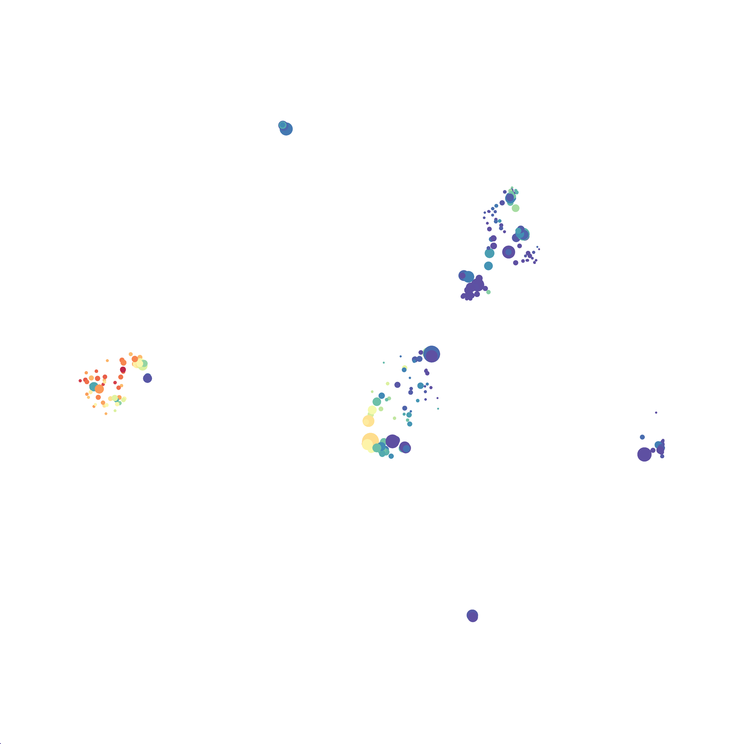
I tested UMAP’s reproducibility. However, like tSNE it is not reproducible between analysis runs:

For the UMAP analyses above I utilized the automatic settings. However, I wanted to see how changing
the distance function, the nearest neighbor #, and minimum distance value settings would influence the analysis results.
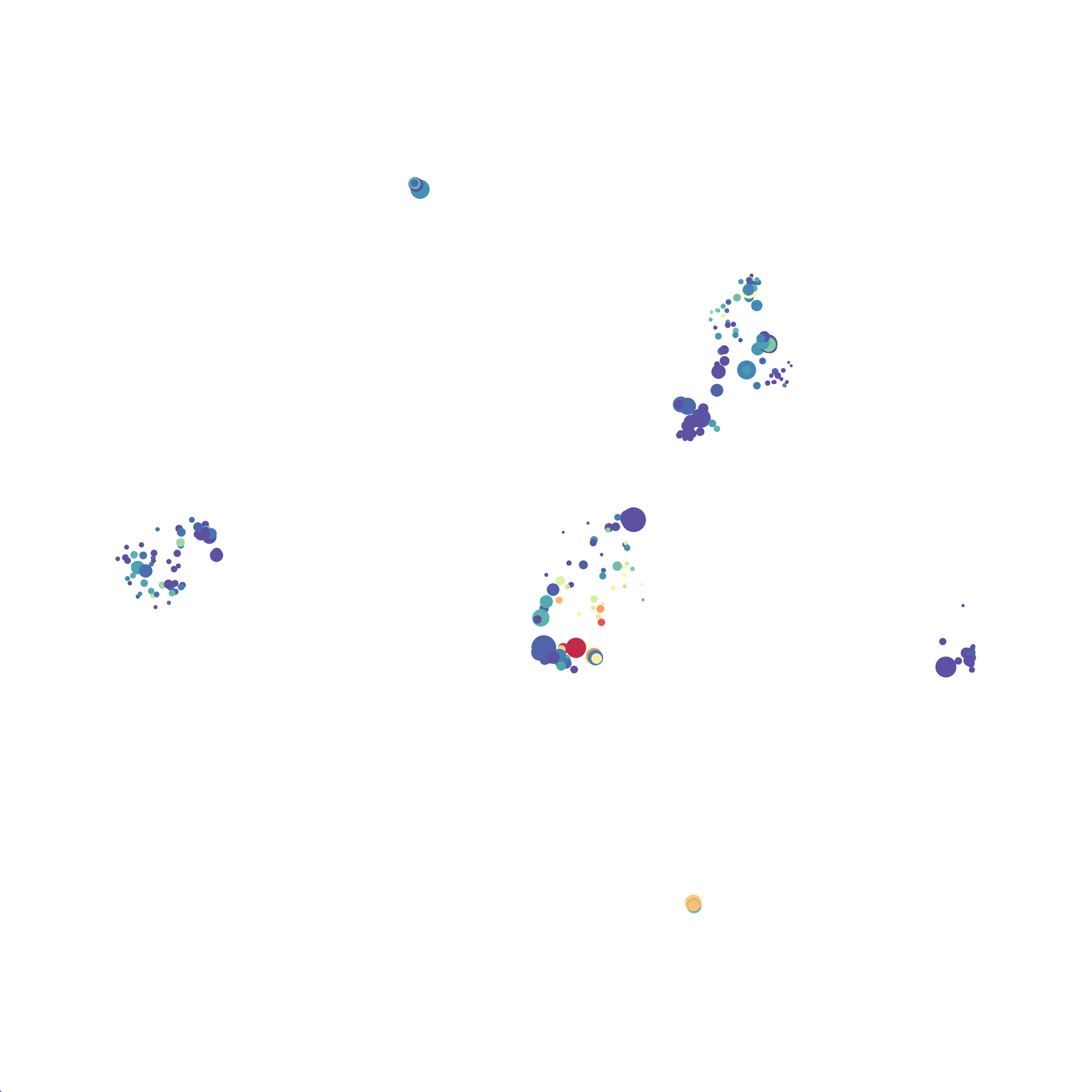
I selected B6 #1 (9,141 events total) and 35 markers for UMAP analysis. I did not change the automatic settings for neighbor # (15) and minimum distance value (0.5), but I varied the distance function (17 options total) between runs. 11 of the distance functions resulted in an error message and the analysis failed, but 6 of the functions resulted in successful analyses. The Euclidean, Manhattan, Chebyshev, and Minkowski distance functions resulted in very similar UMAP plots, these are all “Minkowski style metrics” and are appropriate to use on mass cytometry data. A simple explanation of the differences between Euclidean, Manhattan, and Chebyshev calculations can be found here, and a more complex explanation can be found here. The only other two distance metrics that worked were the Hamming and Sokalsneath functions, but these resulted in discordant tSNE plots. This makes sense as they are typically used for binary data, not continuous variables like those found in mass cytometry data and are thus not appropriate for this analysis.

The next variable I examined was the “nearest neighbor” function. I selected B6 #1 (9,141 events total) and 35 markers for UMAP analysis. I used the “Euclidean” distance function, a minimum distance value of 0.5 (the automatic setting), and varied the number of nearest neighbors run to run. You can select any value from 0-99, so I tried 0, 1, 5, 15 (the automatic value), 50, and 99. The runs utilizing 0, 1, and 99 all failed, but 5, 15 and 50 resulted in similar looking plots. The main observation appears to be a compression of the UMAP plot shape as neighbor number values increase.

The last variable I examined was the minimum distance value. I selected B6 #1 (9,141 events total) and 35 markers for UMAP analysis. I used the “Euclidean” distance function, a nearest neighbor value of 15 (the automatic setting), and varied the minimum distance value run to run. You can select any value from 0.1-0.99, so I tried 0.1, 0.5 (the automatic value), and 0.99. The runs utilizing 0.99 failed, but 0.1 and 0.5 were successful. Although 0.5 was the automatic value, I think 0.1 looks less compressed and offers more resolution.

If you are interested at looking at the impact of these variables in more depth check out this resource. Overall, it appears that any of the Minkowski Distance measurements (Euclidean, Manhattan, Chebyshev, and Minkowski) are appropriate, and produce similar results. It is impossible to tell if they produce identical results as UMAP plots are not reproducible between runs (see above). I would recommend using Euclidean as it appears to be the default option the programmers chose, and it is the distance measurement I have frequently seen in other algorithms (X-shift, PhenoGraph, etc.). I would also recommend sticking with the automatic values for the other variables, though small variations seem to have an impact on the compactness of UMAP plots which can improve resolution or visual appeal. For example, In the biorxiv version of Becht et al 2019, they noted that they used: “15 nn, a min_dist of 0.2 and euclidean distance” indicating that it is appropriate to slightly adjust the minimum distance value. However, I STRONGLY recommend always reporting the settings you used when publishing mass cytometry data.
My final thoughts on UMAP: for this dataset I didn’t notice a significant improvement in the “meaningful organization of cell clusters” that was reported in the Becht et al 2019 publication (see my comparison of tSNE vs UMAP above). However, I did find it to be the fastest and most robust dimensionality reduction tool I’ve used to date. The only complaints I have has to do with the use of the algorithm in FlowJo, which I hope to be addressed, or to be resolved when Cytofkit2 is ready for use. Overall, I anticipate replacing tSNE with UMAP in my analysis pipeline going forward.
For more detail and higher resolution images here is lab notebook entry for this project.
-Abby